In today's fast-paced SaaS world, staying on top of your business performance is crucial. Enter the SaaS dashboard from your window into the heart of your operations. But what makes a great dashboard? Let's dive in and explore the best practices for 2024.
What is a SaaS Dashboard?
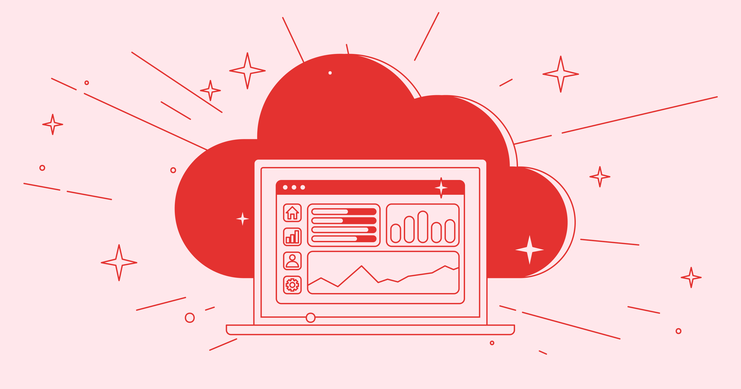
A SaaS dashboard is like a control center for your business. It's a visual display of your most important data. Think of it as your business's speedometer, fuel gauge, and GPS all rolled into one.
These dashboards pull data from various sources and present it in an easy-to-understand format. They show you how your business is performing at a glance. A well-designed dashboard lets you spot trends, identify issues, and make decisions quickly.
The Glow Team, experts in SaaS design, emphasize the importance of clarity in dashboards. They believe that a good dashboard should tell a story at a glance. It should highlight what's important without overwhelming the user with too much information.
Importance in SaaS Business
In the SaaS world, data is king. However, raw data can be overwhelming and hard to interpret. That's where SaaS metrics dashboards come in. They transform raw data into actionable insights.
Why are these dashboards so important? First, they save time. Instead of digging through spreadsheets, you get key information instantly. This means you can spend more time acting on insights rather than gathering data.
Second, they improve decision-making. When you can see all your key metrics in one place, it's easier to spot patterns and make informed choices. This can lead to better strategies and faster growth.
Lastly, they help align teams. When everyone is looking at the same data, it's easier to get on the same page. This can improve communication and collaboration across your organization.

Essential SaaS Metrics
Not all metrics are created equal. Some are more critical to your success than others. Let's look at some of the most important SaaS metrics you should be tracking.
Churn Rate
Churn rate is the percentage of customers who stop using your product over a given period. It's a crucial metric because it directly impacts your growth and revenue. A high churn rate can indicate problems with your product or customer service.
To calculate churn rate, divide the number of customers lost in a period by the total number of customers at the start of that period. For example, if you started with 100 customers and lost 5, your churn rate would be 5%.
The Glow Team suggests setting up alerts for sudden spikes in churn rate. This can help you identify and address issues quickly before they become major problems.
Conversion Rate
Conversion rate measures how many of your leads or free trial users become paying customers. It's a key indicator of your sales and marketing effectiveness. A low conversion rate might suggest issues with your pricing, product, or sales process.
To calculate conversion rate, divide the number of conversions by the total number of leads or trials. For instance, if 10 out of 100 trial users become paying customers, your conversion rate is 10%.
Sales Metrics
Sales metrics help you understand how well your sales team is performing. Key sales metrics include:
- Monthly Recurring Revenue (MRR): This is the predictable total revenue generated by your business each month.
- Average Revenue Per User (ARPU): This metric shows how much revenue you're generating from each customer on average.
- Customer Acquisition Cost (CAC): This is how much it costs to acquire a new customer.
These metrics can help you optimize your sales process and pricing strategy. They're essential for any SaaS metrics dashboard.
Customer Metrics
Customer metrics give insights into how customers are using your product. Important customer metrics include:
- Customer Lifetime Value (CLV): This predicts how much revenue a customer will generate over their entire relationship with your company.
- Net Promoter Score (NPS): This measures customer satisfaction and loyalty.
- Feature adoption rate: This shows how many of your customers are using specific features of your product.
These metrics can help you improve your product and customer service. They're crucial for understanding and enhancing the customer experience.
Steps to Create a SaaS Dashboard
Creating an effective SaaS dashboard isn't just about throwing together some charts and graphs. It requires careful planning and execution. Here's a step-by-step guide to help you create a dashboard that delivers real value:
- Define Your Objectives: Start by identifying what you want to achieve with your dashboard. Are you looking to improve sales performance? Reduce churn? Boost customer satisfaction? Your objectives will guide your metric selection.
- Choose Your Metrics: Based on your objectives, select the key metrics that will best help you track progress. Remember, less is often more. Focus on the metrics that truly matter.
- Identify Your Data Sources: Determine where your data will come from. This might include your CRM, marketing automation tools, financial software, and product analytics.
- Design Your Layout: Plan how you'll arrange your metrics on the dashboard. Group related metrics together and put the most important ones front and center.
- Select Your Visualizations: Choose the right chart types for each metric. Line charts are great for trends over time, while bar charts work well for comparisons.
- Add Context: Include benchmarks or goals for each metric. This helps users understand if performance is on track or needs attention.
- Build and Test: Use a dashboard tool to bring your design to life. Test it with real users to ensure it's intuitive and provides the insights they need.
- Iterate and Improve: Your dashboard should evolve as your business does. Regularly review and update it based on user feedback and changing business needs.
The Glow Team recommends involving key stakeholders throughout this process. This ensures the dashboard meets everyone's needs and increases adoption across the organization.
Overview of Different Types of Dashboards
Different roles within your organization may need different types of dashboards. Let's explore some common types of SaaS dashboards and what they typically include.
SaaS Marketing Dashboard
A marketing dashboard focuses on metrics related to lead generation and nurturing. It might include:
- Website traffic and sources
- Lead conversion rates
- Email open and click-through rates
- Social media engagement
- Cost per lead
This dashboard helps marketing teams track campaign performance and optimize their strategies.
SaaS Analytics Dashboard
An analytics dashboard provides a deep dive into user behavior and product performance. It typically includes:
- Daily/monthly active users
- User retention rates
- Feature usage statistics
- User flow through the product
- Error rates or system performance metrics
This dashboard is crucial for product managers and developers to understand how users interact with the product.
SaaS Sales Dashboard
A sales dashboard helps sales teams track their performance and pipeline. It often includes:
- Revenue targets and actuals
- Sales pipeline by stage
- Win/loss rates
- Average deal size
- Sales cycle length
This dashboard helps sales managers forecast revenue and identify areas for improvement in the sales process.
Finance SaaS Dashboard
A finance dashboard focuses on the financial health of the business. It typically includes:
- Monthly Recurring Revenue (MRR)
- Annual Recurring Revenue (ARR)
- Cash burn rate
- Gross margin
- Customer Acquisition Cost (CAC) to Lifetime Value (LTV) ratio
This dashboard is essential for CFOs and financial planners to monitor the company's financial performance.
SaaS Product Dashboard
A product dashboard focuses on how users interact with your SaaS product. It might include:
- Feature adoption rates
- User engagement metrics
- Customer feedback or NPS scores
- Bug reports or error rates
- Product roadmap progress
This dashboard helps product managers make data-driven decisions about product development.
SaaS Executive Dashboard
An executive dashboard provides a high-level overview of the entire business. It typically includes:
- Key financial metrics (MRR, ARR, etc.)
- Customer growth and churn rates
- Sales pipeline overview
- Major product and operational KPIs
This dashboard gives executives a quick snapshot of overall business health and performance.
SaaS MRR Dashboard
An MRR (Monthly Recurring Revenue) dashboard focuses specifically on recurring revenue. It might include:
- Total MRR
- MRR growth rate
- MRR breakdown by customer segment
- New MRR vs. churned MRR
- Expansion MRR (from upsells or cross-sells)
This dashboard is crucial for understanding the growth and stability of your recurring revenue.
SaaS Customer Dashboard
A customer dashboard focuses on customer health and satisfaction. It typically includes:
- Customer health scores
- Support ticket volume and resolution times
- Customer satisfaction or NPS scores
- Product usage metrics
- Renewal rates and upsell opportunities
This dashboard helps customer success teams identify at-risk customers and opportunities for growth.
Overview of Design Best Practices
Creating an effective SaaS metrics dashboard isn't just about choosing the right metrics. How you present those metrics is equally important. Here are some design best practices to keep in mind:
- Keep It Simple: Don't overcrowd your dashboard. Focus on the most important metrics and use white space effectively.
- Use Color Wisely: Use color to highlight important information or indicate status (e.g., red for alerts, green for good performance).
- Group Related Metrics: Organize your dashboard logically, grouping related metrics together.
- Provide Context: Include targets or benchmarks alongside your metrics so users can quickly gauge performance.
- Use Appropriate Visualizations: Choose the right type of chart or graph for each metric. For example, use line charts for trends over time and bar charts for comparisons.
- Make It Interactive: Allow users to drill down into data for more details or filter data as needed.
- Ensure Mobile Responsiveness: Many users will access dashboards on mobile devices, so ensure your design is responsive.
- Update in Real-Time: Where possible, provide real-time or near-real-time data updates.
- Include Date Ranges: Allow users to adjust date ranges to view data over different periods.
- Use Clear Labels: Ensure all metrics and charts are clearly labeled so there's no confusion about what's being displayed.
The Glow Team emphasizes the importance of user testing in dashboard design. They recommend getting feedback from actual users to ensure the dashboard meets their needs and is intuitive to use.

Conclusion
In the fast-paced world of SaaS, having a well-designed metrics dashboard is no longer a luxury, it's a necessity. By following these best practices, you can create dashboards that provide clear, actionable insights to drive your business forward.
Remember, the key to a great dashboard is balance. You want to provide enough information to be useful, without overwhelming users. Focus on the metrics that truly matter to your business and present them in a clear, visually appealing way.
By leveraging the power of data visualization, you can transform raw numbers into strategic insights. This will empower your team to make better decisions, react quickly to changes, and drive your SaaS business to new heights.
Are you ready to take your SaaS metrics to the next level? Start applying these best practices today and watch your data come to life. With the right dashboard, you'll have the insights you need to navigate the exciting world of SaaS in 2024 and beyond.

