Introduction
The modern world is filled with digital benefits for humans. Today, using artificial intelligence (AI) to generate pictures, for example, does not surprise anyone. People don't notice how they wake up and use various websites or apps that open the world to the flow of information. But have you thought about convenience?
Agree, complicated navigation is frustrating or awkward design is frustrating. It leads to high bounce rates and missed opportunities. And if your situation is exactly like this, we present you Glow - a company that will help you fix such a situation.
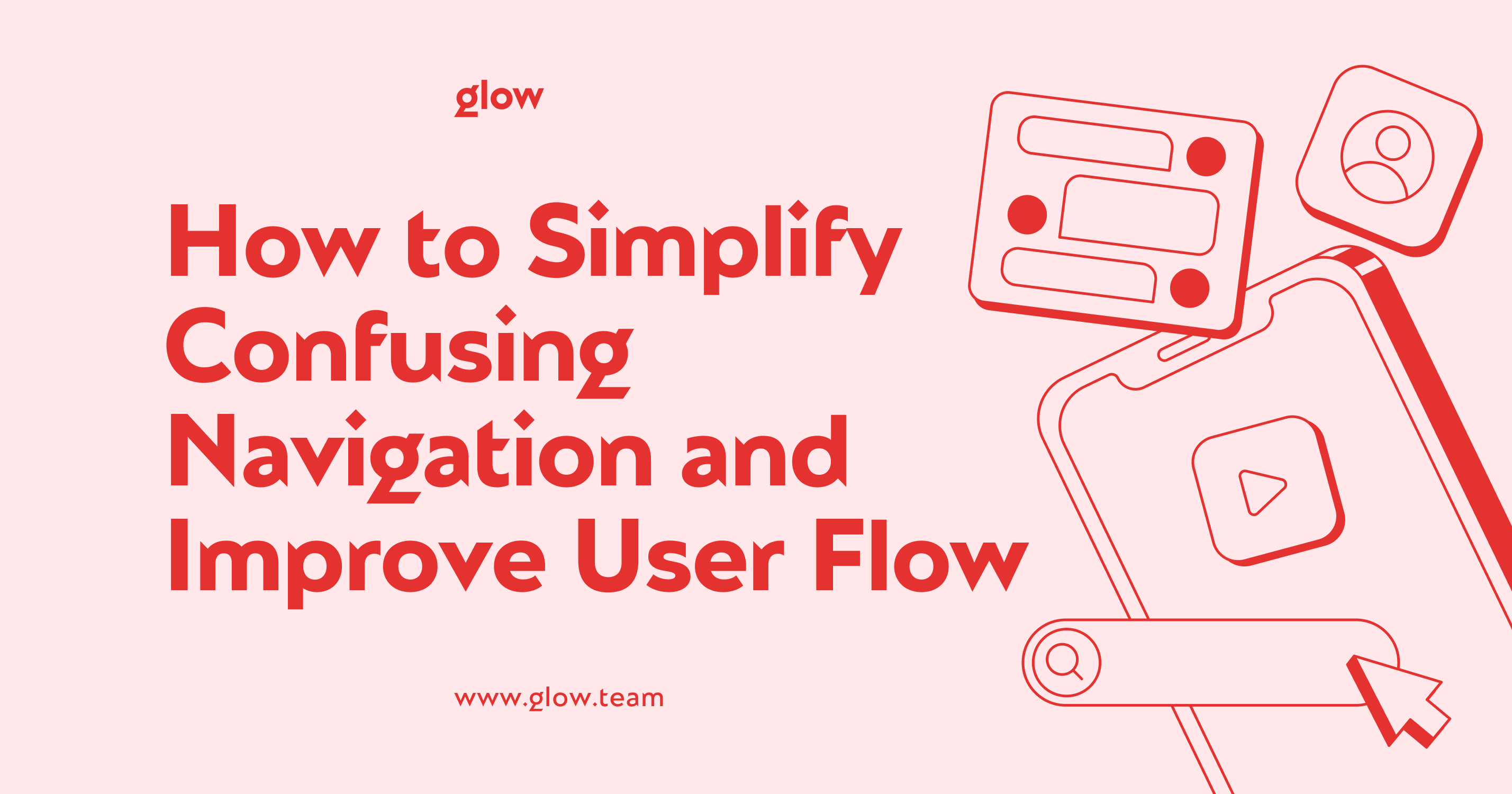
This article discusses strategies to simplify navigation and improve user flow for a website, ensuring your digital platform is intuitive and engaging.
Understanding Navigation and User Flow
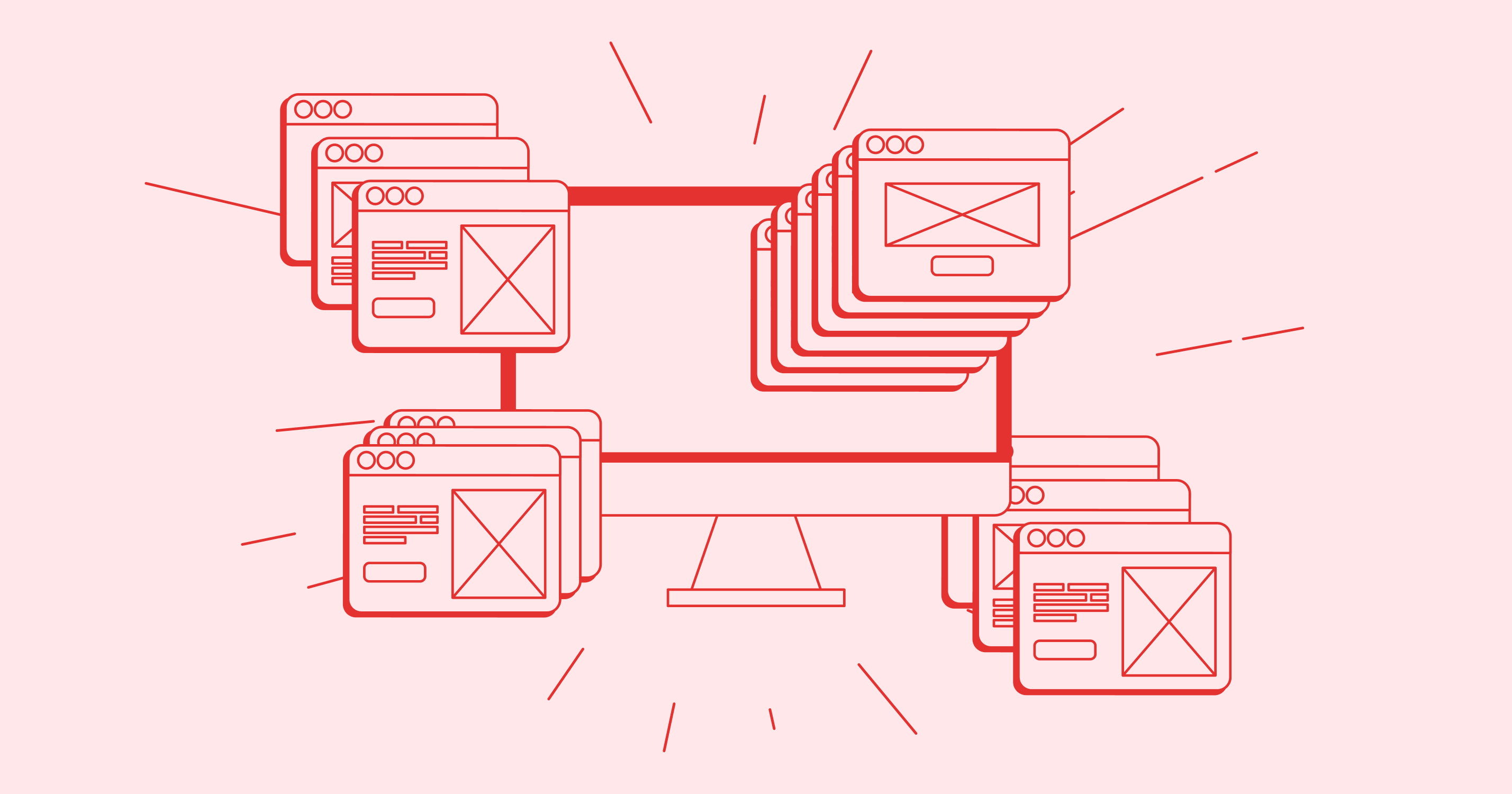
Navigation is the foundation of all digital interfaces. It directs readers through your content, assisting them in finding what they're looking for. User flow refers to the path a user takes to perform a task on your website or app. When these aspects function together, consumers can easily navigate your digital world and achieve their goals.
Goals of Effective Navigation
The primary aim of navigation is to provide clear pathways for users. It should be intuitive, allowing visitors to predict where links will lead. Effective navigation reduces cognitive load, making the user's journey smooth and enjoyable. By understanding your users' needs, you can create a navigation system that feels natural and effortless.
Key Strategies to Improve Navigation and User Flow
Simplify the Structure
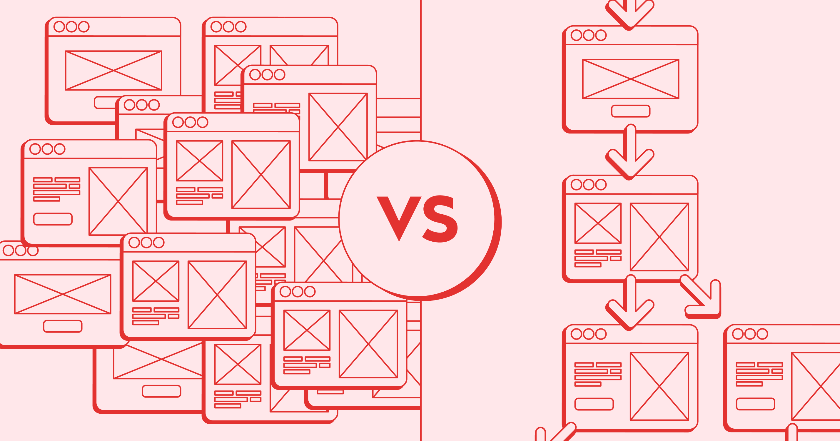
One of the most impactful ways to improve user flow for a website is to simplify your site's structure. Start by auditing your content and removing unnecessary pages or sections. Group related information logically, creating a hierarchy that makes sense to your users. Use clear, descriptive labels and buttons for menu items to eliminate guesswork.
Consider implementing a flat architecture where possible. It reduces the number of clicks needed to reach important information. Remember, every additional click allows a user to get lost or frustrated. Streamlining your structure creates a more direct path to valuable content.
Personalization
Tailoring the user experience can significantly enhance navigation and user flow UX. Implement features that remember user preferences and behavior. It could include recently viewed items, personalized recommendations, or customized dashboards. By anticipating user needs, you can present the most relevant options upfront, reducing search time.
Consider using AI-driven personalization to adjust navigation based on user behavior dynamically. This advanced technique can predict what a user will need next, further streamlining their journey. However, always balance personalization with user control to maintain a sense of agency.
Utilizing Visual Cues and Feedback
Visual elements play a crucial role in guiding users through your digital space. Use consistent color schemes, icons, and typography to create a cohesive look. This visual consistency helps users quickly identify navigation elements across different pages. Implement hover effects and animations to provide immediate feedback on interactive elements.
Consider using breadcrumbs for complex sites, allowing users to track their location easily. Progress indicators for multi-step processes can also improve user flow, giving visitors a clear sense of where they are and what's left to complete. These visual cues act as silent guides, enhancing the overall navigation experience.
Techniques for Enhancing User Flow
Intuitive Information Architecture
Creating an intuitive information architecture is fundamental to a smooth user flow UX. Start by conducting user research to understand how your target audience thinks about and categorizes information. Use card sorting exercises to inform your site structure and menu organization.
Implement a logical hierarchy in your navigation, with broader categories leading to more specific subcategories. Ensure that your site's structure mirrors users' mental models of organizing information. This alignment between user expectations and site structure reduces cognitive load and improves navigation efficiency.
Progressive Disclosure
Progressive disclosure is a powerful technique for managing complex information without overwhelming users. This approach involves revealing information gradually as users need it. Start with essential options and provide ways to access more detailed information or advanced features as required.
For example, you might initially use expandable sections or "learn more" links to hide detailed information. It keeps the main interface clean and simple while providing access to in-depth content. Progressive disclosure is particularly effective for improving user flow for websites with diverse user bases or complex functionality.
Continuous Improvement
User Testing and Feedback Loops
To truly optimize navigation and user flow, ongoing user testing is essential. Regularly conduct usability tests to identify pain points in your navigation system. Use heat maps and click tracking to understand how users interact with your interface. This data can reveal unexpected user behaviors and highlight areas for improvement.
Implement feedback mechanisms throughout your site or app. It could include short surveys, feedback buttons, or chat support. Actively encourage users to share their experiences and suggestions. By maintaining an open dialogue with your users, you can continually refine your navigation based on real-world usage.
Iterative Design Process
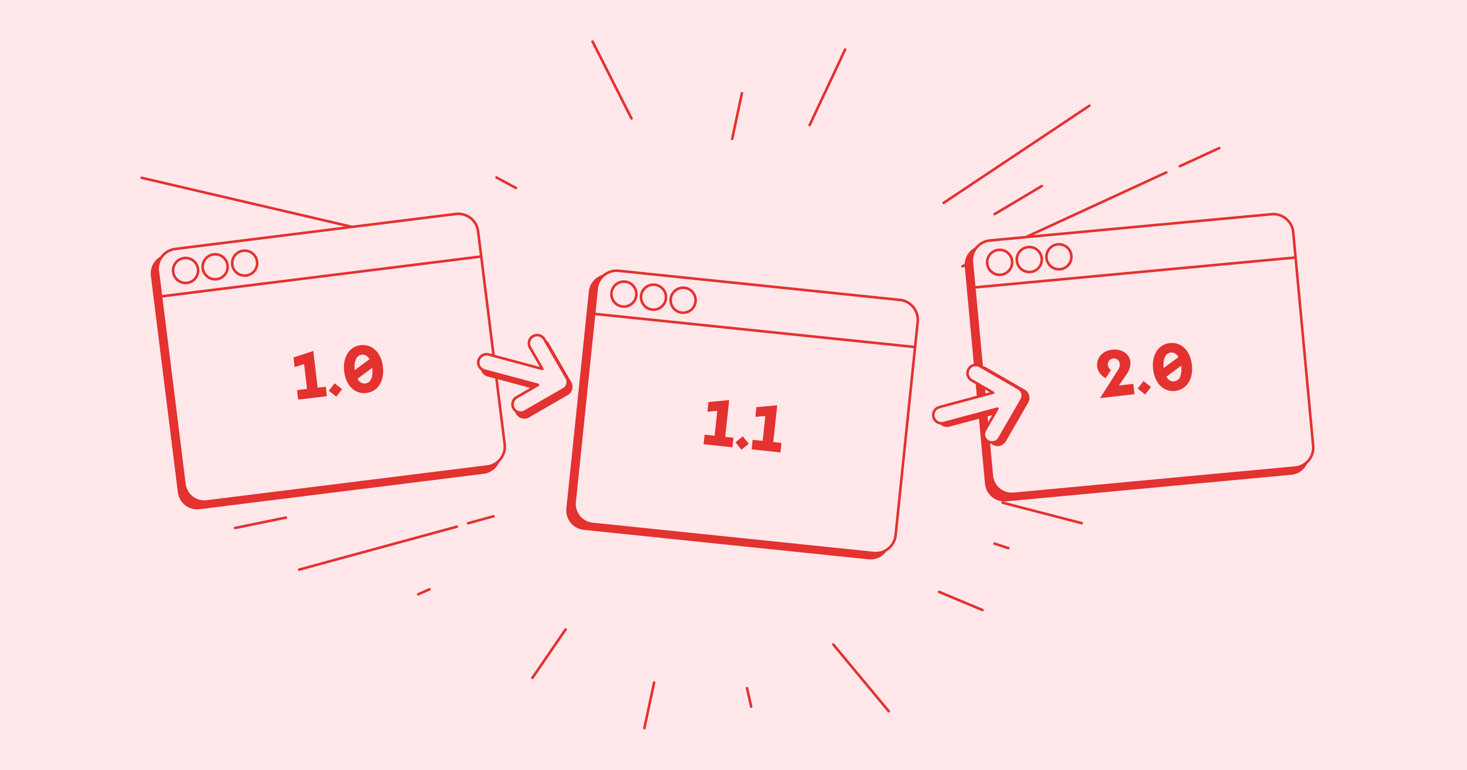
Adopt an iterative approach to improving your UX process flow. Make small, incremental changes based on user feedback and testing results. It allows you to measure the impact of each change accurately. Start with low-fidelity prototypes to test major navigation concepts, then refine and test again with higher-fidelity versions.
Remember that perfecting navigation and user flow is an ongoing process. User needs and expectations evolve, and your digital platform should evolve. Regular audits of your navigation system can help identify outdated elements or new opportunities for improvement.
Conclusion
Simplifying navigation and increasing user flow are essential components of successful digital experiences. You can easily guide visitors through your digital area by emphasizing clear structure, personalization, visual signals, and intuitive information design. Understanding your users' needs and behaviors is critical to effective navigation.
Implement the strategies and techniques discussed in this article, but always validate your choices through user testing and feedback. Embrace an iterative design process, continuously refining your navigation using real-world usage data. By prioritizing a smooth user flow for a website or app, you enhance user satisfaction and improve key metrics.
In the ever-evolving digital landscape, the ability to provide clear, intuitive navigation can set your platform apart. It's not just about making information accessible; it's about creating an enjoyable, friction-free experience that keeps users returning. As you work to optimize your user flow UX, remember that simplicity and user-centricity should be at the core of every decision.
By applying these principles and continuously seeking to improve, you'll create a digital experience that users love to navigate. It benefits your audience and contributes to your digital platform's success in achieving its goals.

