EthosCE: new look at medical platform
Start scrolling 19,277 px
Client
- EthosCE
- USA
Industry
- Education
- Medicine
Services
- Product Design
- UX / UI
Starring
- Vyacheslav Ksendzyk
Challenge
EthosCE - is a platform that provides opportunities for healthcare professionals to take a next step in their career by getting further qualifications. Our goals was to redesign the platform and make it more visually pleasing, accessible and efficient based on UX desicions and patterns.


EthosCE improves medical education
The advantage of this platform is not only the possibility of healthcare professionals to advance their career but also the possibility for educational institutions to publish its own courses and lectures. Additionally, a student that have finished the course receives a certificate about the finished course.
100+
Companies in the health care industry
$286.62 bil.
Total Market Size
10%
Growth rate in 2021
6 milions
Students study online
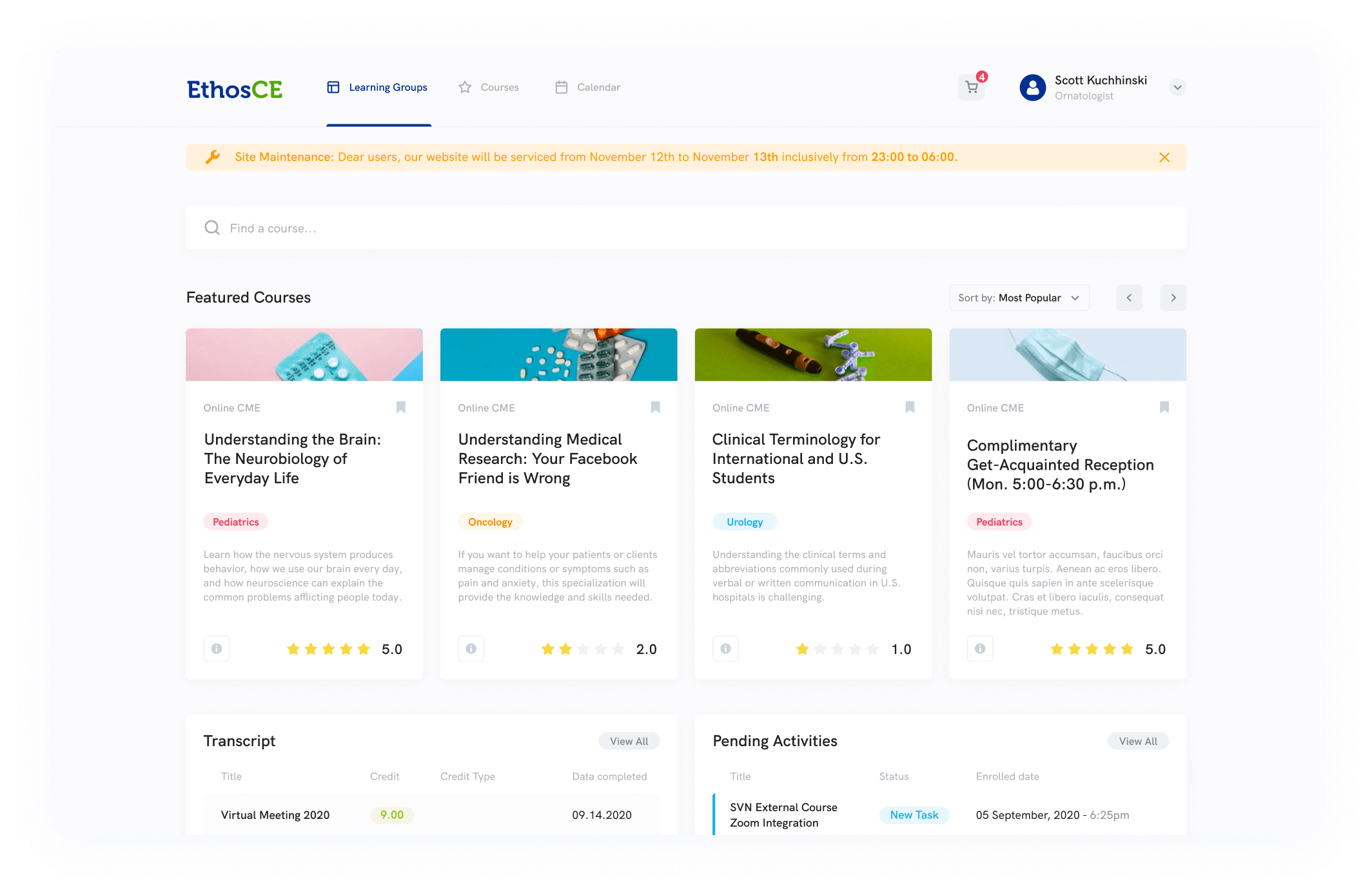
How it works
EthosCE allows a wide range of possibilities as an educational platform. A grade system, feedback from the professors, variety of courses and categories, exams and different types of content. The Universities and hospitals that are partnering with EthosCE have access to branding pages that allow them to promote its courses and institutions.
White Label Design
Platform allows not only to publish but to create a separate customizable page where client can publish content, create newsfeed, and discussions within learning groups. Our design accomplished the goal of branding for each institution to make it unique in colors, but consistent with EthosCE branding.

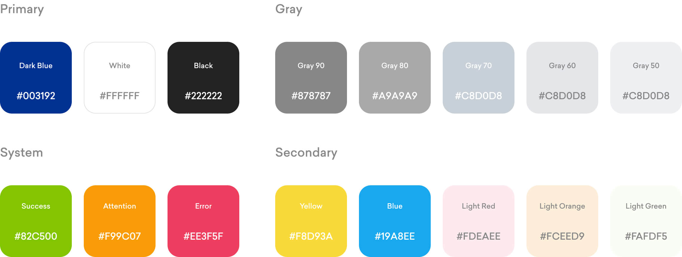
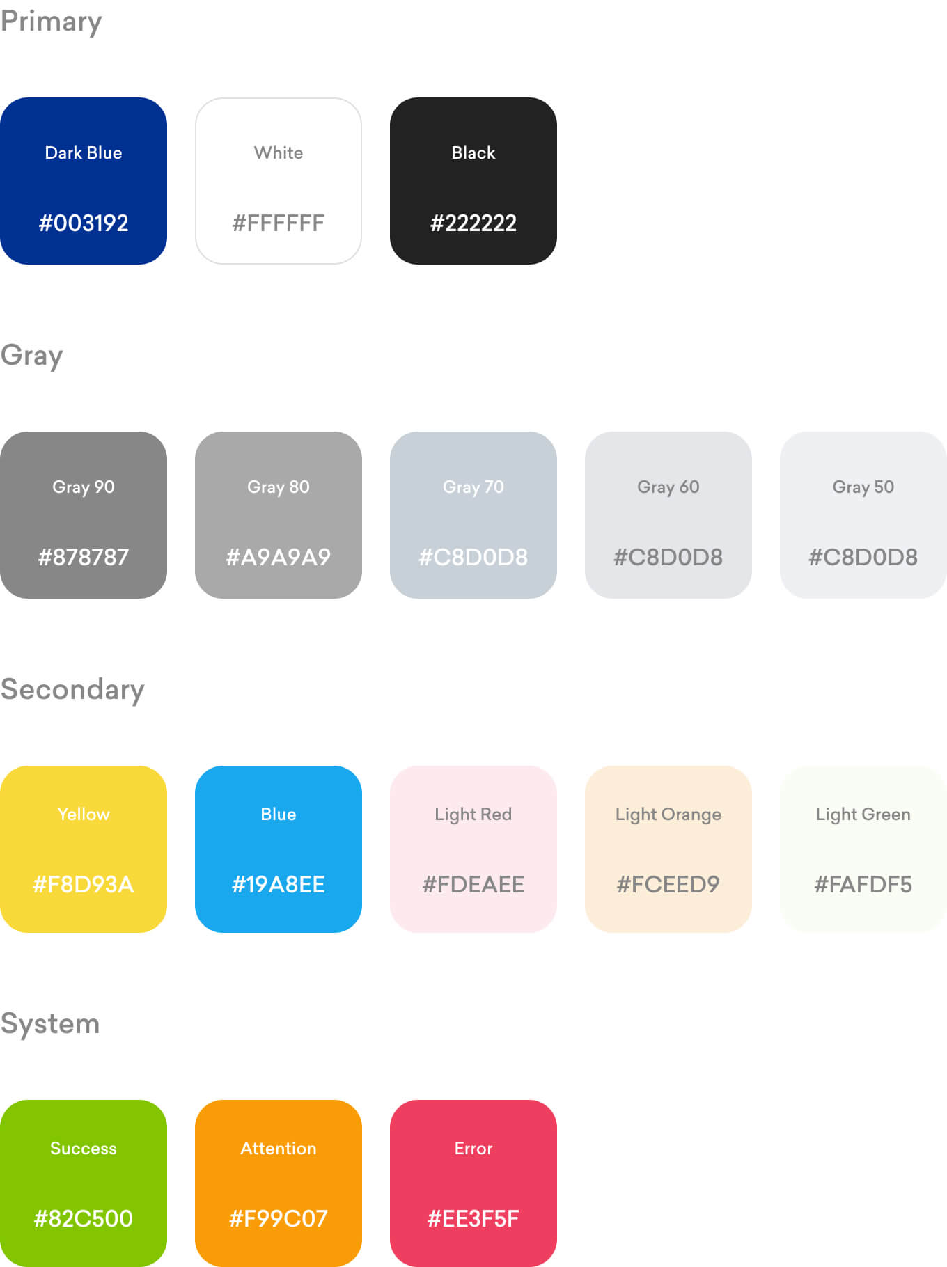
Colors
When choosing the color scheme we were relying on old branding colors since the platform has is recognizable visual structure. We have added additional colors and elements that are adding up to the main ones to complete the picture.

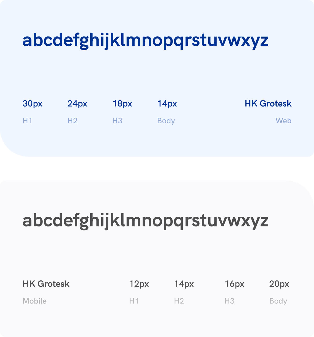
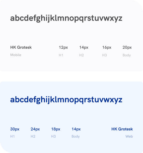
Typography
We used Grotesk family font to underline the simplicity of the EthosCE educational platform. As an addition, the big library of this font allows more freedom in the further development.

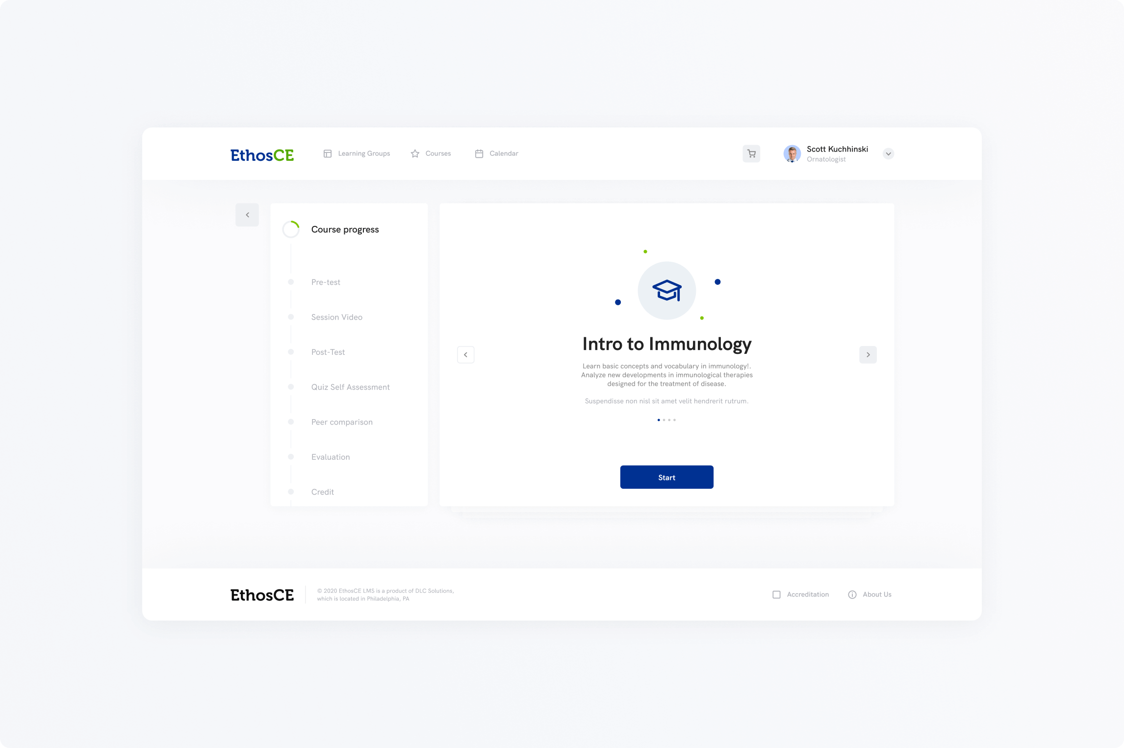
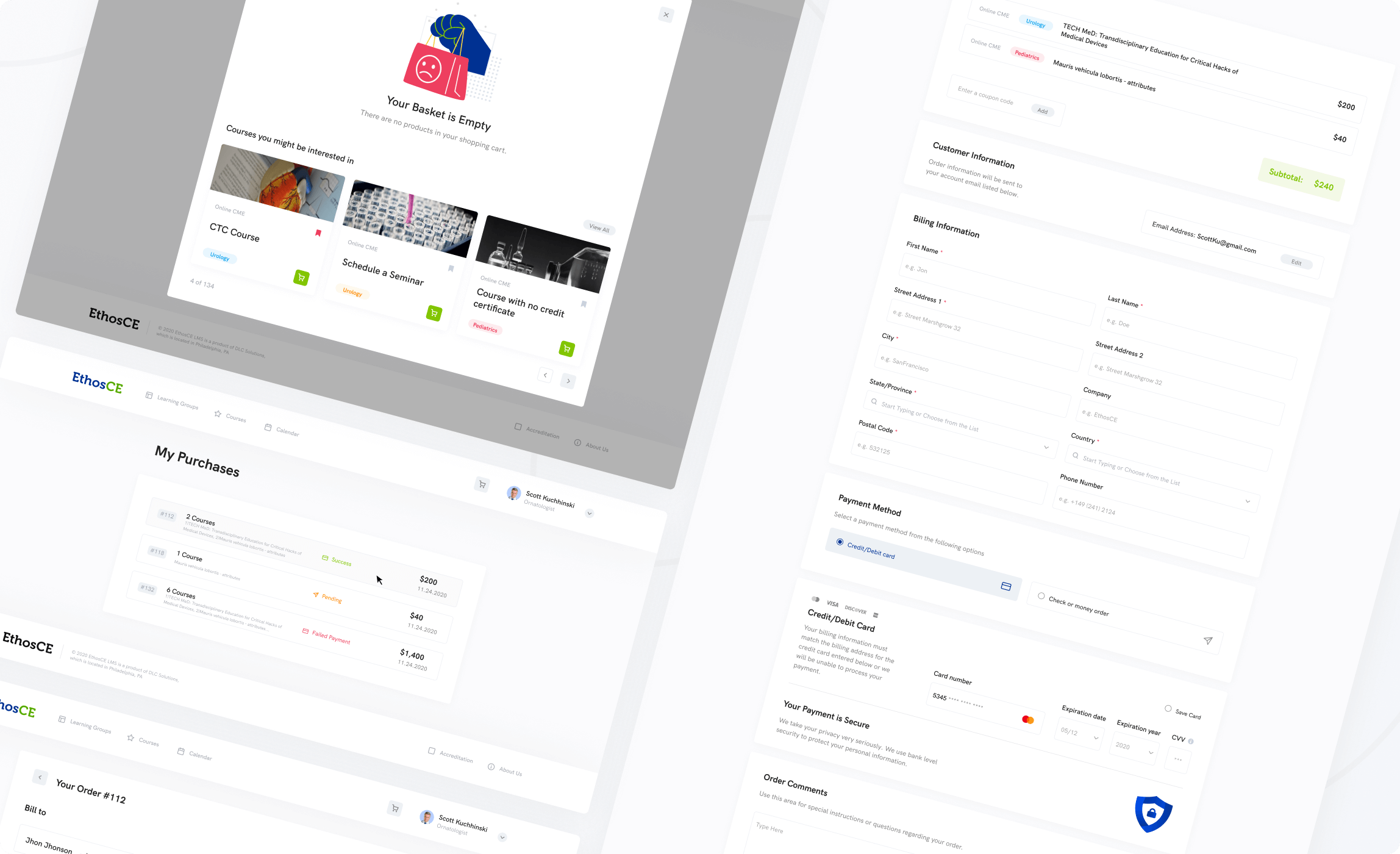
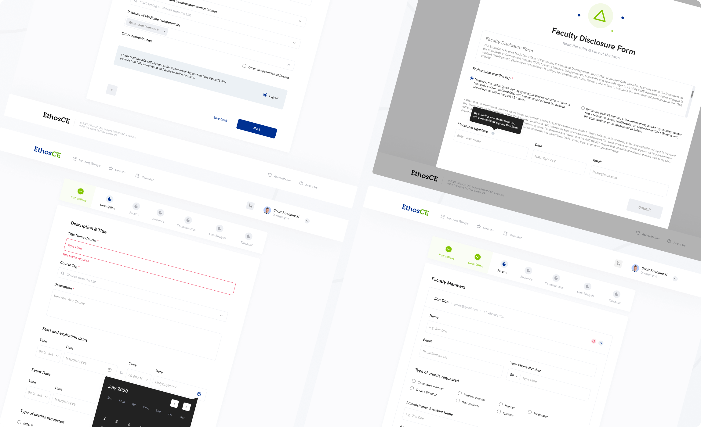
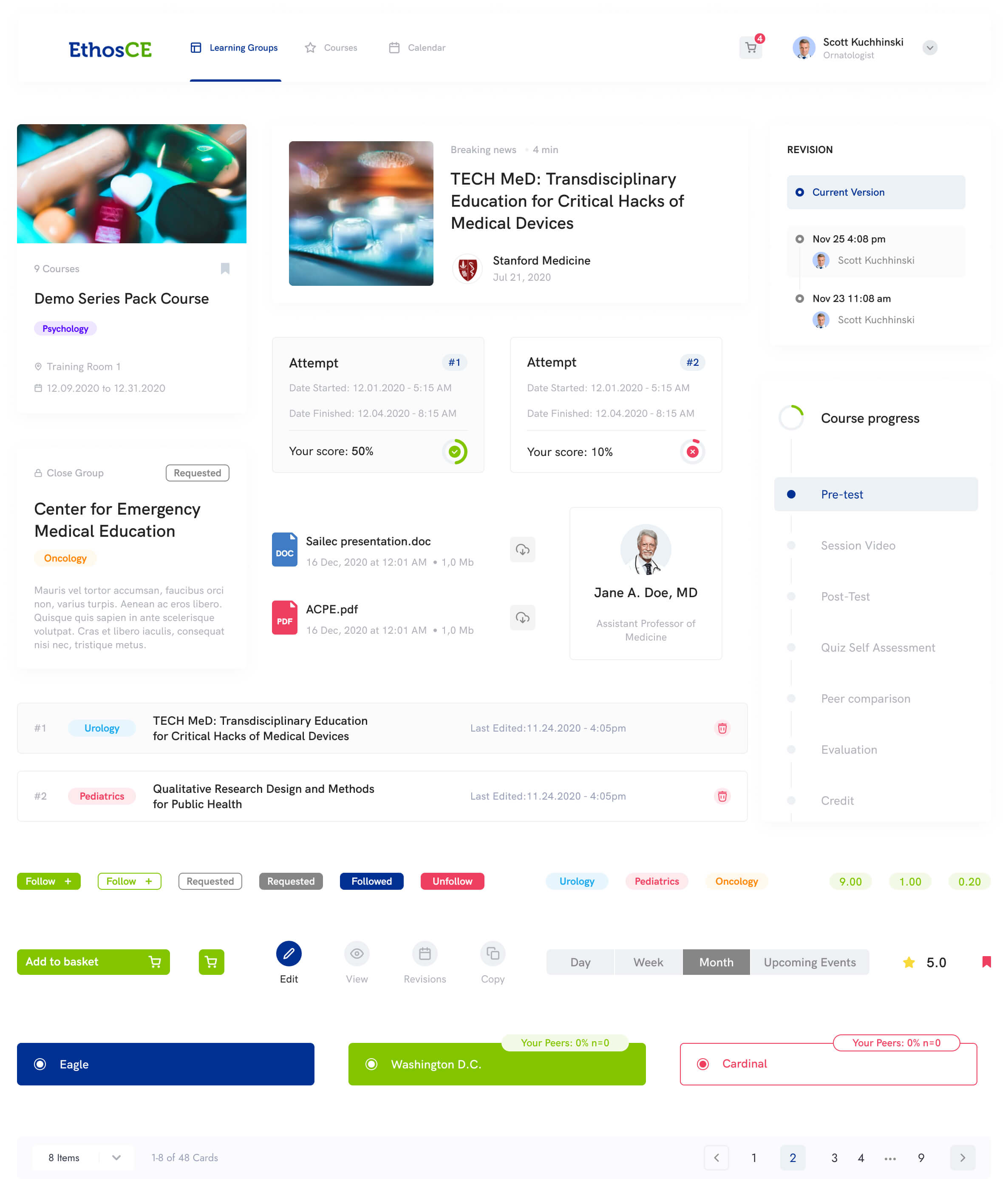
Course Test
By reworking the main flow of the course progress our team successfully tackled the interface that will be comfortable for the user while learning on the different stages of the course structures.
Courses Search
Course search is one of the main pages that allows you to find a suitable course based on your specialty. We have added tag system, filters and search elements that will allow a user to spend less time on finding the right course and get personalized experience.

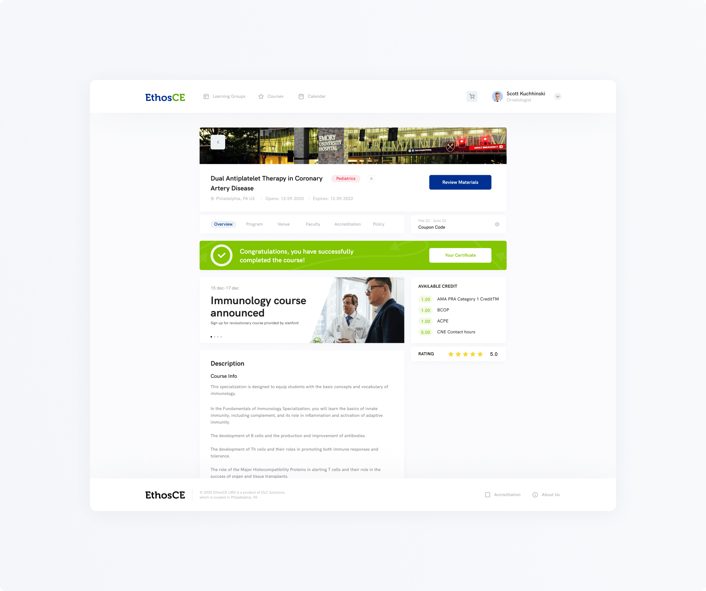
Course Page
Course page was redesigned as well, the emphasis was on the fast intuitive search and all of the main features are on the main page. A potential student can see the files, credits and all other needed information before signing up for the selected course.
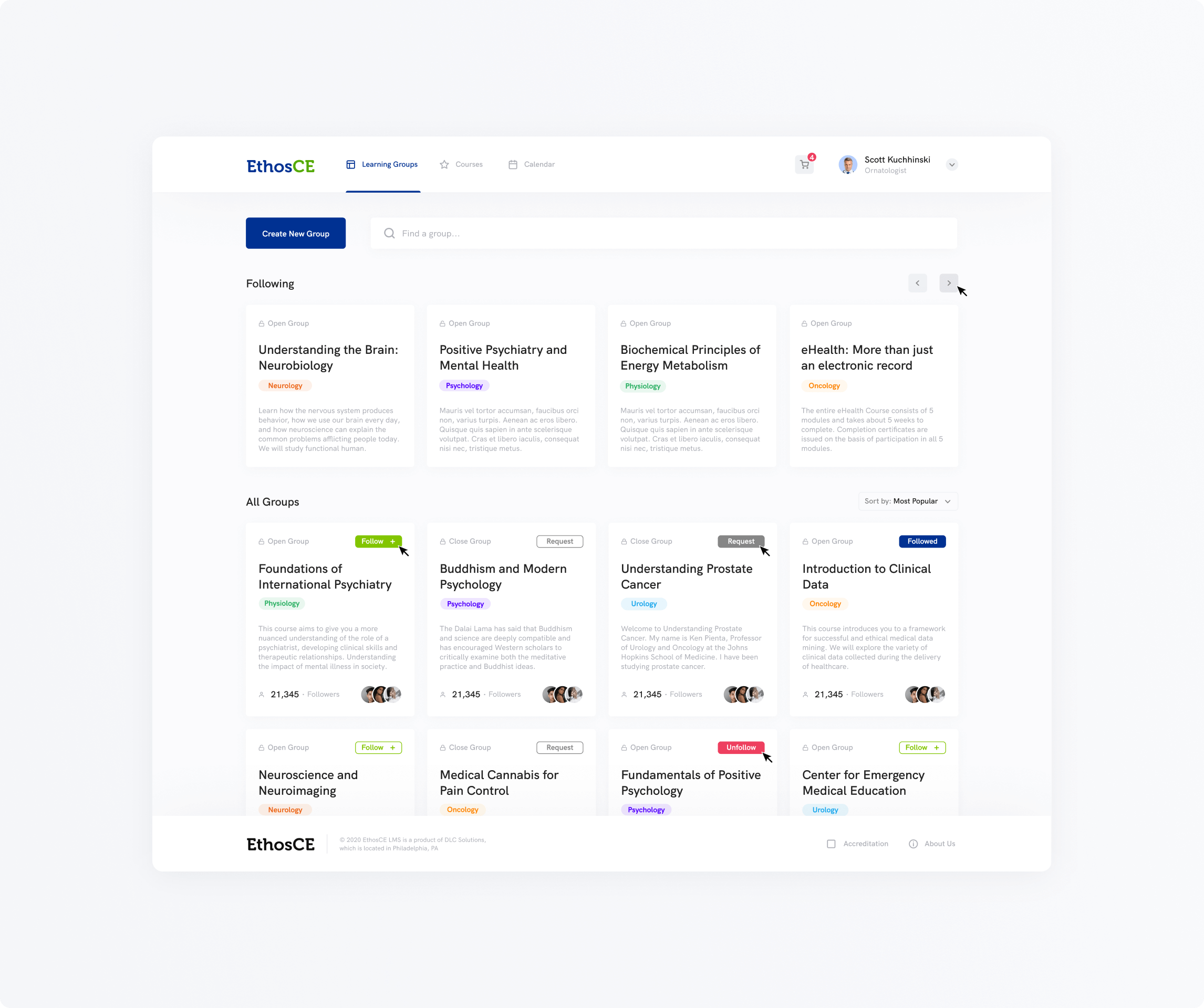
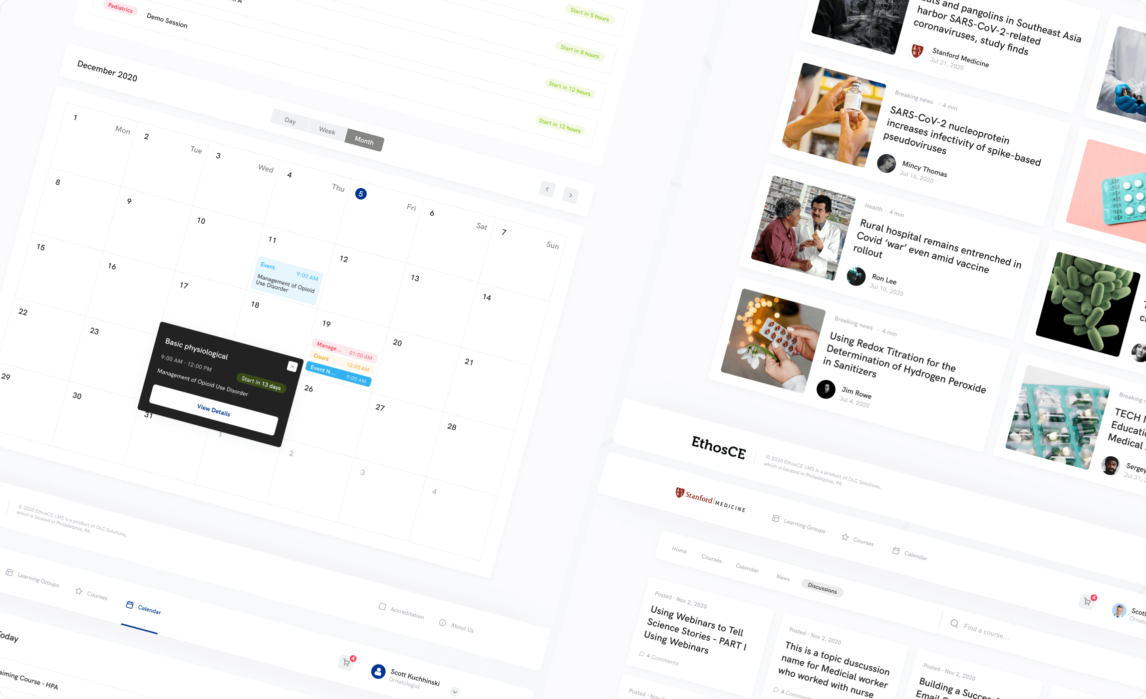
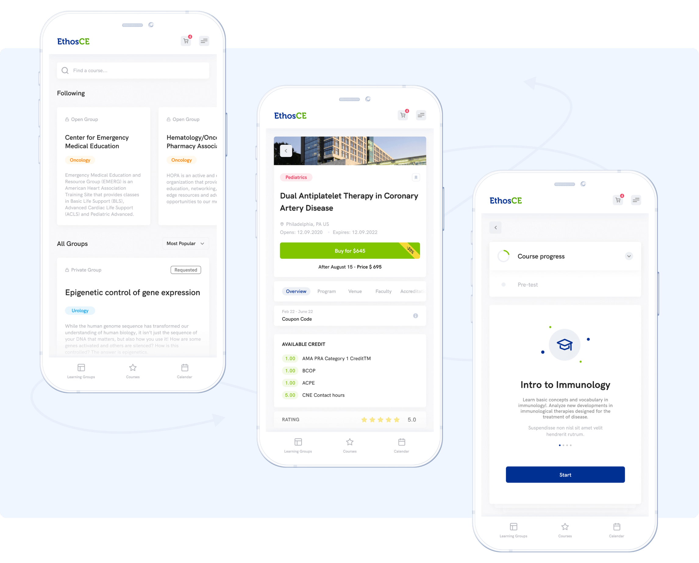
Learning Groups
The focus on the social discovery is very important when it comes to distant learning platforms. Therefore, one of the main features of the platform is a group search where a user can find people by the same interests or ask questions related to their field of study.
Other Relevant Pages
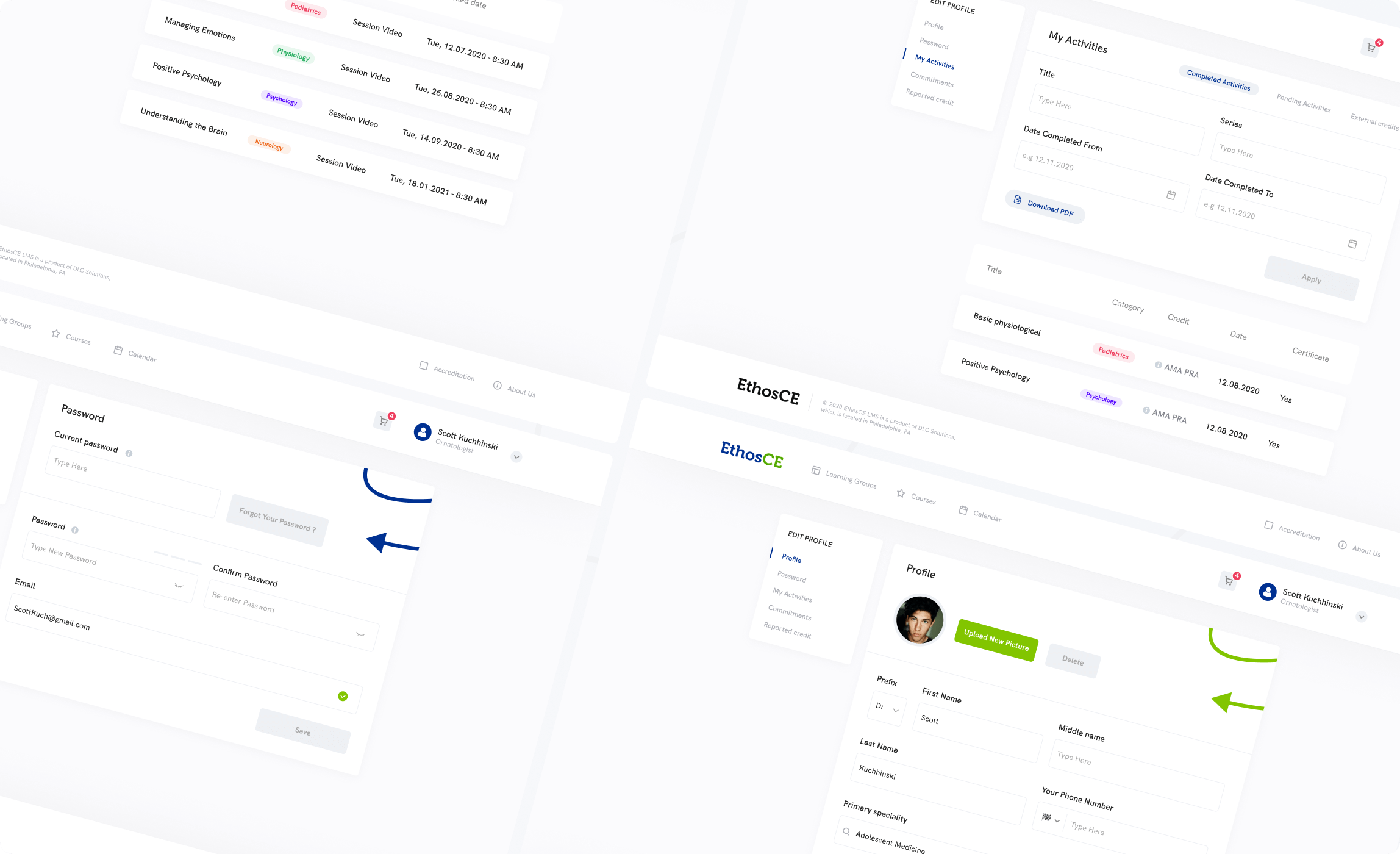
Profile of the user, calendar, newsfeed and the creation of the course were a big chunk of work for us since creating a course is a complex task for potential educators. We’ve made simpler and divided huge sections into progress bar with smaller steps.
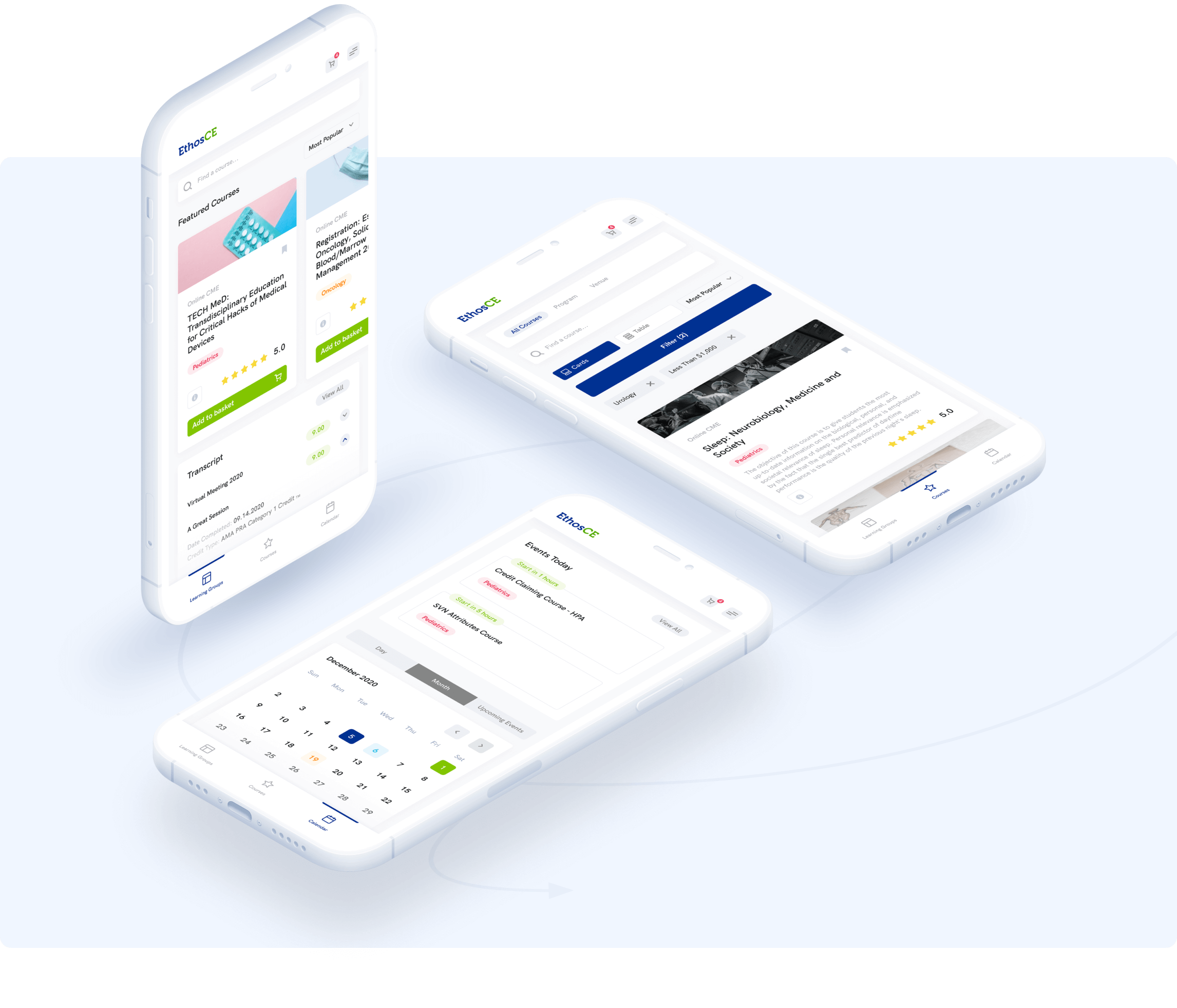
Mobile
Like in any other project we understand the importnace of the mobile web version. With EthosCE case we were able to transform our web experience into mobile with no problem using the best practices and patterns available.
Design system
Additionally, we have created a library of components according to atomic system and style guides to make the process of the development easier and faster. In the future, this will allow us to design additional features even quicker.

Client’s words about work with Glow
Scott Kuchinski
Product Manager, EthosCE
Glow Design Agency handled frontend development for a learning management system company. They provided several UI design options for implementation into the client's web application.
Next case
Platform for parking in airport