Charge your car without
worries
Start scrolling 20,381 px


Client
- JUCR
- Germany
Industry
- Charge App
- Electric Vehicles
- Car rental
Services
- Product Design
- User Experience
- User Interface
Starring
- Stas Kovalsky
- Vyacheslav Ksendzyk
- Olga Levchenko
Challenge
JUCR - fast and convenient access to all charging stations in Europe. Our goal was to design the interface from the very beginning, to do research on what the users need most and to create it inside the application.


Research
In 2020, there were roughly 285,800 public charging stations for electric vehicles in Europe (including Turkey). This figure includes normal chargers up to 22 kilowatts as well as fast charge with over 22 kilowatts. Figures grew consecutively between 2010 and 2020, with prominent increases seen in 2011, 2012, and 2016.

High Fidelity
Wireframes
Our first task was to conduct a research and think about which chips are most needed by users, then, do some tests. Of course, we started with wireframes, created a clickable prototype and went to show the client how his future application would work and protect his search. Thanks to wireframes, we have saved a tremendous amount of time and money.

Colors
Before coming to us, the client had already created his brand book, had the logo, colors and more. We had to use everything that the client already has and keep in mind that this application is audience friendly. It must be comfortable for a young guy who is a digital native and loves bright colors as well as for a woman of age who has poor eyesight and does not often use such products


Typography
As we already said, the client had his own brand book and we must use his colors, font and logo. We also used the Montserrat font that the client had already chosen in advance. It is modern, simple and at the same time stylish.

Profile
Profile is a place where you can see basic information about your activity in the app: how many times you have charged, how much you helped the environment by using the app, add or remove your cars, select coupons and much more.


Smart Notification Center
Do you often sit by your car, waiting for it to charge? We think that instead of waiting on the spot for a couple of hours you can go for a walk, use a coupon that the application gives you and wait for the notification when your car gets fully charged, also you can receive other useful notifications.
Statistics Animation
Are you concerned with deforestation? Maybe your carbon footprint bothers you. Don’t worry, we’ll give you a clear metric of how much carbon you saved. If it was not for you, all this carbon could have done so much damage to our planet, good job!

Charging Process
Simplicity is one of our core values and we tried to reflect it here as well. The visualization of the Charging Process is simple and understandable. As a bonus, you are offered various coupons to make your waiting time more pleasant. And you don't have to check the charging screen all the time.

My Coupons
We have mentioned coupons a couple times, but what are they? JUCR cares about you and don't want for you to get bored. That's why they gift you with special offers near your location while your car is charging. In winter a Warm starbucks coffee is waiting for you.

Charger Animation
Micro-attractions may sound complicated and superfluous, but we disagree. All the small thing combined make the user experience better, they evoke positive emotions in users and helps them remember you and come back to your product. They must always be sure of what will happen if they click here or there.

Occupied Animation
What if you arrive and the station is busy? Happens from time to time, right? We’ve heard you and solved this problem. As always, the coolest decisions lie on the surface and come to mind at the very last moment. What if you could get a notification when the station gets free and drive there without having to wait in line? Cool and simple, isn't it?
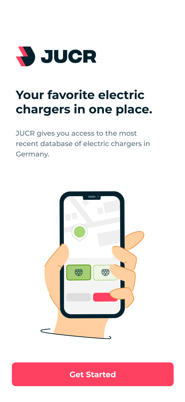
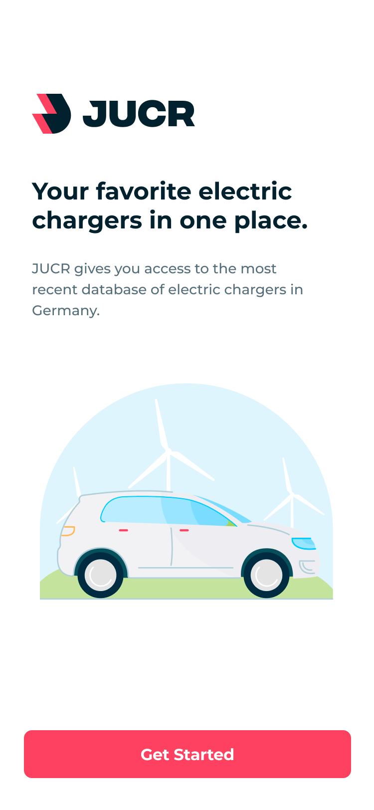
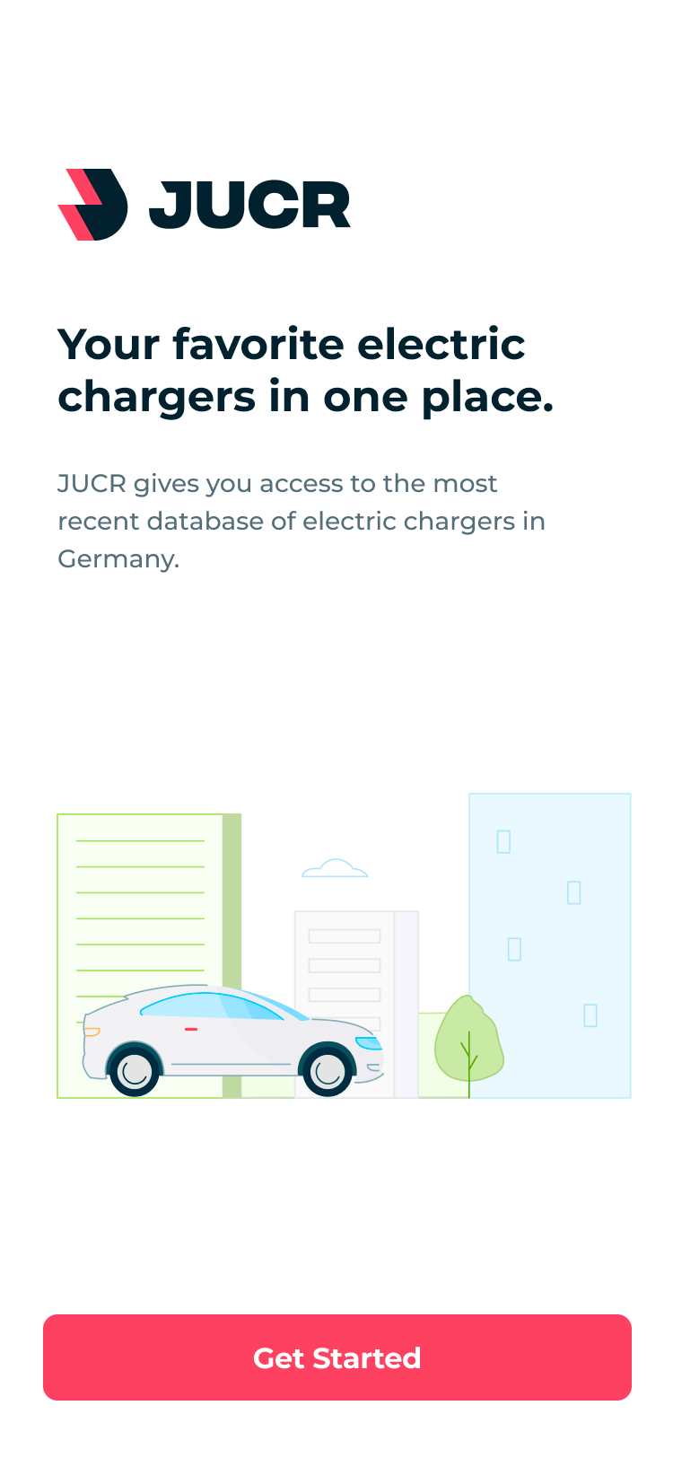
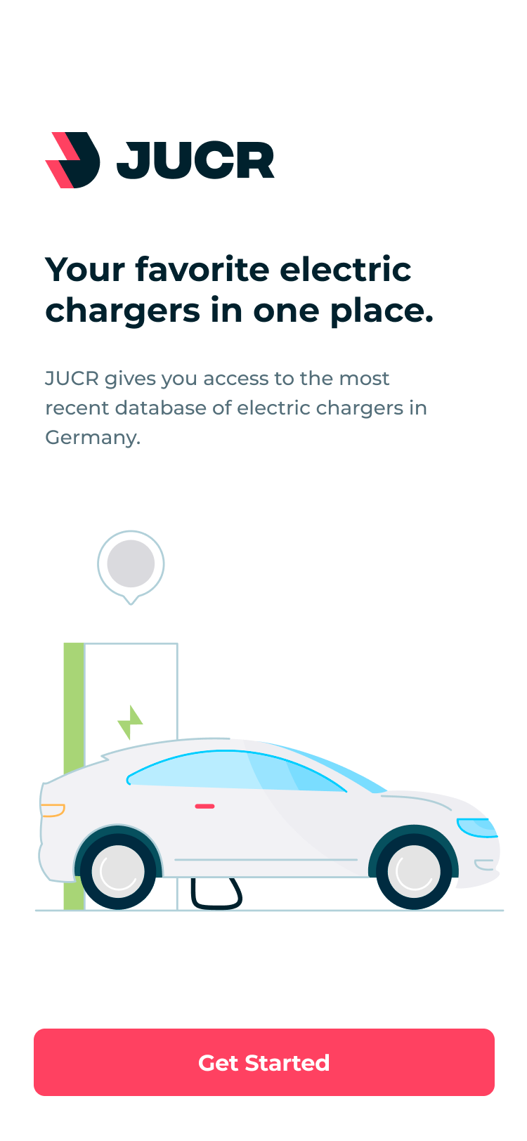
Onboarding Animation
The learning process is just as important as anything else, you may find the application pretty simple, but the user may still need an introduction to it. For all audiences, the best way is illustration and animation, any person, of any age, will understand what is happening here and will never close your application without trying it.
Design System
You believe that you don't need a design system? Let us present you the counter point: Using design systems saves you a lot of time and money right away but they also help you save resources in the future. Not only that, but such system will speed up the development process of new chips and screens for your product. We develop a design system for all of our products.

Next case
FleetChaser: efficient fleet management platform