CryptoGenie is a tool for predicting
the relevant trends
of various crypto assets
Start scrolling21,595 px
Client
- CryptoGenie
- UAE
Industry
- Artificial Intelligence
- Blockchain
Services
- Product Design
- User Experience
- User Interface
Starring
- Artem Kovalenko
- Dmitry Zelenko
- Olga Levchenko
CryptoGenie
CryptoGenie is a brand new trend-predicting tool for cryptocurrency. Our team’s goal was to create the whole design from scratch, having only the idea and inspiration. So, we’ve conducted a research to discover industry tendencies and base our design on them.
Landing Page
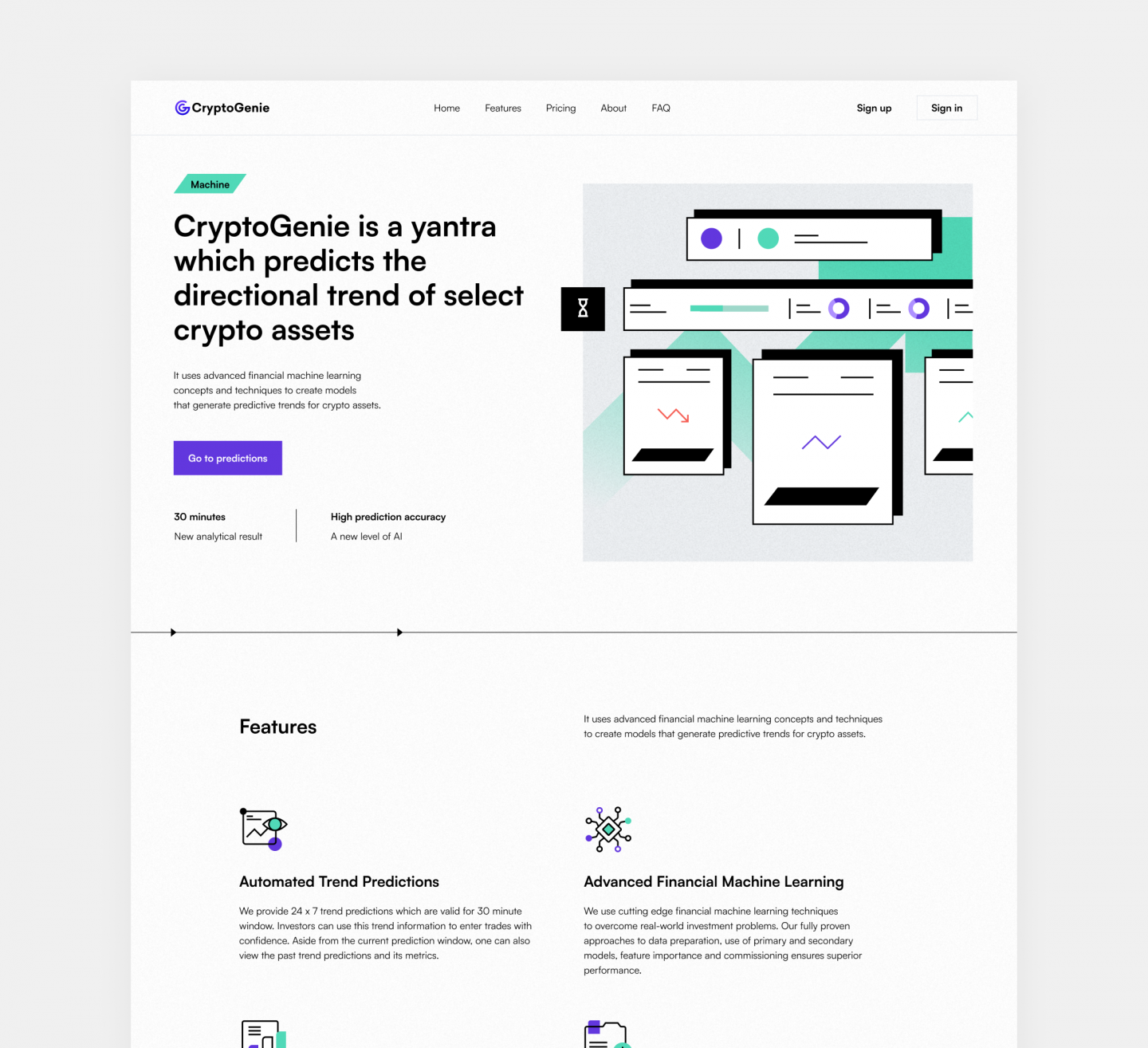
CryptoGenie’s landing page contains all the relevant info on how the product actually works. A number of highlighted features make it unique among competitors.
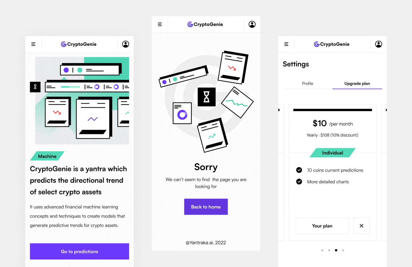
Given that a big number of users prefer browsing via smartphone, we also designed a mobile version for all of the functional screens.
Platform
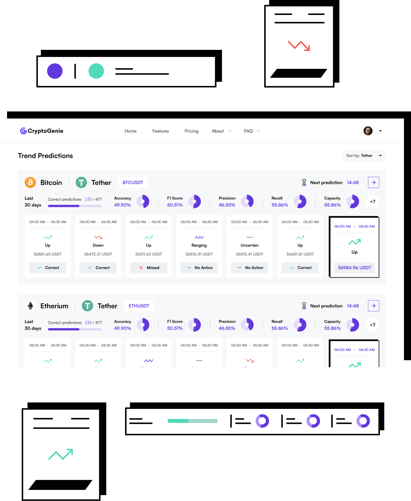
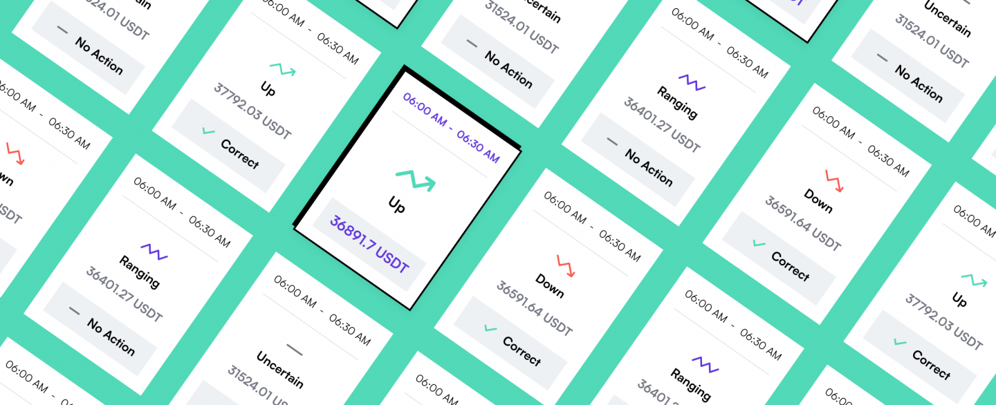
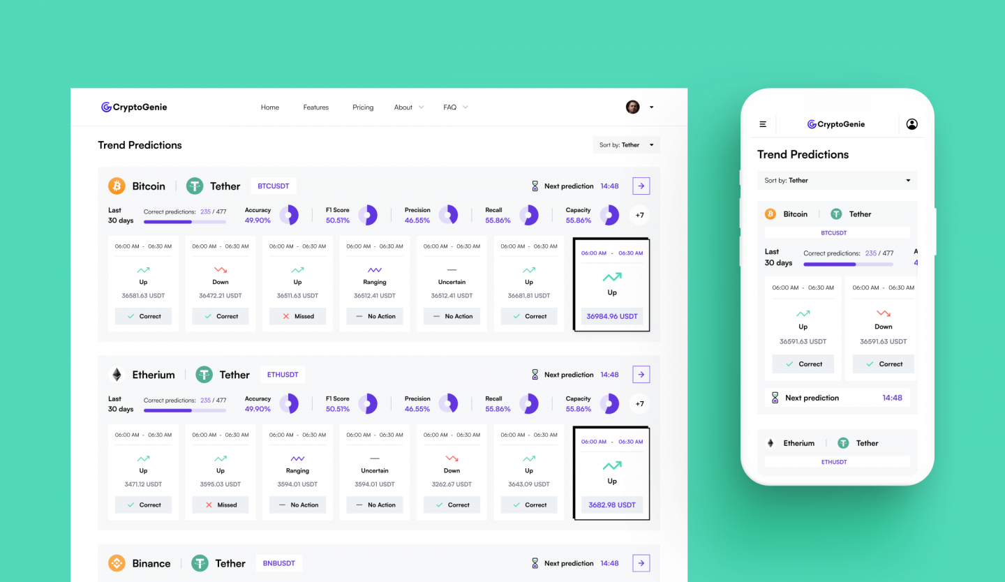
The platform itself contains a number of cards, one per each crypto asset. They show the direction the price of the asset is going.
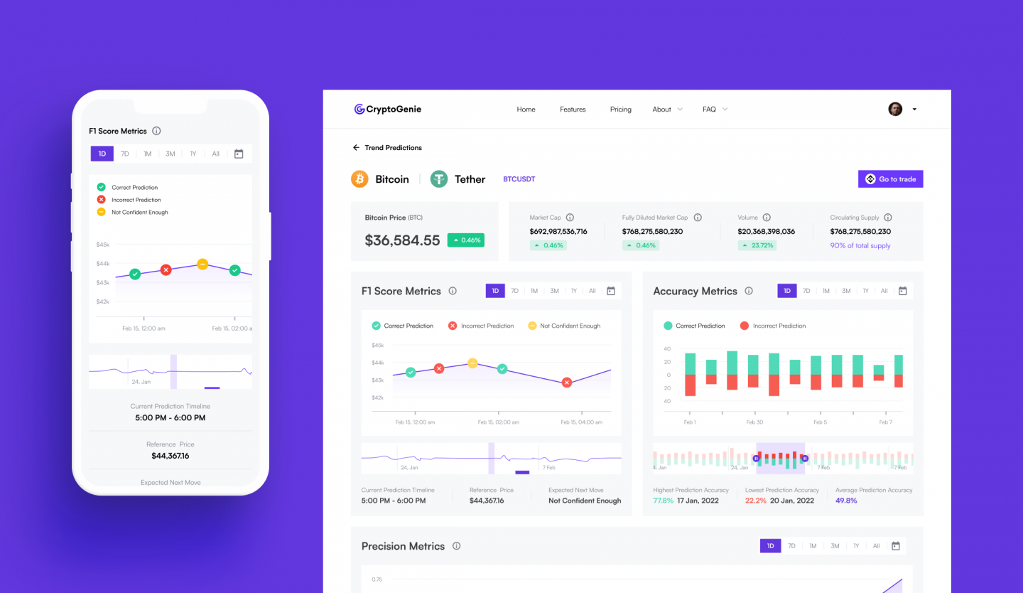
Each asset also has a full page with a number of metrics based on the available info.
Charts & Stats
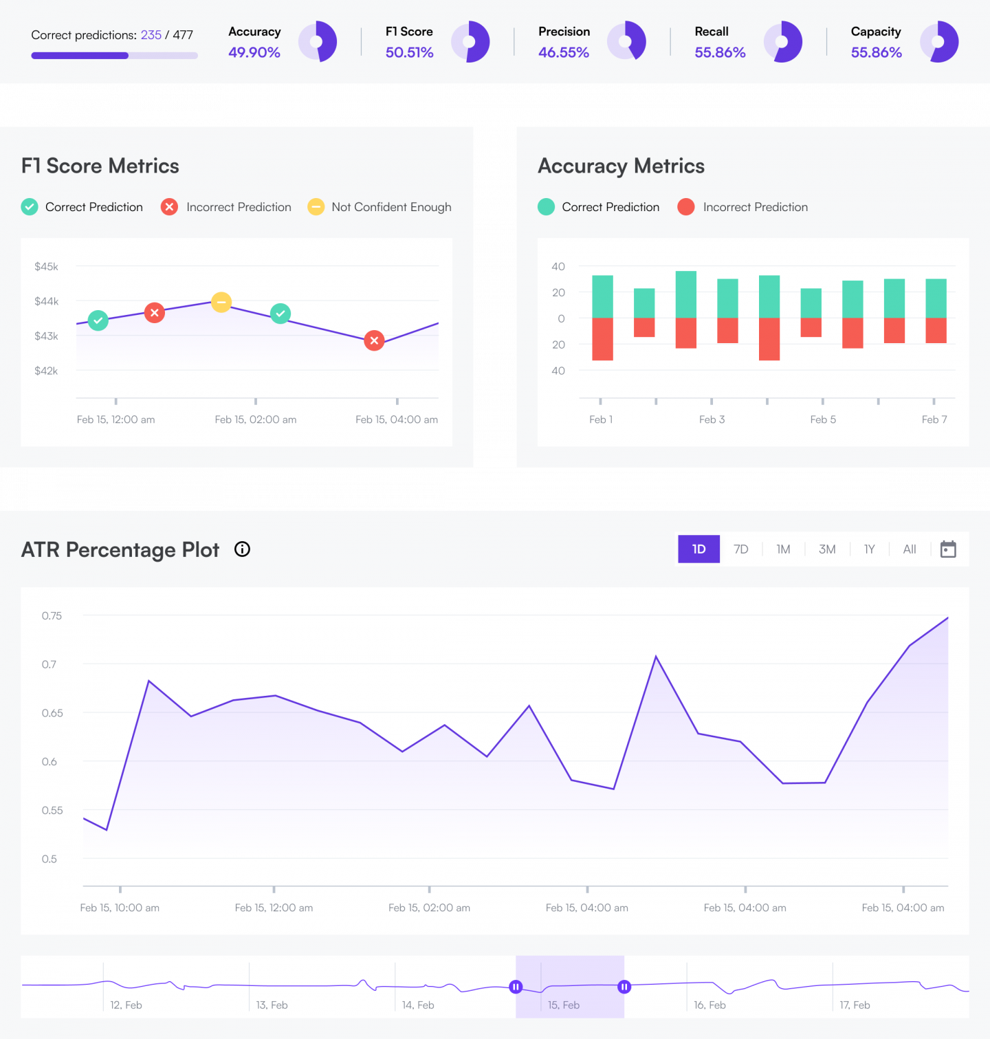
Per client’s request, we also developed layouts representing various kinds of product metrics.
Depending on the information type, there are different kinds of charts and diagrams as shown below.
One AI to rule them all
The logo represents a combination of C and G from CryptoGenie. It shows the unity between the AI and the user in a form of a Genie. The Genie is the one doing the predictions and showing you the relevant charts.
The logo is built using 2 circles, a 54 corner, and a horizontal line. All of these elements form identity patterns.
Isn't it nice?
Below is the full size logo with according proportions. X is the distance between the logo itself and the company name next to it. Also X equals the safe distance around the logo.
The two-color logo is only used on White and White Smoke background.
Do it like this...
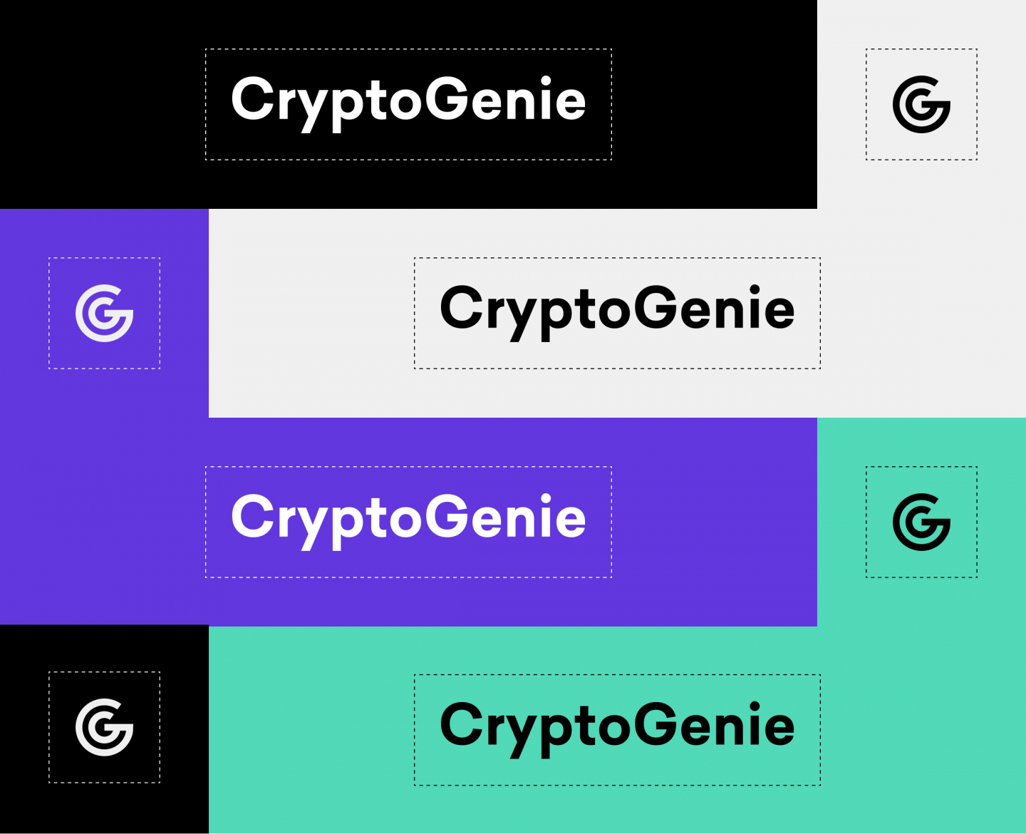
This is the monochrome version of the logo. There are pairs of main accents (Purple Heart) and primary colors (Shamrock). It is not advised to use secondary colors for the logo on all backgrounds. White Smoke and White are similar so they are interchangeable.
Only the monochrome logo with the most contrast primary color (Purple Heart) must be used on photos.
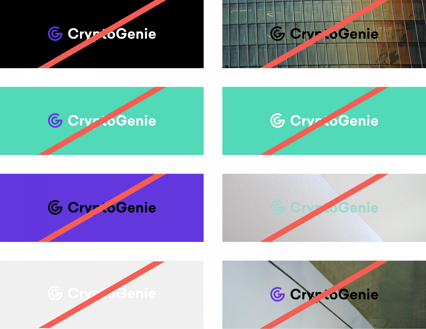
... but never like this!
These are samples of a wrong logo use.
Multiple Cases
The logo and the company name can be used separately if needed. The safe distance rule is the same as for the logo itself. The color rules are the same as applied to the monochrome logo.
Colors
Upon conducting our research on the relevant products
Typography
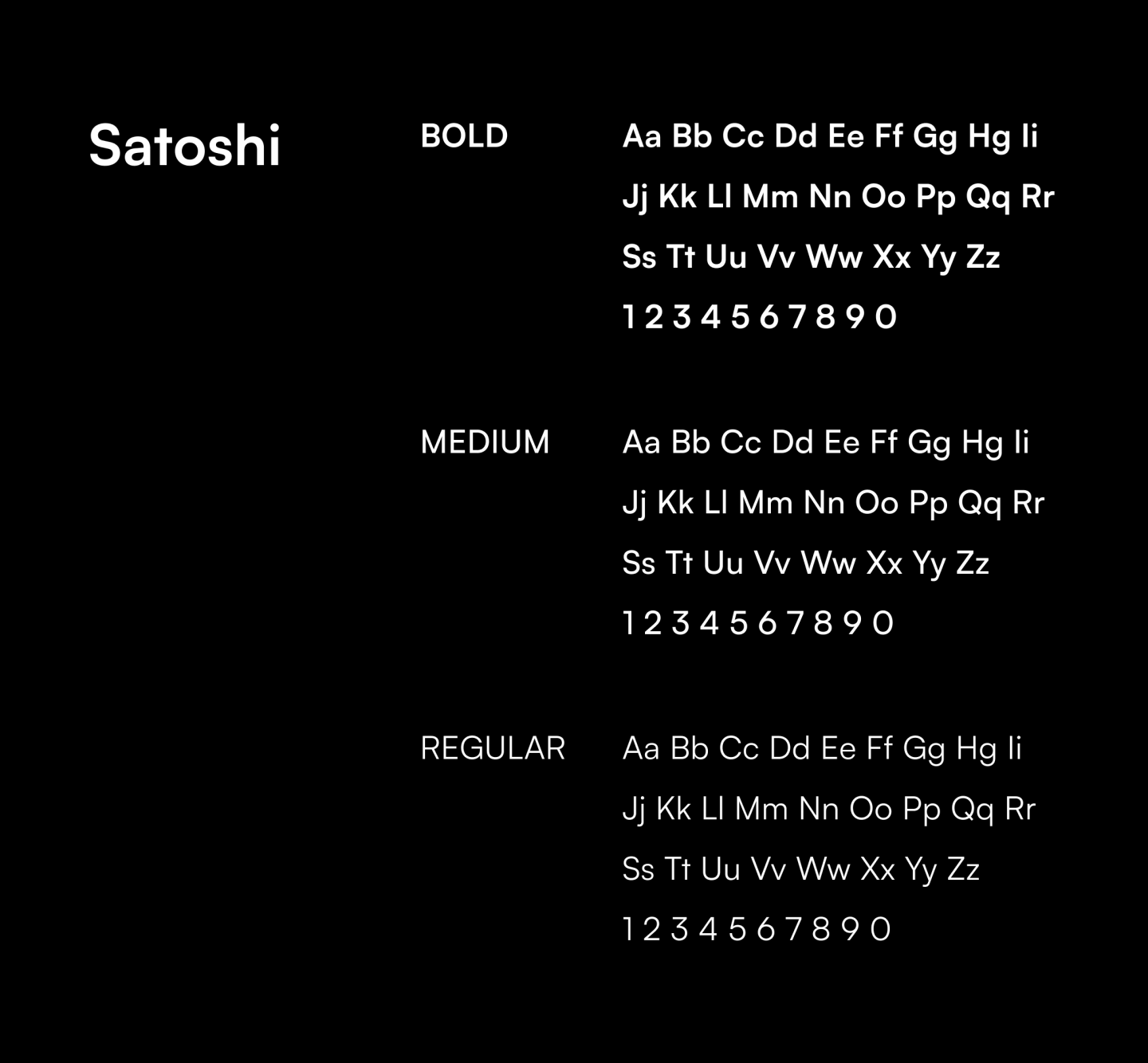
Satoshi is a modernist sans serif typeface. Its design combines typically grotesque-style letterforms with some characters that are quite geometrically designed. In terms of its appearance, Satoshi was inspired by Modernism and Industrial-Era graphic and typographic design.
Business Card
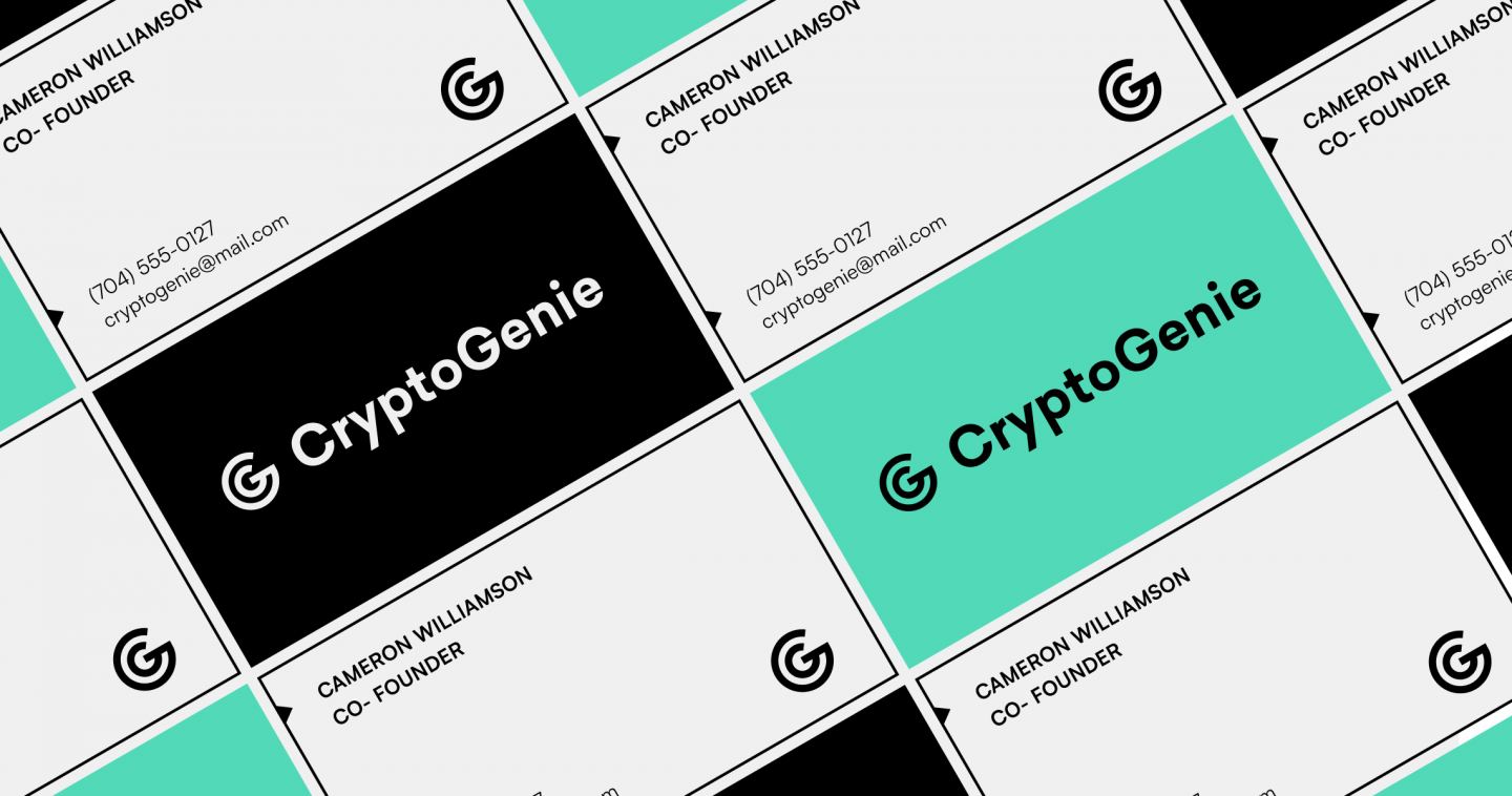
Here is how the business cards might look like.
Graphic Elements
Some elements, including circles, lines, and triangles, can be used as part of identity in the design.
Here are some examples of icon style. They show the use of simple shapes, 2.5px lines, and identity accent colors.

Next case
FleetChaser: efficient fleet management platform