LiquidSpace
- workspace
rental service
We balance business
objectives with customer needs
objectives with customer needs
User Experience
UX Audit
Research
Wireframe
Prototype
Visual
Design
Design
Art Direction
Visual Identity
Motion Design
Digital
Branding
Branding
Product Identity System
Naming
Logo
Motion Design
Challenge
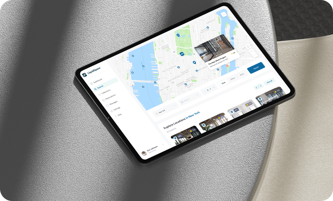
Our team’s goal was to create an user-friendly office rental service which would help everyone to find and book a workspace in a couple of clicks.
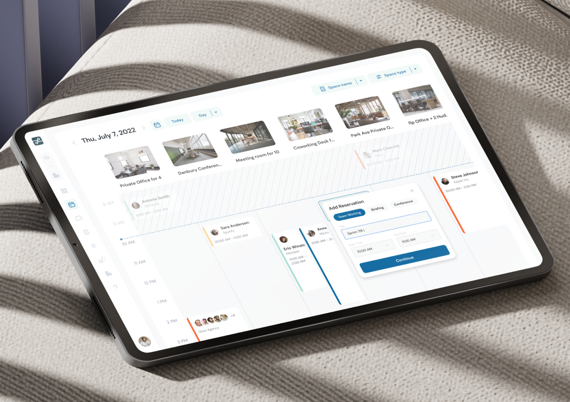
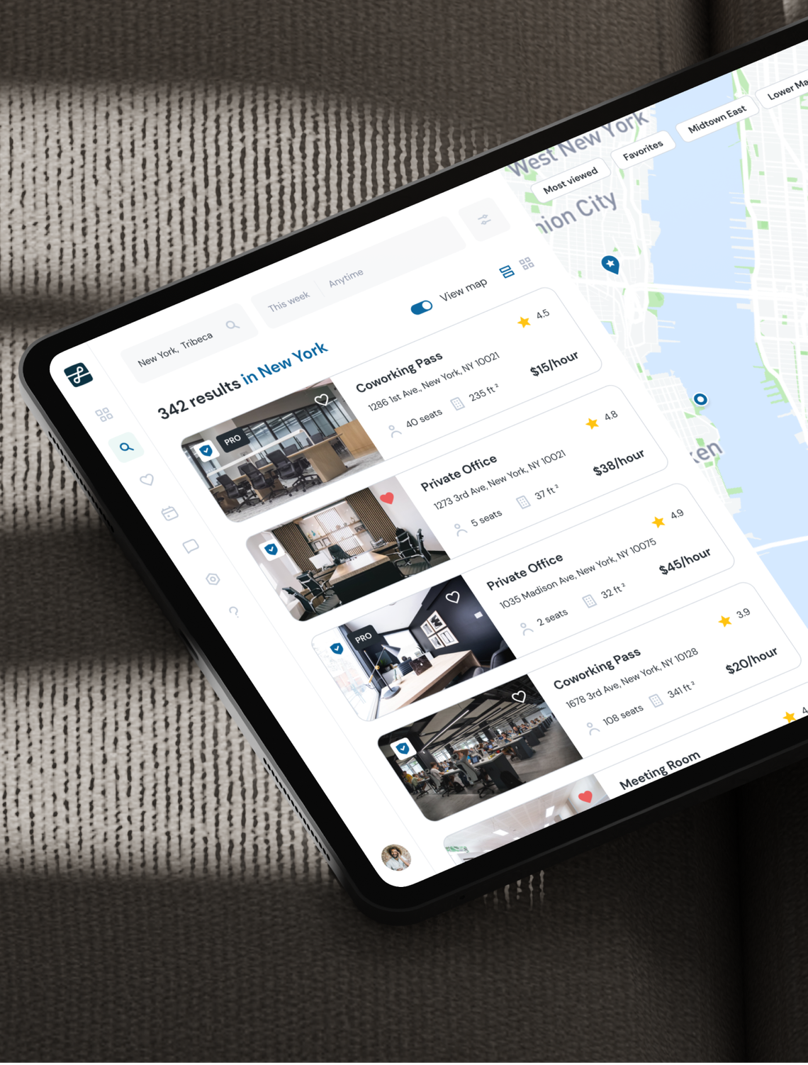
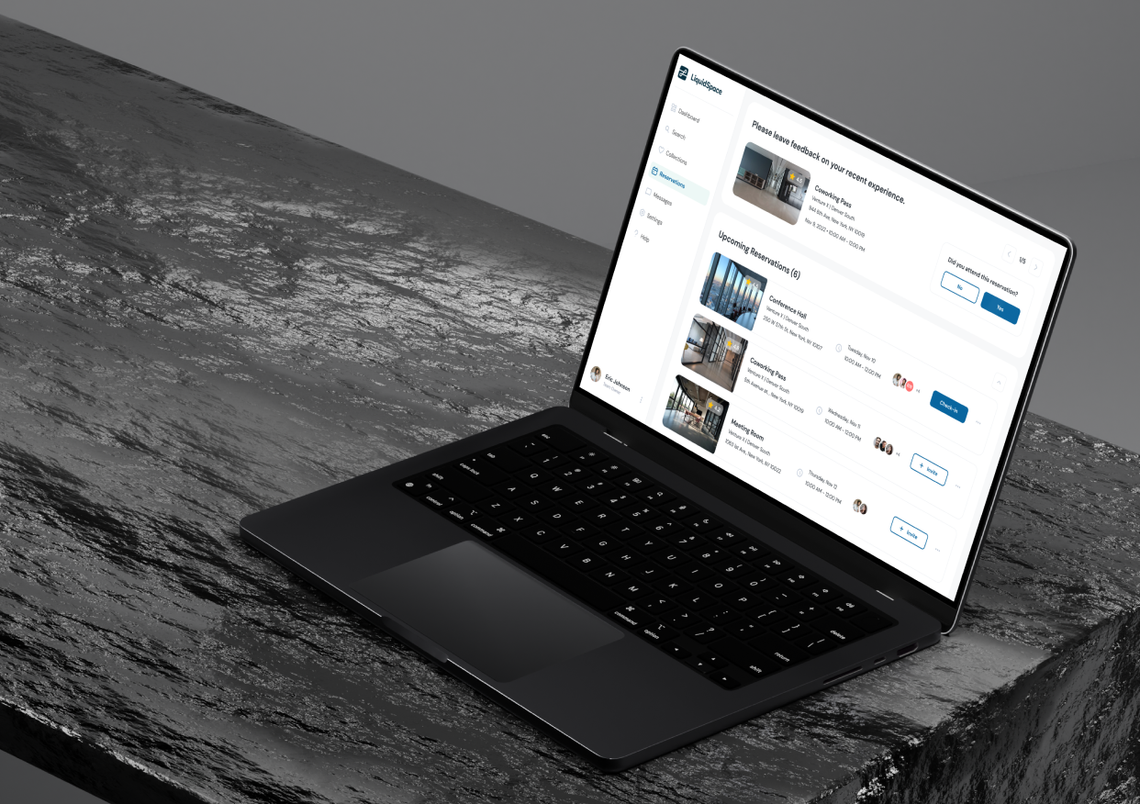

All work on the project was
divided into several parts:
divided into several parts:
User Flow
Research
Research
UX
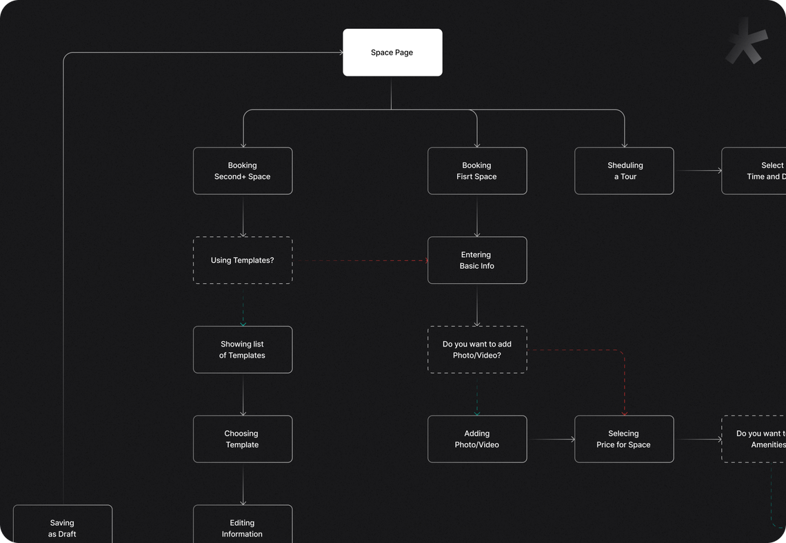
In order to look at the interactions from user’s point of view we used User Flo, this resulted in a logical and convenient product.
Customer
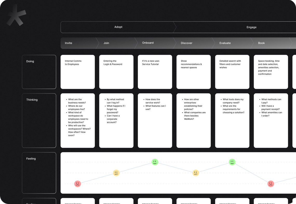
Journey Map
Journey Map
UX
We place a great deal of importance on the marketing strategy built via CJM. This allowed seeing the product from a bird’s-eye view and identifying its problems.
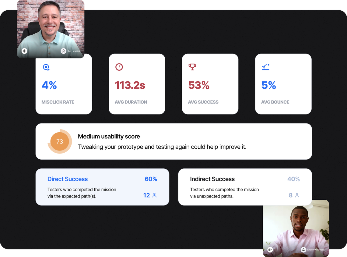
Usability Testing
by Maze
by Maze
UX
To confirm the hypotheses and test the convenience of the service, we used quantitative research, among which was usability testing.
Colors
When we were looking at the color palette for the future service, we took combinations of shades of blue (reliability and trust) and white (simplicity and perfection).

Deep Sea
#00293A

Ocean Blue
#00609C

Arctic Blue 20%
#A1DED2

Secondary / Label
#ADB5C7

Base
#F7F8F9

Outline
#EBEEF2
Design
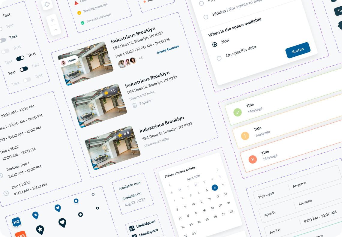
System
System
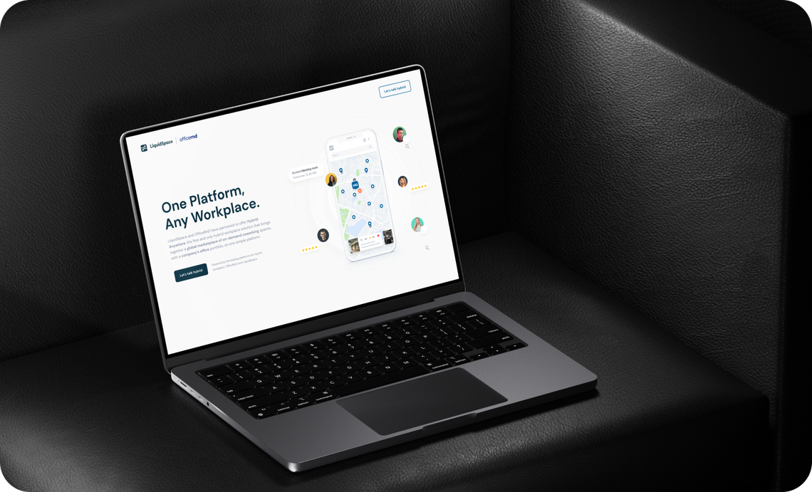
In order to speed up the process and reduce the cost of development of new versions of the product, we have created a design system, thanks to which the interfaces are designed logically and decorated in the same style.
Graphic
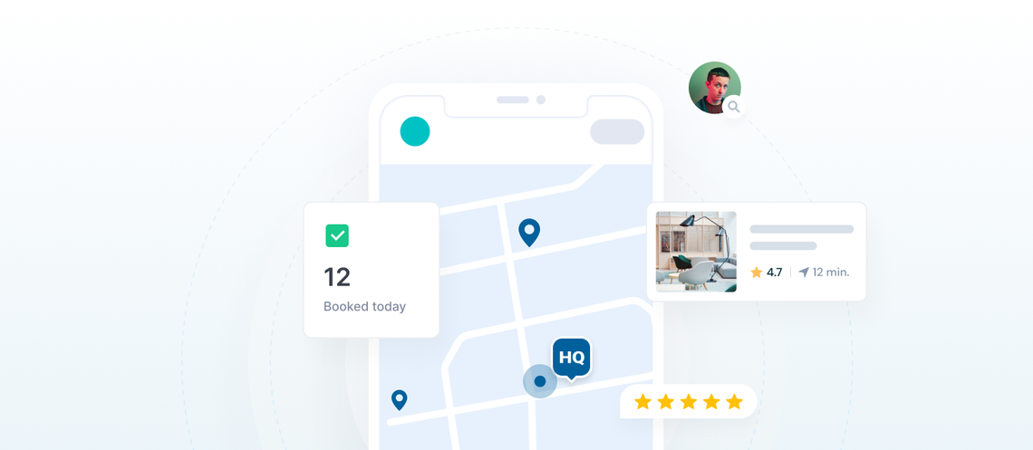
Elements
Elements
In order to increase the user’s interest and diversify the content, we have created a number of illustrations that are used everywhere: from personal page to emails.


Feature
refinement
refinement
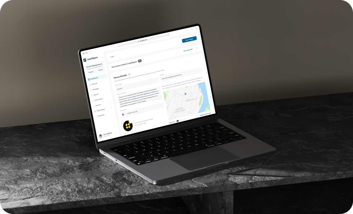
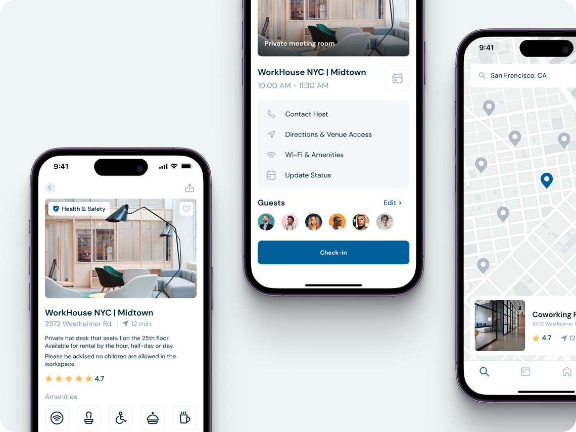
Our team worked on improving the usability of existing features and making the user experience as convenient as possible.
Mobile
Version
Version
Our team worked on improving the usability of existing features and making the user experience as convenient as possible.
Results
We are committed to the efficiency of the developed product and are always invested in it going into the world and changing it for the better. Needless to say, we are always professional and positive in our communications and feedback gathering.

Eric Zellhart
VP of Product at LiquidSpace
Review
Glow Design is very receptive to feedback and process improvements so the client has been able to work effectively and effectively. They are also great communicators and provide good suggestions for improvement.
Next case
FleetChaser: efficient fleet management platform
Explore
