Platform for parking in airport
Start Scrolling 20180px
Client
- Parking Systems
Industry
- Parking
Services
- User Experience
- User Interface
Deliverables
- Web Platform
- Mobile Version
- UI Kit
Challenge
Our goal was to develop a platform that will automatize the parking routine. It is possible with the help of a device that would show which parking spaces are free and which are occupied. At the beginning of our work we faced the following problems:
- Manual management is very troublesome since many people use the system every day.
- People should be able to navigate the parking scheme easily but it is very complex.
- It is hard to control a large number of devices manually.
We’ve built a simple plan:
- Research the parking industry to find other problems and brainstorm solutions to them.
- Create wireframes to quickly test ideas before working on pixel-perfect design.
- Create design system to speed up development of new features
- Align our understanding of the product through several Discovery Sessions
- Fill and review strategic canvases; review and confirm them with stakeholders
- Deliver their visual identity, and continue to iterate on product enhancements with Parking Systems
Research
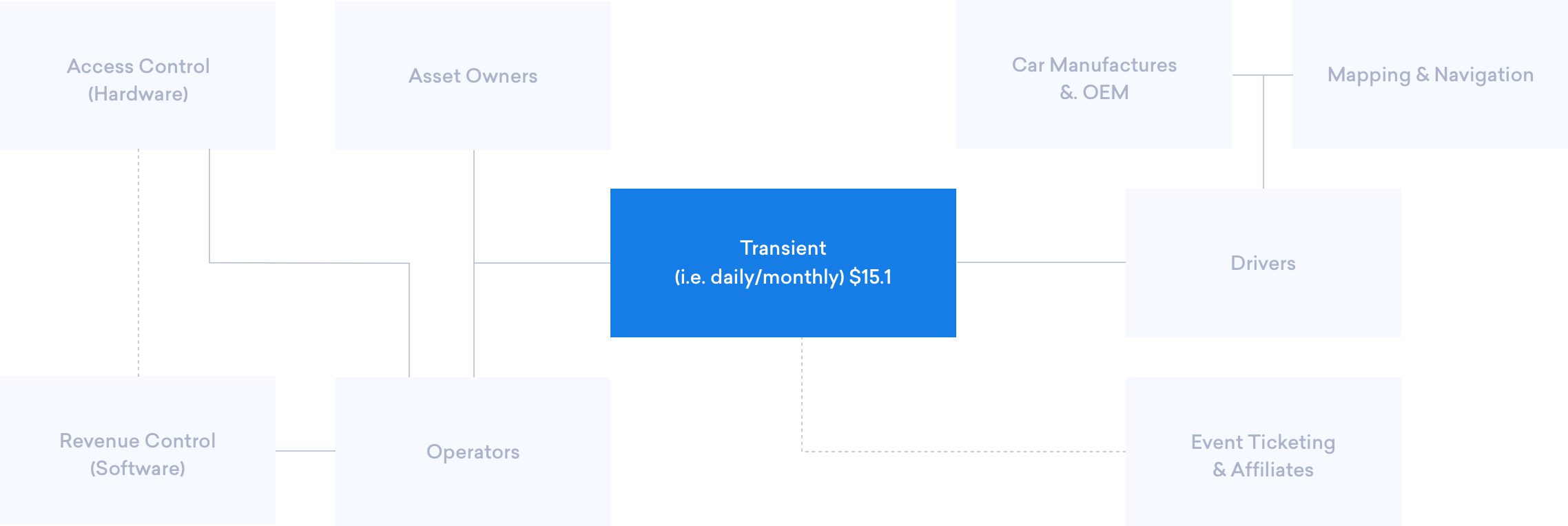
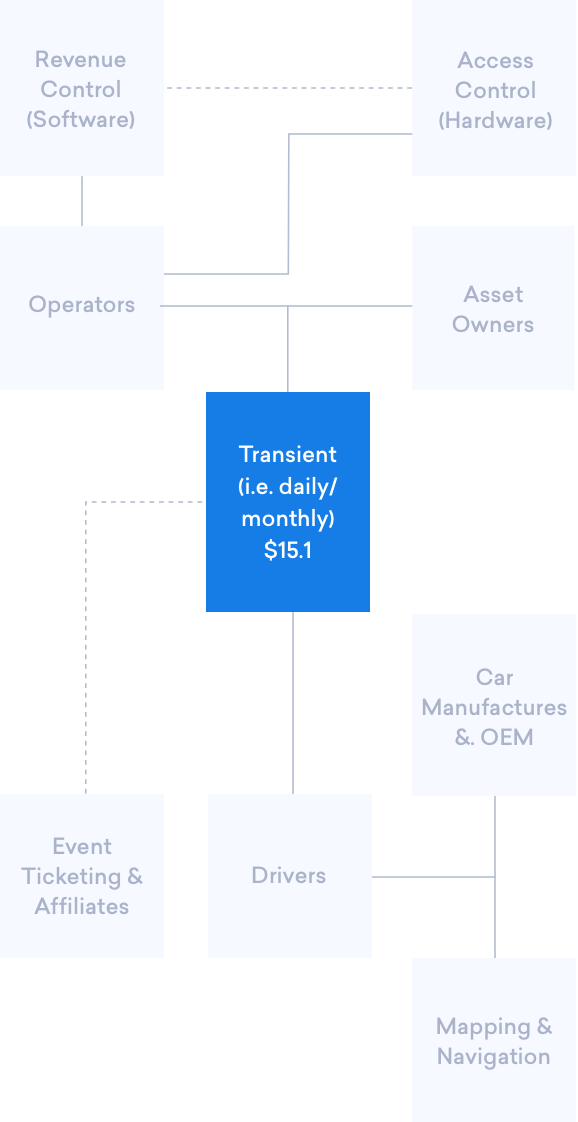
Not so long ago, parking had nothing to do with innovations. It is easy to understand since the parking industry remained unchanged for many years. It is divided into two segments: on-street parking (i.e. parking meters) and off-street parking (i.e. surface lots and garages).
$11bn
Total Revenue in 2019
19 745
Number of Businesses
3.3%
Annual Growth 2014-2019
156 322
Industry Employment

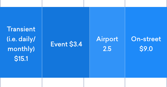 Revenue in Billions
Wireframes
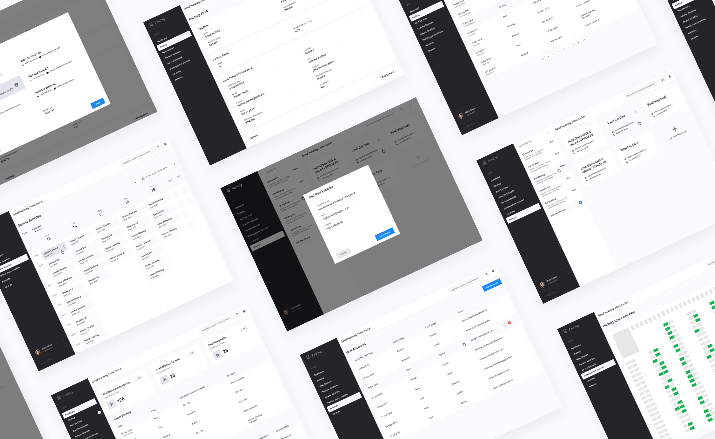
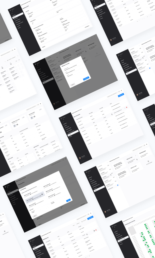
We have prepared a set of wireframes to demonstrate our potential users the basic functionality of the system. We began by defining the structure and information architecture. This usually allows saving a lot of time before moving to pixel-perfect design at the initial stage.
Colours
We have chosen a light and soft color scheme to make the interface look airy. It looks good not only on PC but also on tablets. Blue is used as the main color for highlights and calls to action. As for the backgrounds, we used lighter versions of the main colors.

Typography
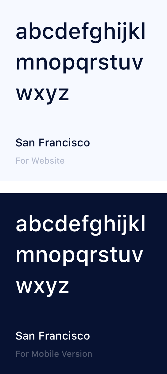
We used San Francisco, the sans-serif typeface from macOS, to offer unmatched legibility, consistency, and performance on our website. It looks great on tablets as well.

Icons
We have chosen filled-in icons for this product. They are easier to identify on the low-resolution screens and tablets. The icons can be used as navigation items and action buttons.
Anytime anywhere
Our users can use the product at any time of the day under different lighting conditions. It is possible, because we have made a dark version of the interface to prevent eye strain after dark.
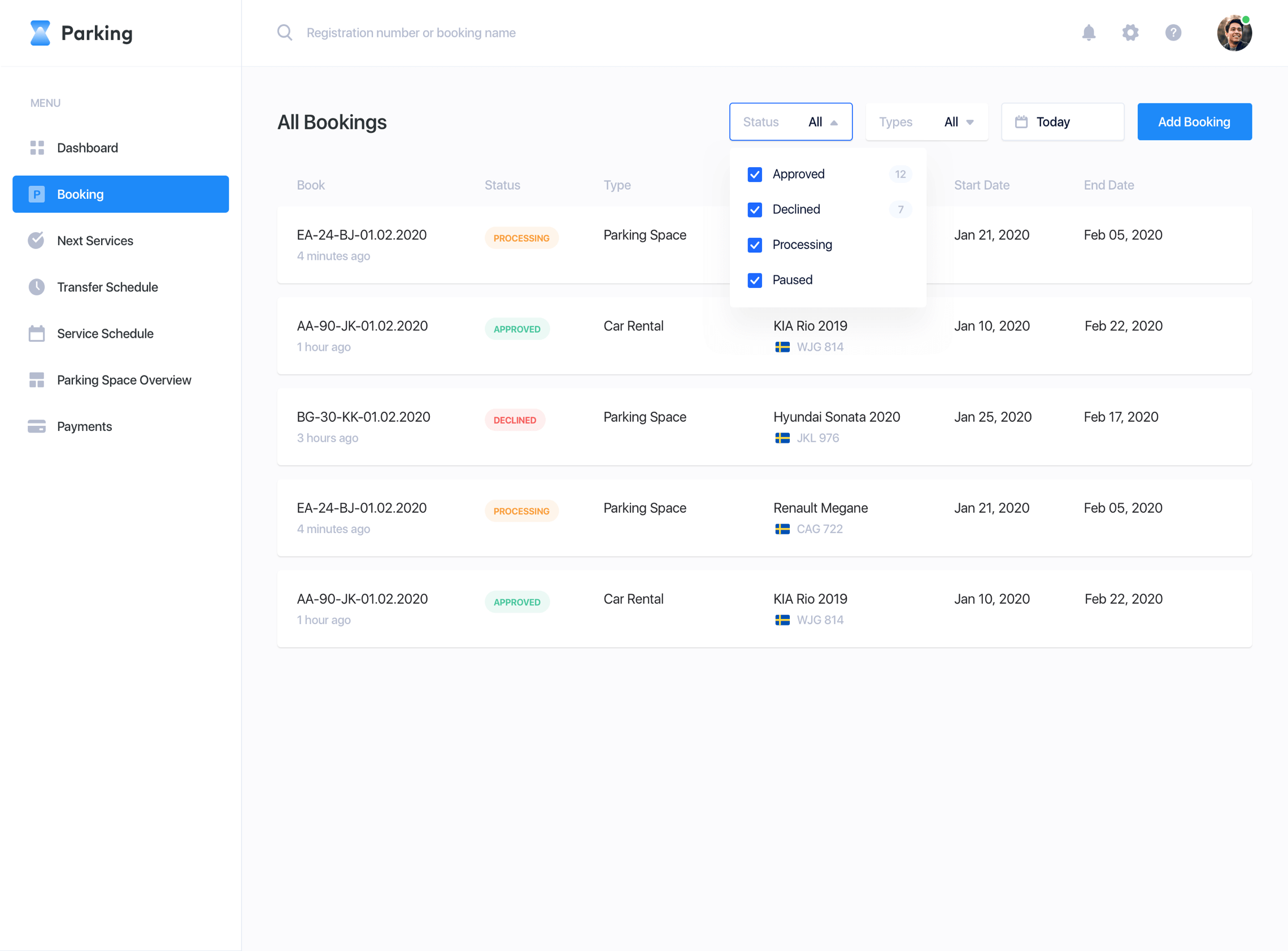
All bookings
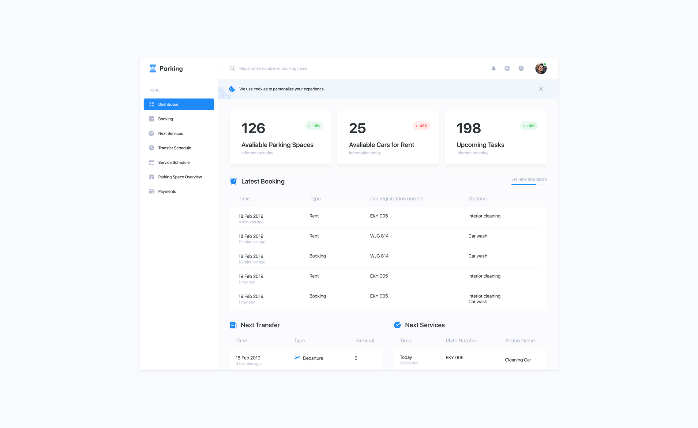
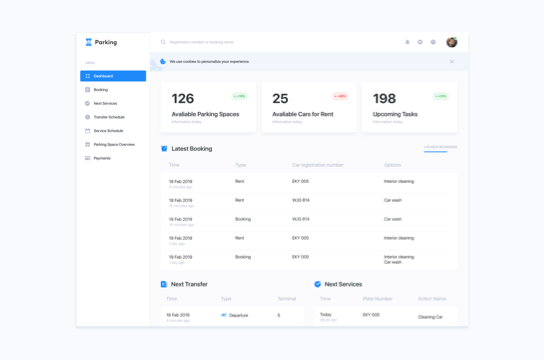
The main goal of this product is to automate the processes of parking spaces monitoring and manage new bookings. Every reservation offers full information about the driver, car, date, place, and booking status. Each booking has a unique number. Users can track the statuses of parking spaces using the number.
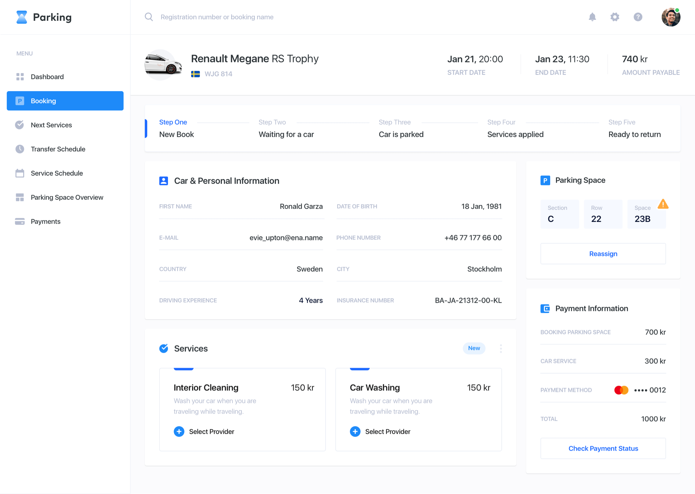
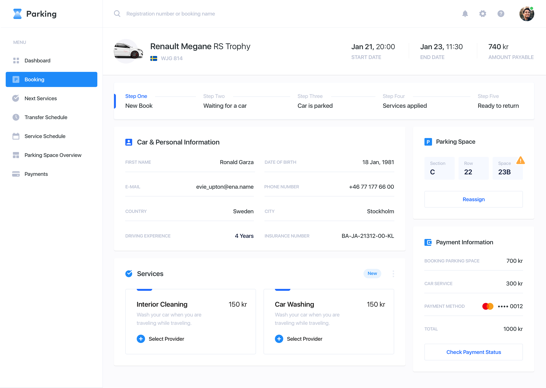
Booking details
This screen offers all the information about the reservation. The dispatcher can see everything they need, including booking details, status and the payment info. On this page, you can add extra services for your reservation, such as car wash, interior cleaning, or electric car charging. Manager can choose any worker for this service and set the date and time for its completion.
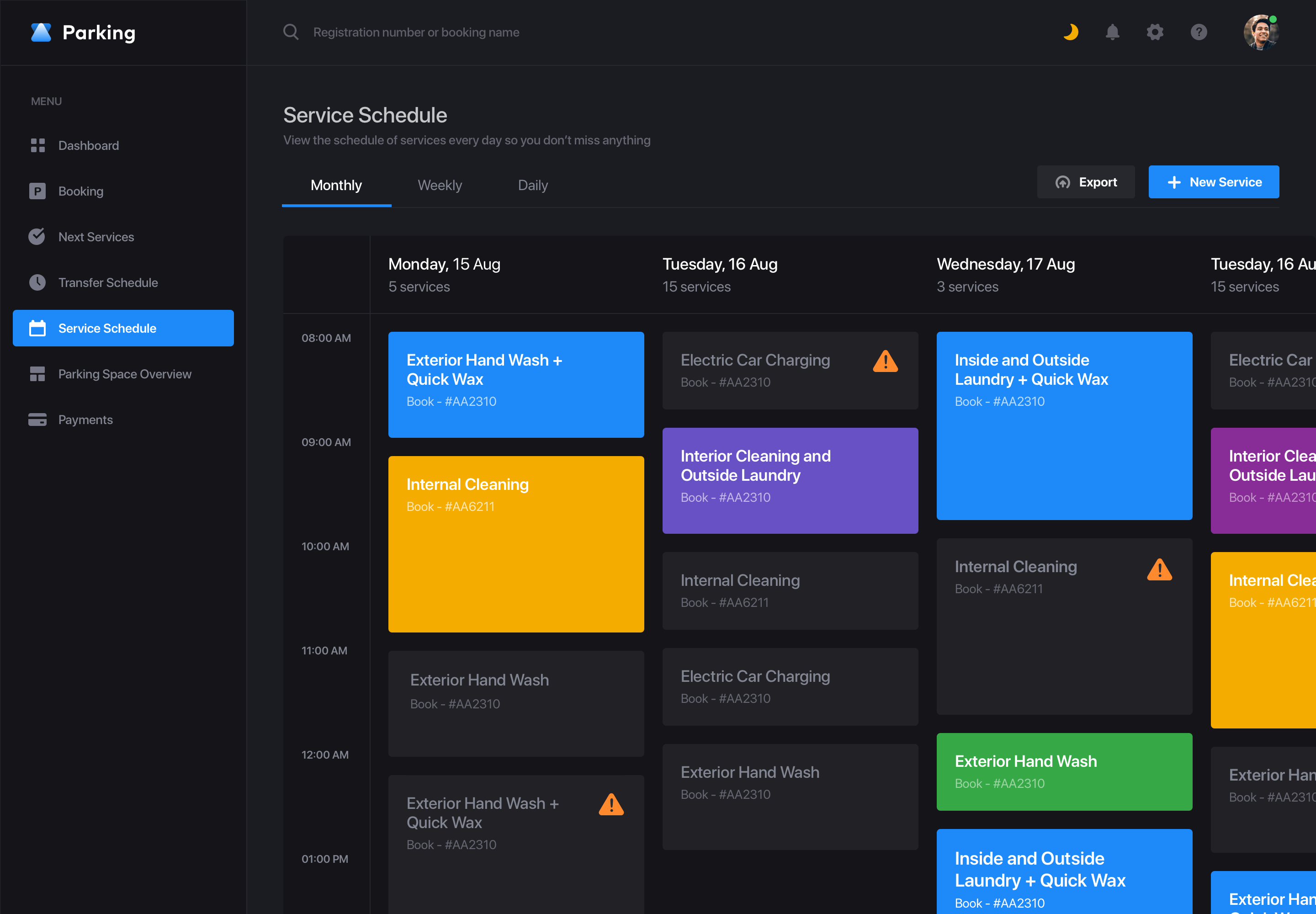
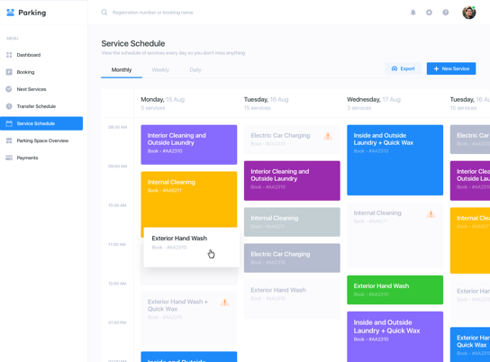
Service schedule
If the client needs additional services such as interior cleaning, the Parking Service will take care of it. The manager should be able to control the schedule of all services for every reservation. In order to achieve this, we have made a convenient calendar. It shows all the scheduled services. Each type of service has its own color, which allows getting the information very quickly.

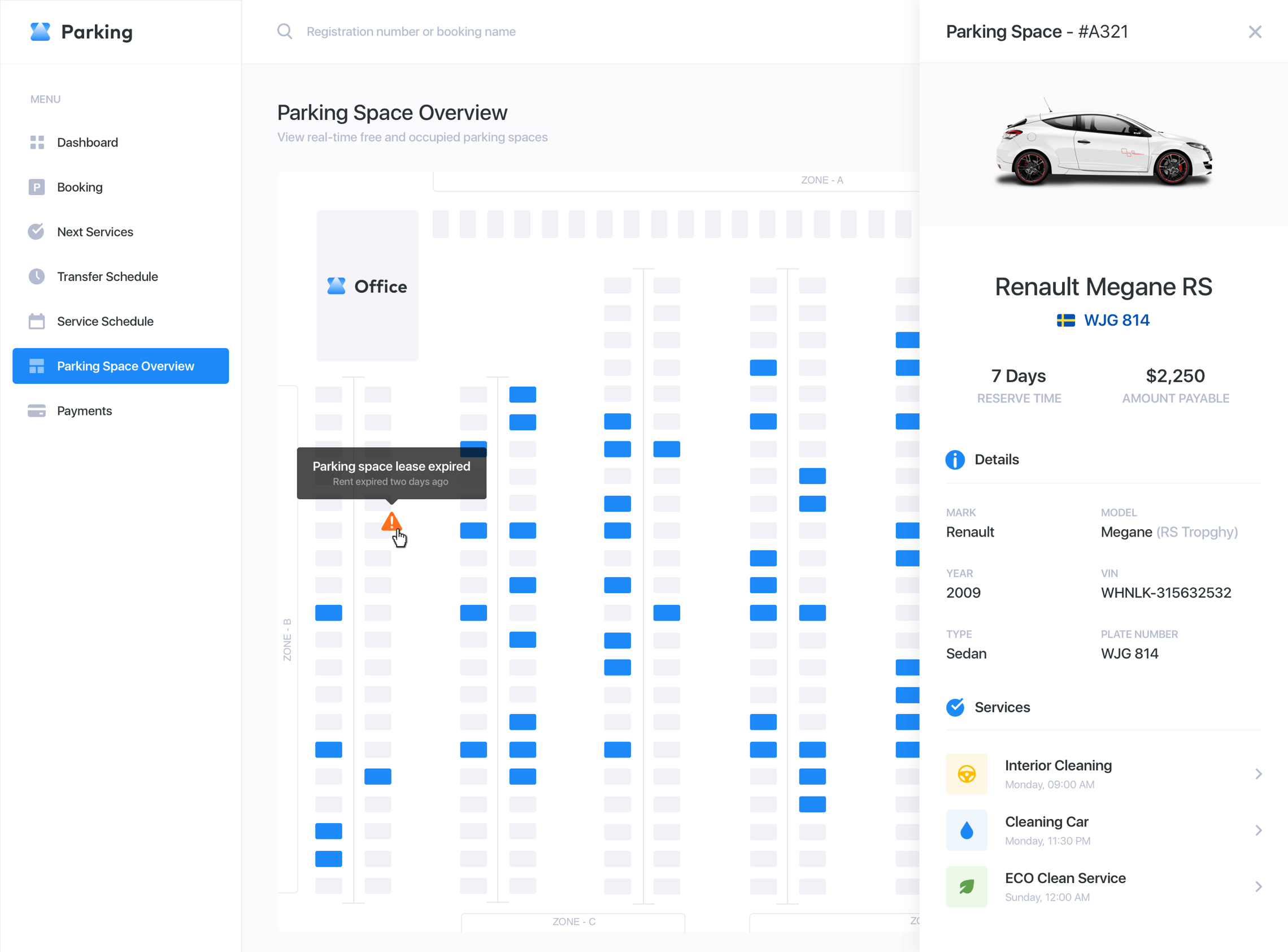
Parking space overview
In addition, the dispatcher should be able to track the congestion of the parking lot, the available parking spaces, and the parking spaces with the expired rental. If the client fails to pick up their car on time, the manager would contact them to extend the parking space reservation. If the manager needs to get the full booking details, they can click on the parking space to see the sidebar. It allows viewing the booking details right on the same page.
A one-size-fits-all grid
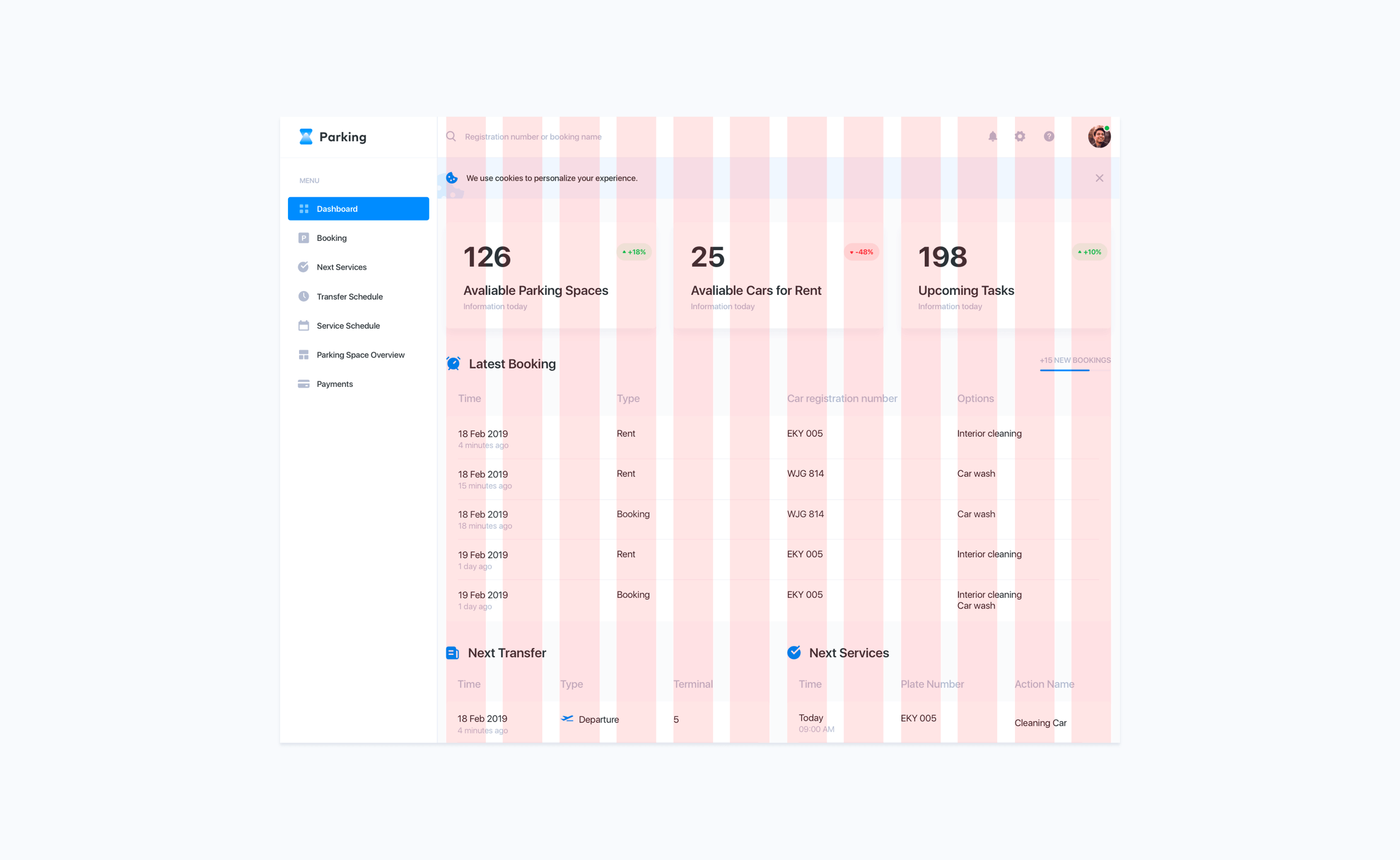
The development process should be quick and agile. That is why we have created the design based on the classic 12-column grid. It is a simple, popular, and effective solution.
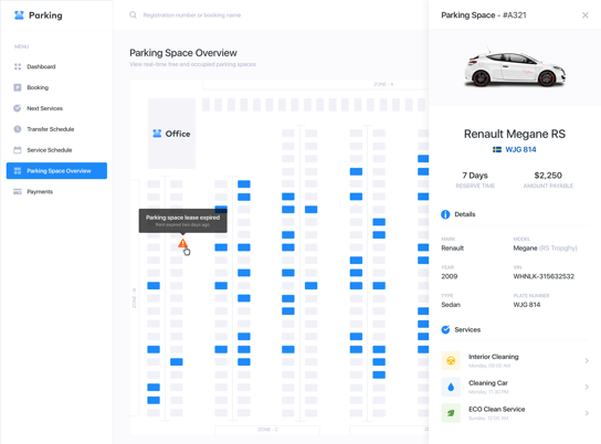
Parking space overview
In addition, the dispatcher should be able to track the congestion of the parking lot, the available parking spaces, and the parking spaces with the expired rental. If the client fails to pick up their car on time, the manager would contact them to extend the parking space reservation. If the manager needs to get the full booking details, they can click on the parking space to see the sidebar. It allows viewing the booking details right on the same page.


A library of components
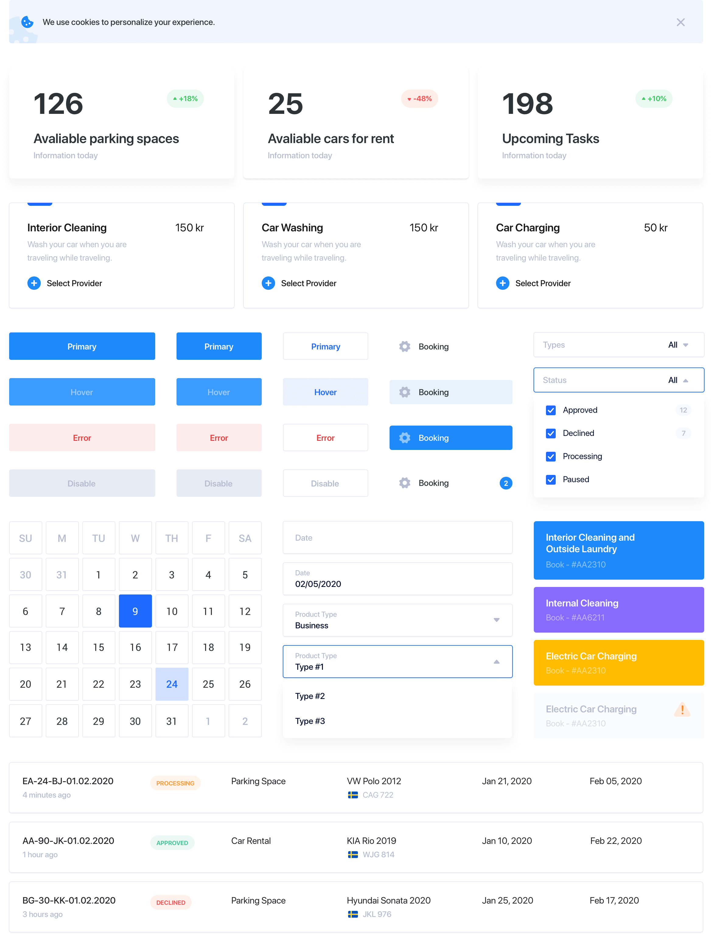
Finally, yet importantly, we have created a UI Kit with a large number of elements. It is aimed at simplifying and speeding up further work on the product. It will preserve the consistent visual style for the entire product.
Next case
Zero-emissions car rental