Tilt: a platform that connects students with financial aid opportunities
Start Scrolling 21,645px
Client
- Tilt
- USA
Industry
- Education
- Financial Aid
Services
- Product Design
- UX / UI
- Illustrations
Starring
- Stas Kovalsky
- Vyacheslav Ksendzyk
- Olga Levchenko
Challenge
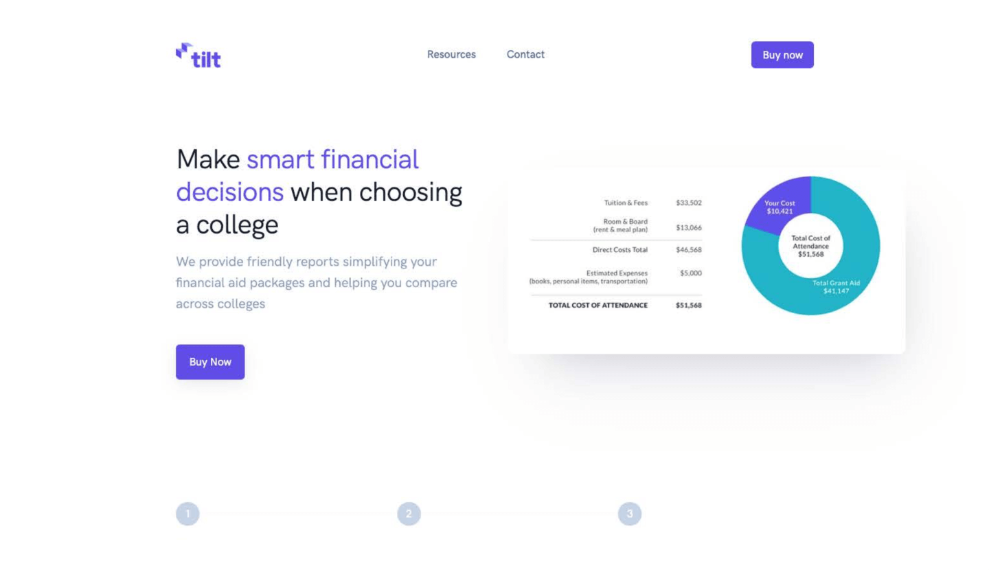
Tilt helps students to find and select colleges that will offer them the best deal. Glow, in its turn, helped Tilt to redesign its website as well as a platform for students. Our goal was to simplify the process for high school graduates when looking for college opportunities and create a place where prospective students can organize all information they need for admission.

Tilt works like a swiss watch
Tilt’s competitive advantage in the education industry is a personal approach to every high school graduate who is looking for a bright future in college. Every application is processed by Tilt employees who add a personal touch to brand and client communication. Therefore, the platform stands out in the industry to help each and everyone on their platform to make a right decision for their future.
Students enrolled in 2019
Federal Pell Grant
Received financial aid
Grants and scholarships
How it works
Tilt asks users to fill out a short form to discover prospective student college preferences. Based on provided information new users will see suggestions of colleges they may be interested in. Inside a platform, students can manage colleges and search for financial aid opportunities.
Website & mobile adaptation
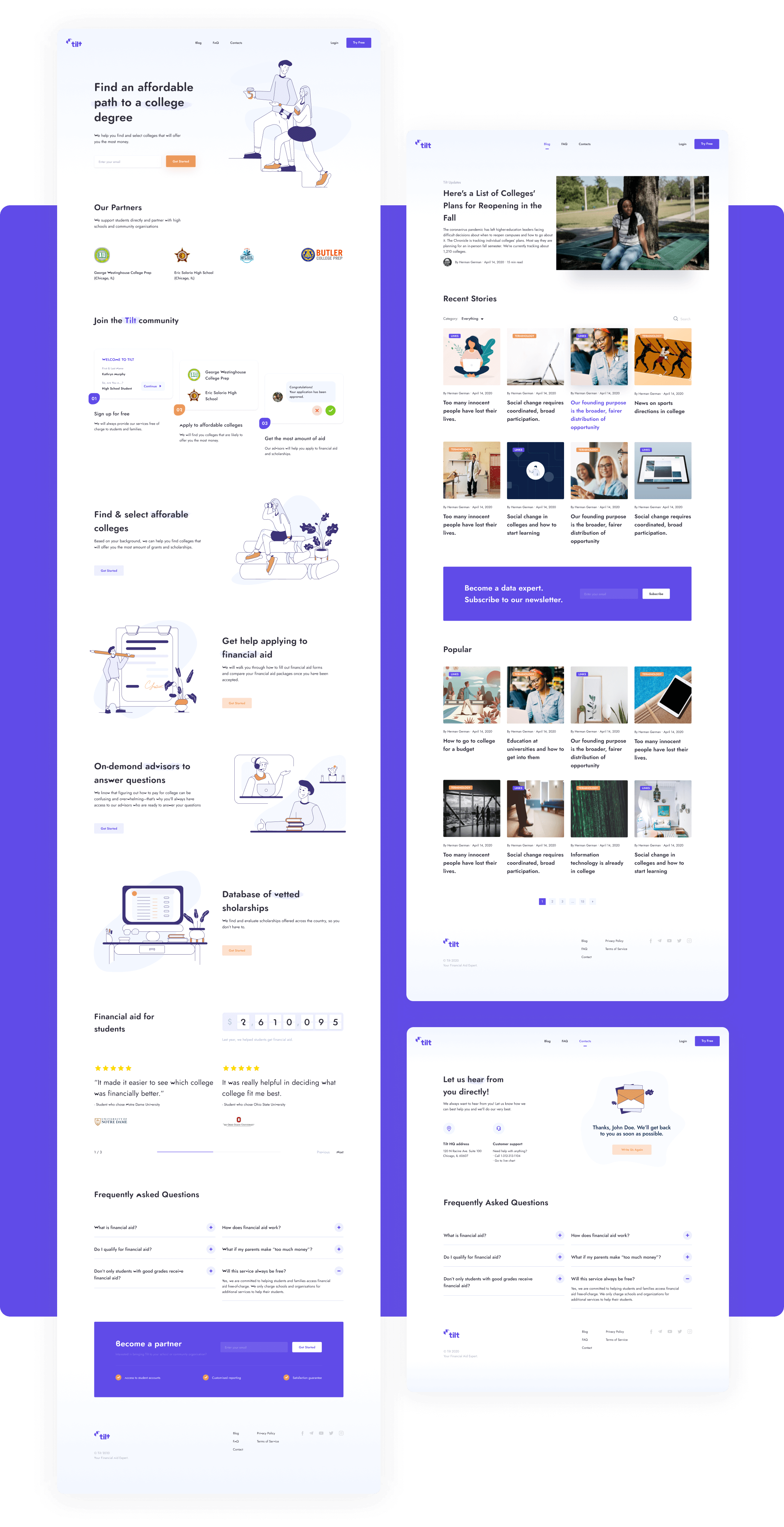
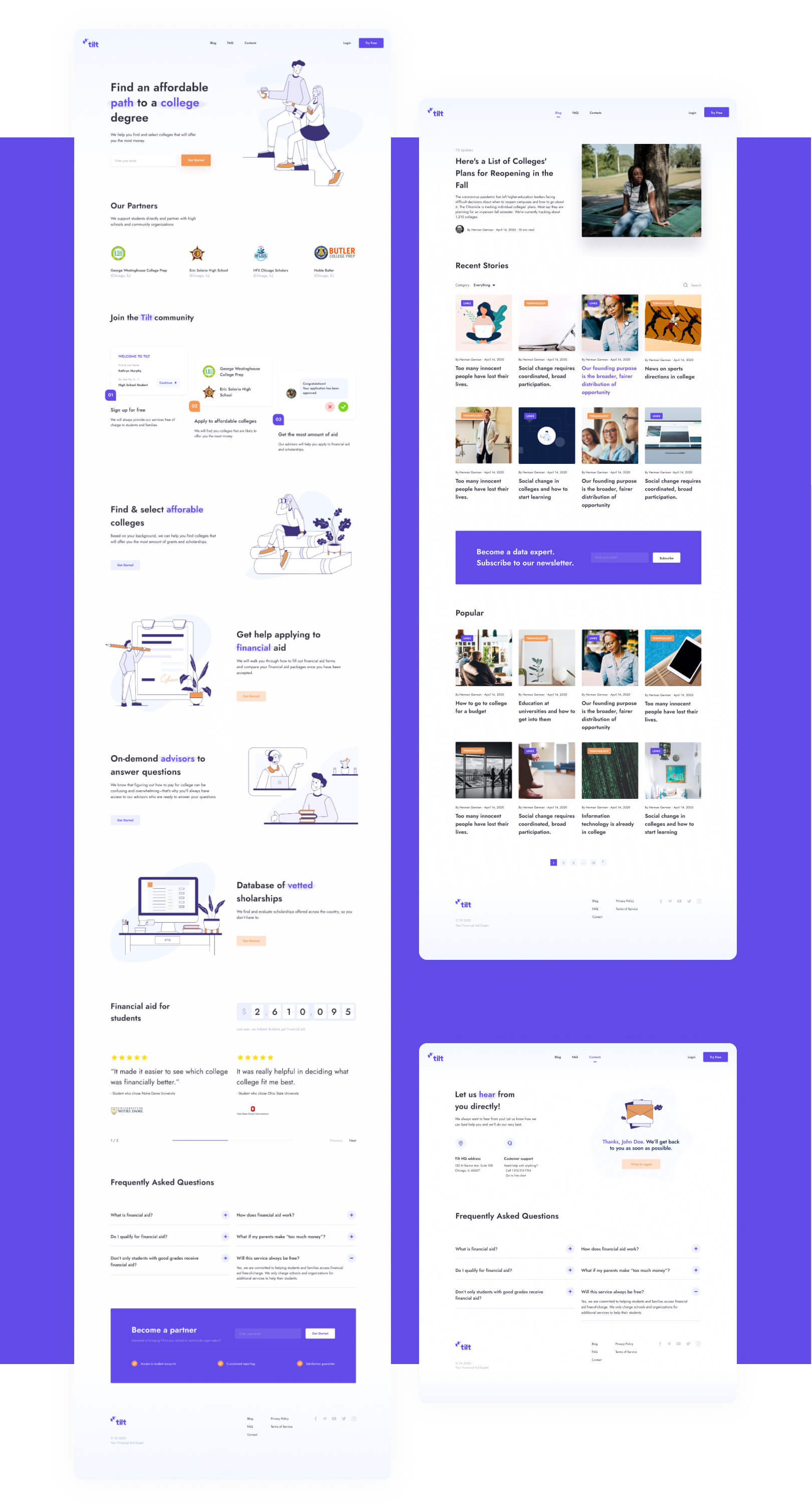
New Tilt look & feel was created with the target audience in mind. The youngsters who are about to make a serious commitment are in need to feel welcomed and trusted on Tilt platform. Friendly illustrations and clean interface help a lot to build credibility between Tilt service and future students.
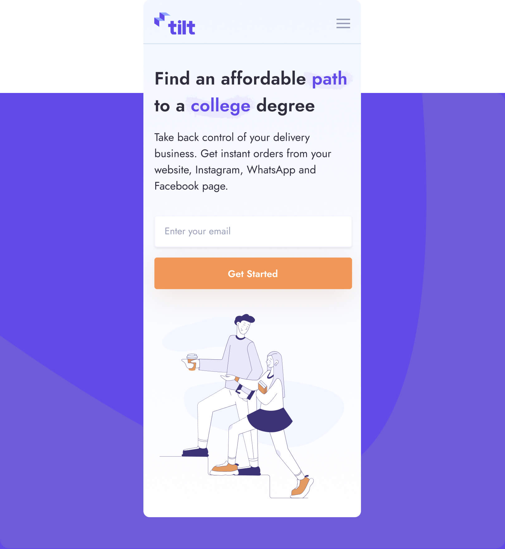


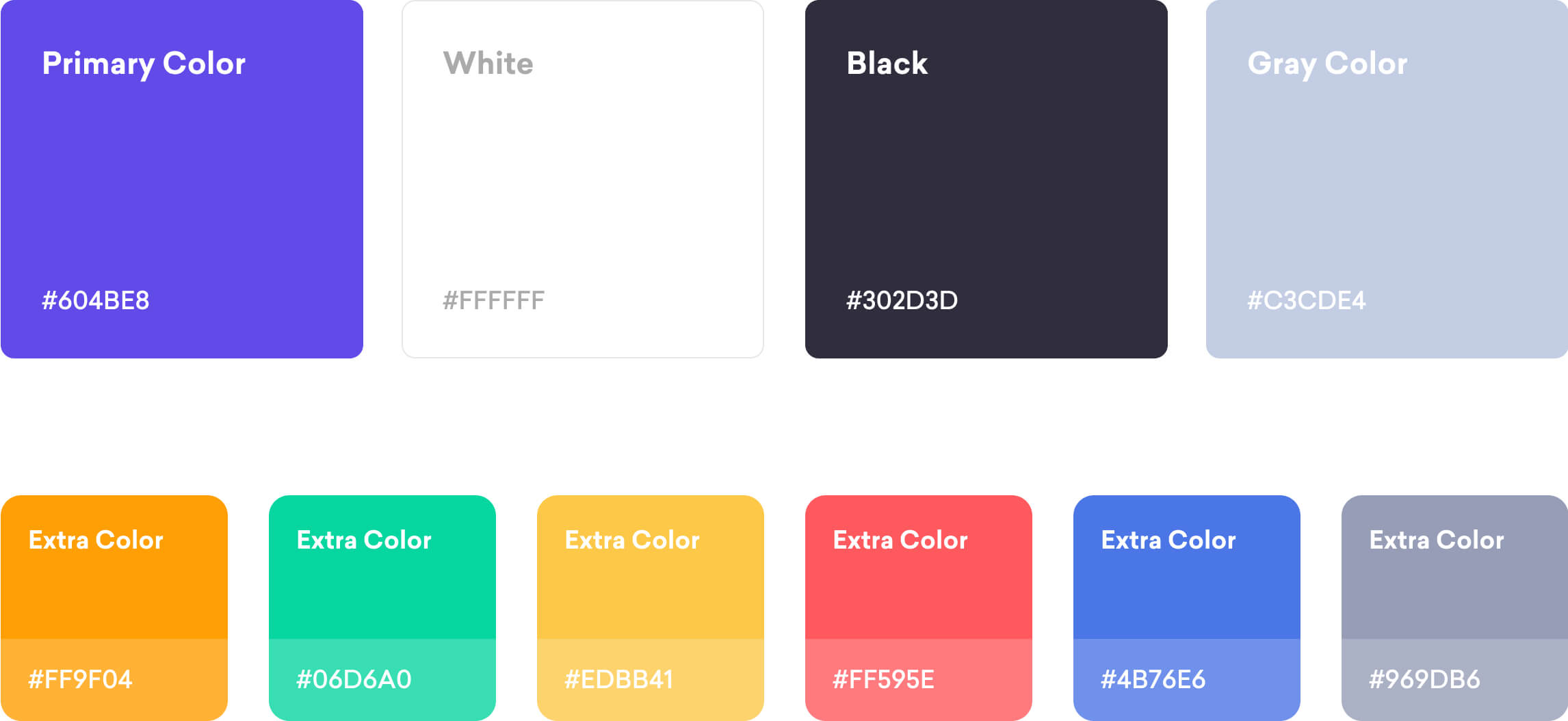
Colours
We envisioned the life of students associated with bright and fun memories. That is why we transformed that idea through color palette. Combining the clean look and colorful accents colors helps students to stay focused while using the platform.
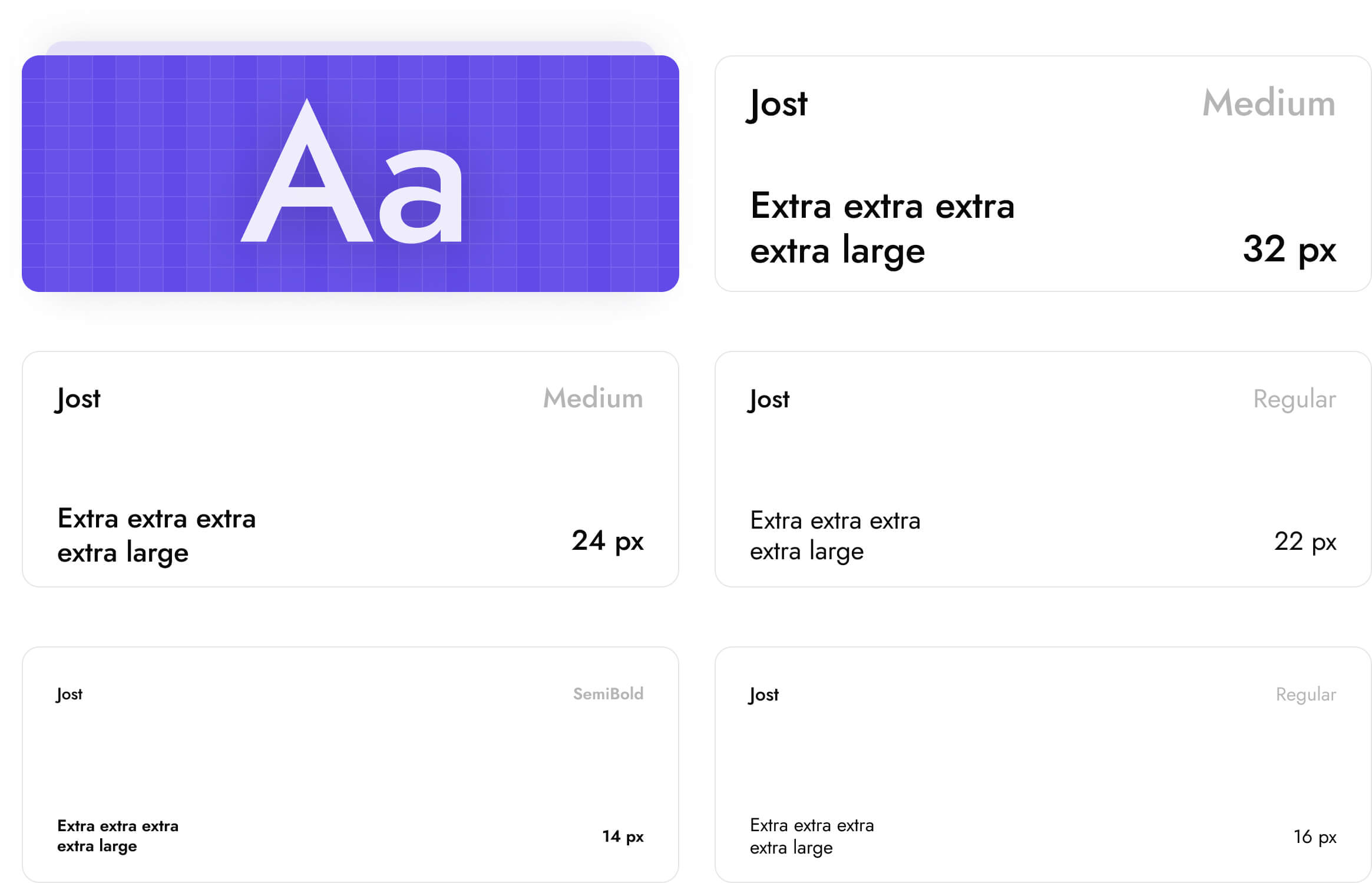
Typography
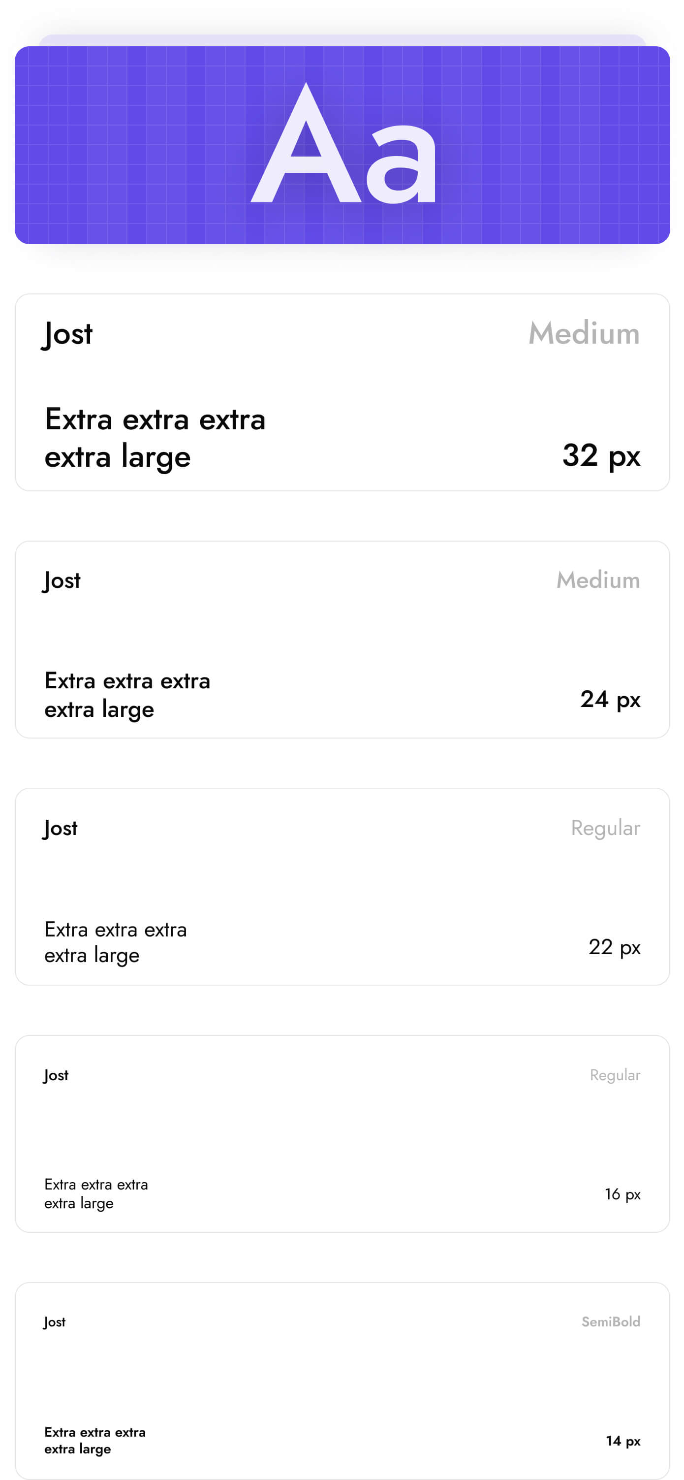
We used Jost font which was designed by Owen Earl. While it looks fresh it is still easy to read in non-overloaded interfaces.
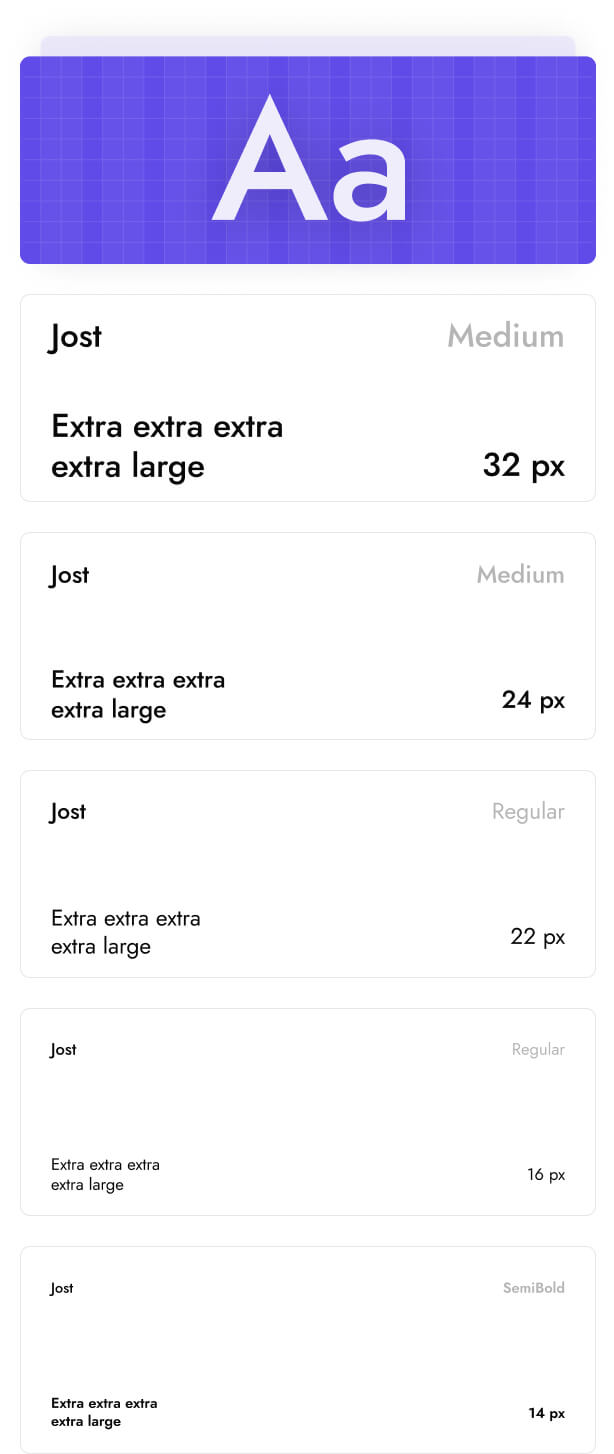
Icons
We designed a unique icon set for Tilt. Outline style helped us to navigate users through platform without using template solutions.
Illustrations
For illustrations we choose the simple line art style with accents on the primary design colors. Two main heroes who personify enrollees were drawn in situations the real students could be in. The major message is lightness and credibility in school selection, which simplifies the decision-making process for every high school graduate.


Dashboard
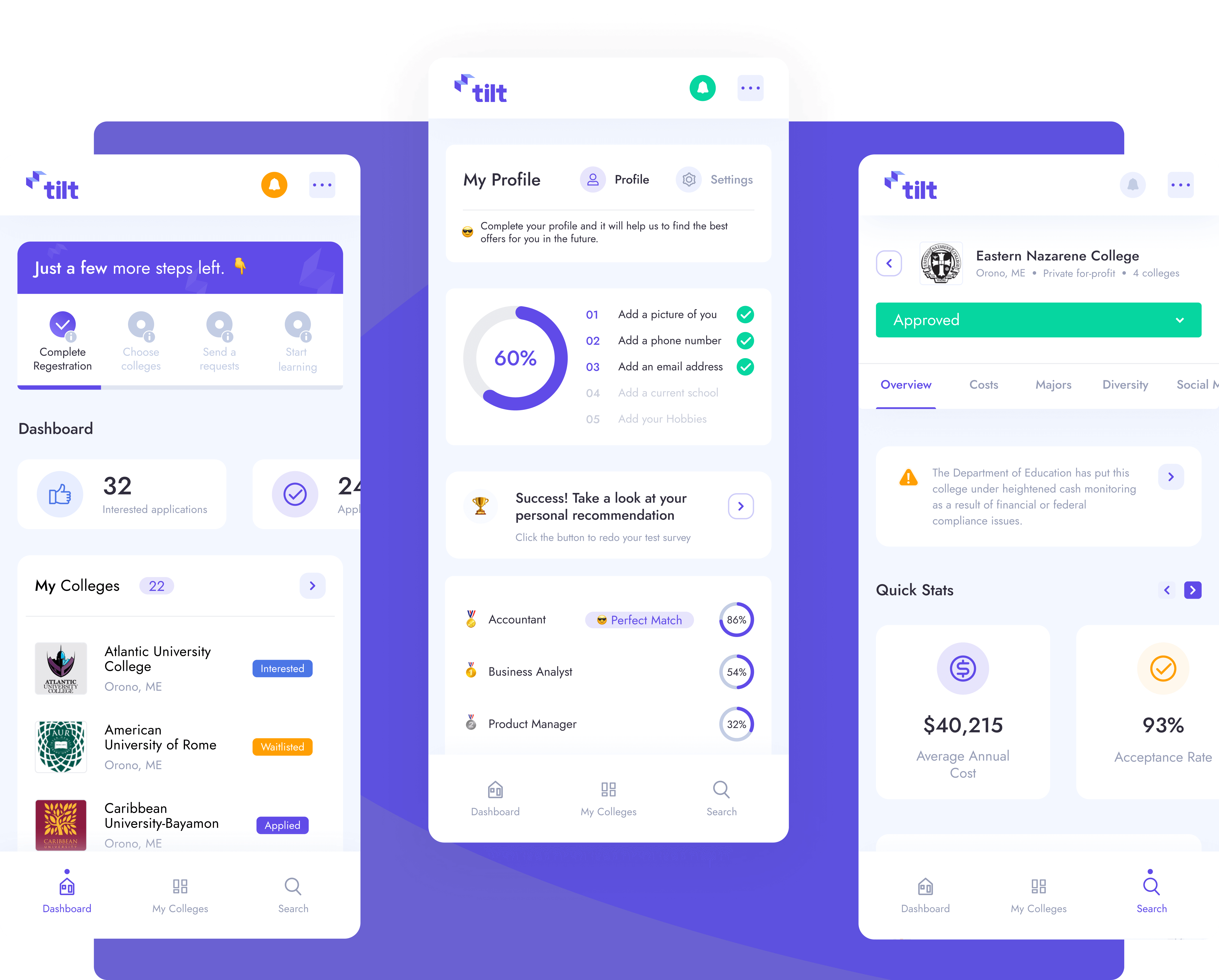
Users who enter Dashboard for the first time need a guide. Our wizzard-to-do-list gives them a clear understanding of what they should do next: fill out the profile, find preferred colleges and apply. Statistics on this page provide a user with different types of applications.
Colleges search
The college search is one of the most important features of Tilt. After onboarding, this page shows a personalized result that fits the student’s location, preferred majors, and budget. Filters help to find more accurate results. You can also switch to the map view to find colleges near your home.
Detailed college page
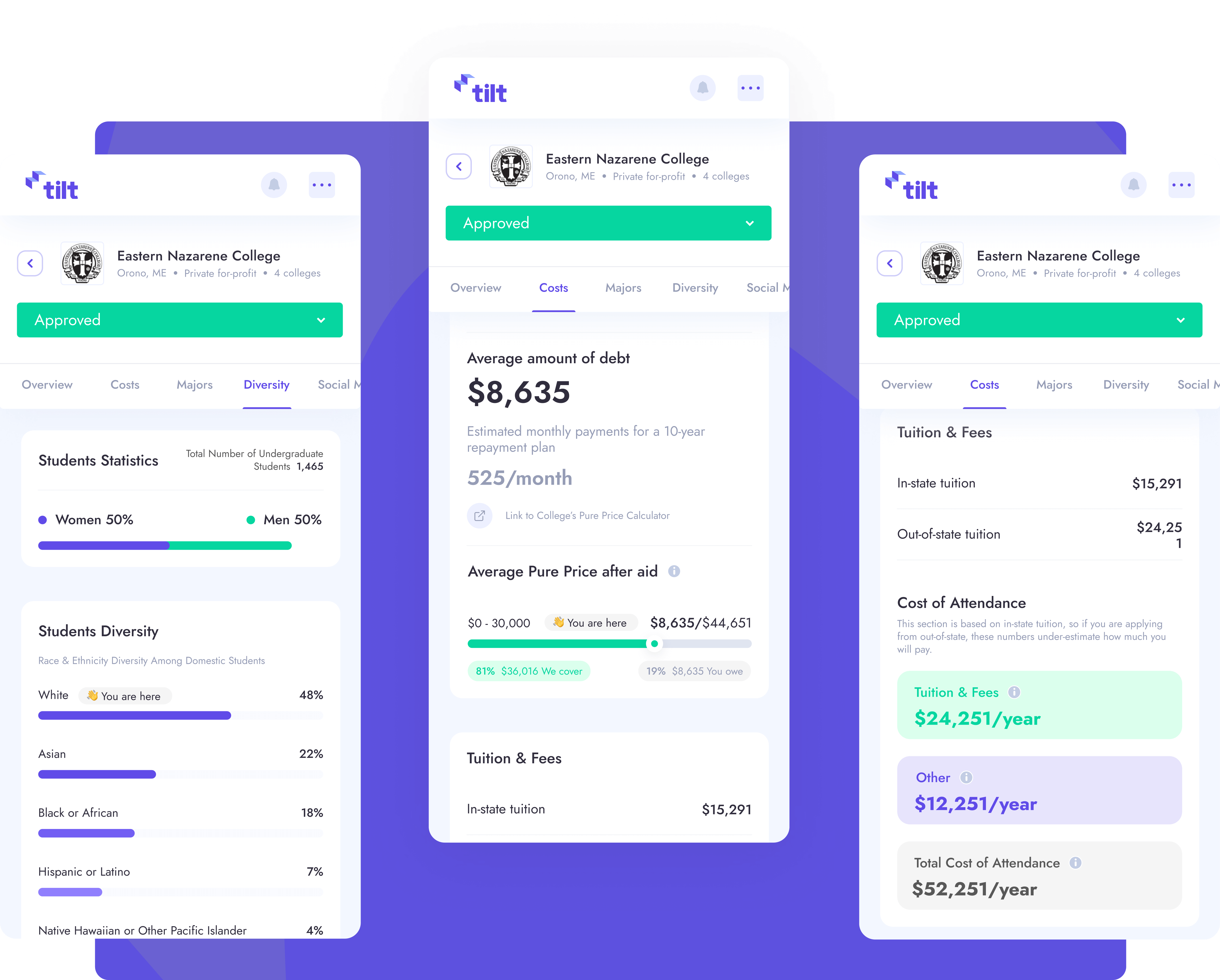
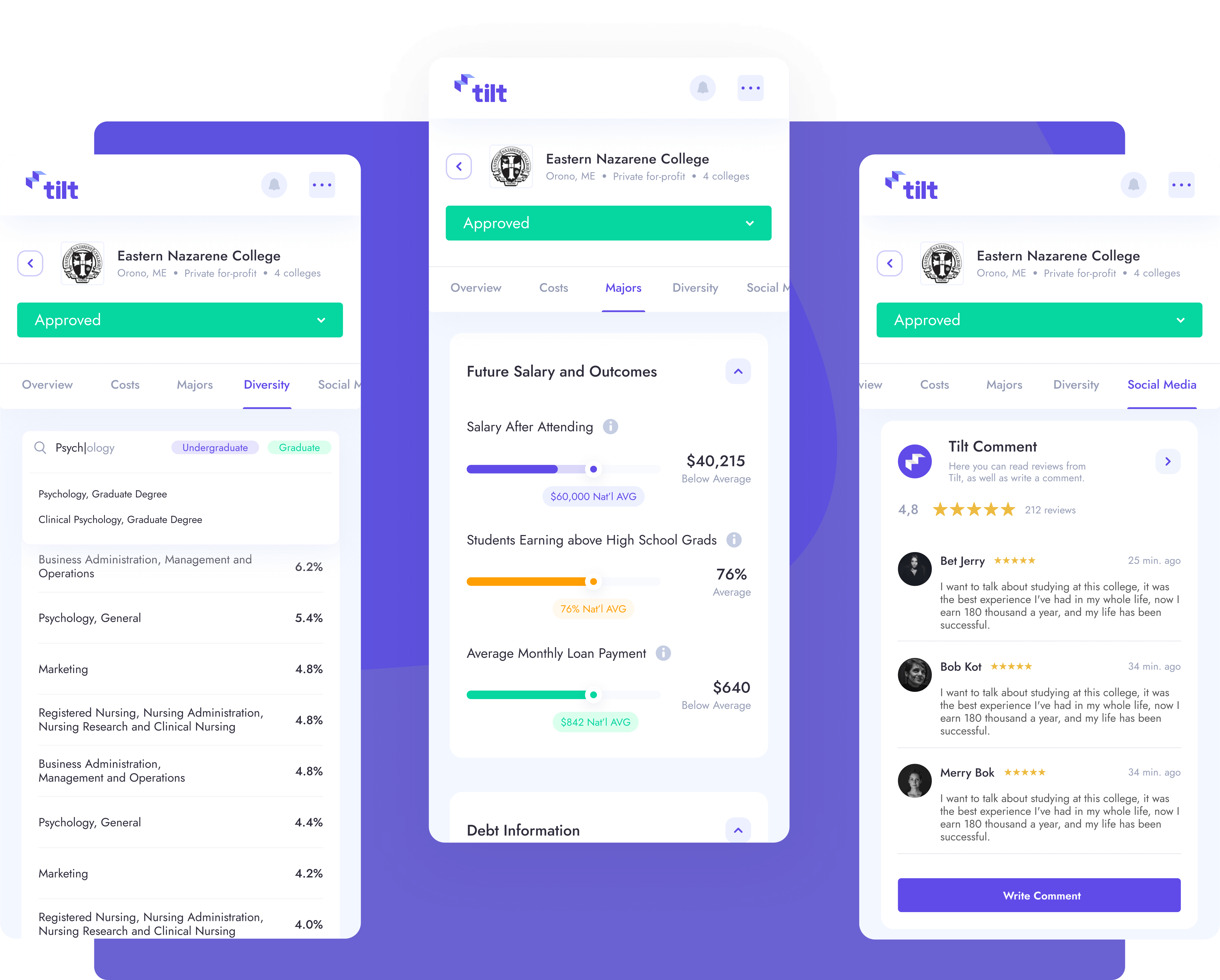
We decided to split the college details page into different tabs based on priorities. The most important tab is an overview where you can see the main information, contacts, and stats. Simple Calculator manages to calculate all the important fees regarding education and housing costs. The social media tab can help students to learn more about the college’s campus life and see reviews from other students.
Mobile
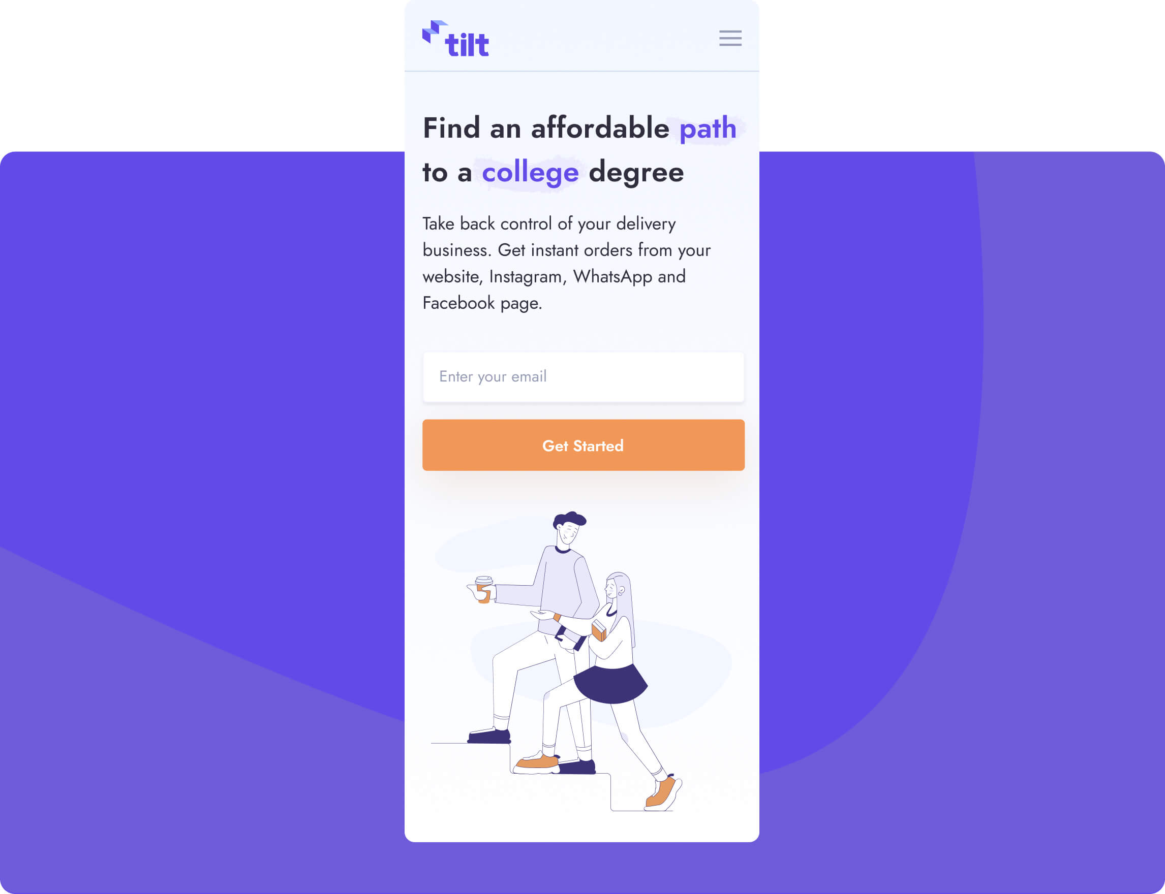
While working on the mobile version of the dashboard we wanted to create an experience similar to the mobile app. Youngsters spent more time on mobile devices compared to desktops. That’s why our goal was to design an interface that lets users do their tasks on the go.
Design system
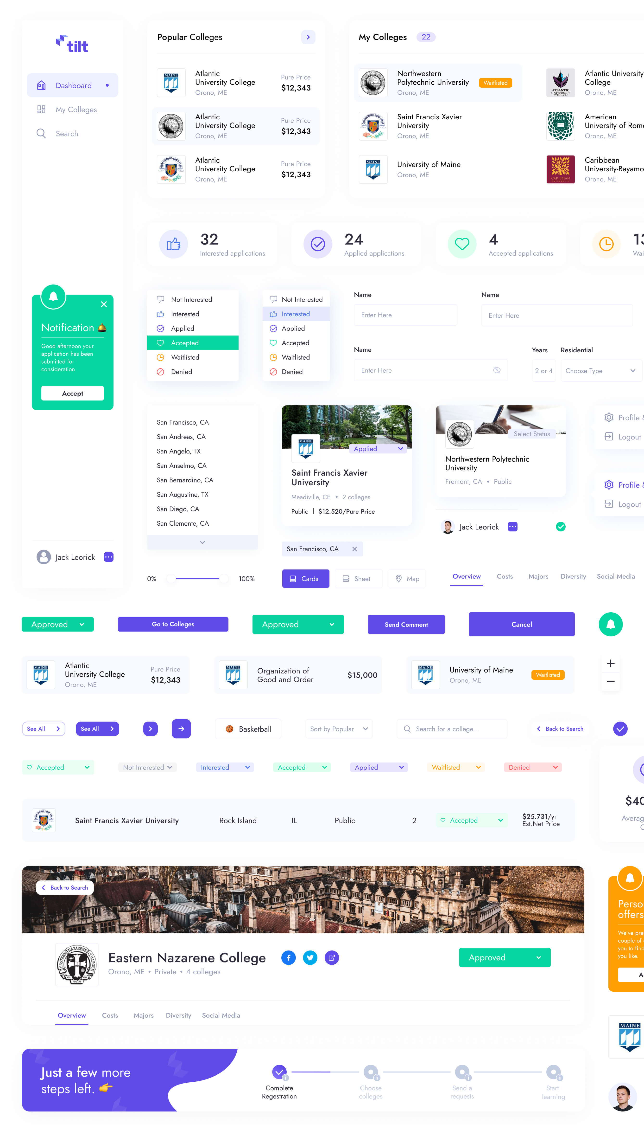
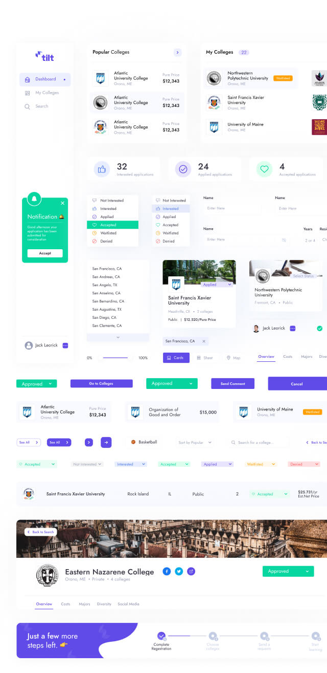
We created a design system for Tilt from scratch. It is based on the atomic design methodology. Each UI-control has its own goal and was built on atoms, molecules, and organisms. Sounds too hard? Don’t worry, that’s our job to worry about complex things.
Client’s words about work with Glow
Next case
FleetChaser: efficient fleet management platform
