The design looks great, but the final product does not: fix frontend issues with Design QA


Learn how Glow Team's Design QA process ensures the final product matches the design vision, addressing common frontend issues.
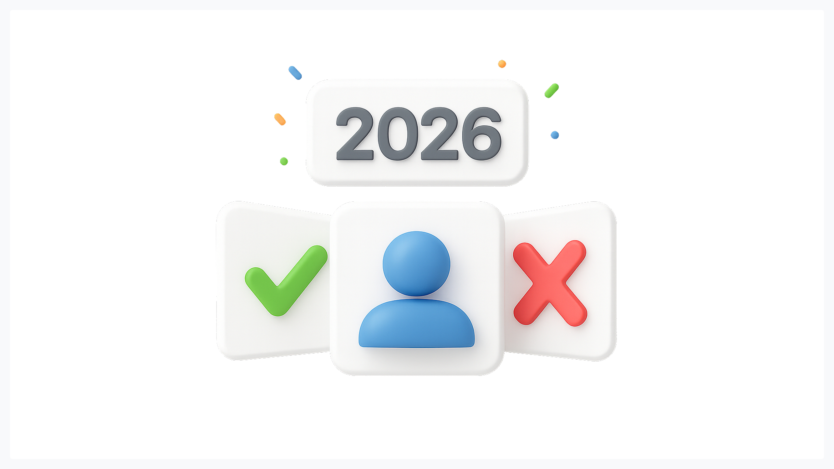
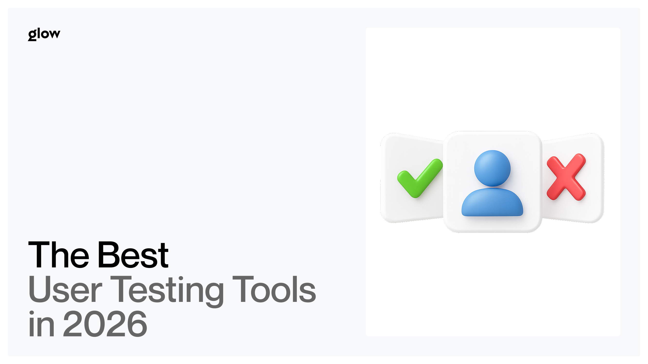
User testing isn't optional anymore, it's how you avoid building products nobody wants. In 2026, the gap between teams that test and teams that guess keeps widening. The companies winning right now are the ones catching problems before they cost money. This guide breaks down the user testing tools that actually work, who they're best for, and how to pick the right one for your team.
Why User Testing Tools Matter in 2026
Your users expect more than they did five years ago. They've used hundreds of apps, and they know what good UX feels like. If your product is clunky or confusing, they're gone in seconds.
Testing before you build saves money. For example, Airbnb improved bookings by 25% through simple design changes like better photos and clearer call-to-action buttons. Those changes came from testing, not guessing. The alternative? Spending months building features users don't want, then scrambling to fix them.
Remote testing is now standard practice. Your team is probably distributed. Your users definitely are. Tools that let you test from anywhere have become essential infrastructure, not nice-to-haves. Remote user testing has evolved from a pandemic workaround to the default approach for most product teams.
AI is accelerating everything. Modern testing tools use AI to spot patterns you'd miss manually - which buttons confuse people, where they get stuck, what makes them leave. You get insights in hours, not weeks. The technology analyzes thousands of user sessions to surface the moments that matter most. For more on how AI shapes design workflows, check out this deep dive on AI in UX.
The shift toward data-driven design has made the best usability testing tools a competitive advantage. Teams that test regularly ship better products faster because they catch issues early. They know what works before committing engineering resources. This approach has become standard at companies that win in their markets.
What to Look For in a User Testing Tool
Skip the fluff. Here's what actually matters when evaluating usability testing software:
- Ease of setup. If it takes your team a week to figure out the tool, you've already lost. The best tools let you start testing within an hour. Look for platforms with templates, clear documentation, and support that actually responds.
- Ability to test prototypes. You need to test before writing code. Look for tools that work with Figma, Sketch, or whatever you're designing in. Prototype testing tools should connect directly to your design files so you can validate ideas while they're still cheap to change.
- Video or screen recording. Watching someone use your product tells you more than any survey. You see where they hesitate, click the wrong thing, or give up. The facial expressions and verbal reactions reveal frustrations that users won't report in written feedback.
- Task success tracking. Can users actually complete what they set out to do? This metric cuts through everything else. It's the difference between a product that looks good in screenshots and one that actually solves problems.
- Heatmaps. Visual data on where people click, scroll, and ignore helps you spot patterns fast. One glance tells you whether your call to action is getting attention or if users are clicking dead zones.
- Panel availability. Some tools provide testers. Others make you recruit your own. Know which model works for your timeline and budget. Built-in panels save time but cost more. Recruiting your own users gives you exactly who you need, but adds complexity.
- Integrations. Does it play nicely with Figma? Jira? Your analytics stack? If your tools don't talk to each other, you'll waste time stitching data together manually. The right UX testing tools should fit into your existing workflow, not force you to adopt new ones.
The Top User Testing Tools in 2026

UserTesting - Best for real human feedback
UserTesting connects you with actual people who match your target audience. You watch them use your product while they talk through their thought process. It's not cheap, but the insights are high-quality. Best for teams that need detailed qualitative feedback and have a budget to match.
Userlytics - Best for global testing panels
Need testers from specific countries or demographics? Userlytics has a massive global panel among user testing tools. You can test in dozens of languages and get feedback from markets you're entering. Good choice if you're expanding internationally and need diverse user perspectives.
Hotjar - Best for behavior analytics
Hotjar shows you what users actually do on your site through heatmaps, session recordings, and scroll maps. It's easy to set up and the visual data is immediately useful. Works great for optimizing existing products rather than testing prototypes. One of the best usability testing tools for behavior analytics.
Maze - Best for prototype validation
Maze specializes in rapid prototype testing as prototype testing tools go. Connect your Figma files and start collecting data in minutes. You get quantitative metrics like task completion rates and time-on-task, plus qualitative feedback. Perfect for early-stage teams that need to validate design decisions quickly without breaking the bank.
Lookback - Best for moderated sessions
Lookback excels at live, moderated user interviews. The video quality is excellent, and the interface makes remote sessions feel natural. Researchers can take notes in real-time, and stakeholders can observe without disrupting the session. Strong choice among usability testing software for deep research.
Crazy Egg - Best for visual click insights
Crazy Egg's strength is showing exactly where people click, including "rage clicks" where users click repeatedly in frustration. The A/B testing features let you validate changes before rolling them out. More focused than Hotjar but excellent at what it does. One of the more specialized heatmap tools available.
Optimizely - Best for A/B testing
Optimizely is the heavyweight for experimentation among A/B testing platforms. You can test variations of pages, features, or flows and see which performs better with real metrics. The platform handles complex multi-variant tests and integrates with your analytics. Best for teams that want data-driven decisions on live products with actual traffic.
UXCam - Best for mobile UX
UXCam is built specifically for mobile apps. You get session replays, heatmaps, and crash analytics all in one place. The tool automatically captures user frustration signals like repeated taps or app exits. If your product is mobile-first, this beats trying to adapt web-focused tools. Strong mobile-focused UX testing tools option.
Userbrain - Best for quick remote tests
Userbrain is fast and simple among usability research tools. Order tests, get video feedback within hours. No lengthy setup, no complicated features you'll never use. Perfect for lean teams that need regular feedback without dedicating someone full-time to research.
Loop11 - Best for task-based testing
Loop11 focuses on task completion and usability metrics. You create specific scenarios, users attempt them, and you get hard data on success rates and paths taken. The tree testing feature helps validate information architecture. Ideal when you need quantitative proof that your navigation or flows work.
Comparison: Which Tool Fits Your Team?

Different teams need different approaches to testing. Your company size, budget, and product type determine which usability testing software makes sense for you:
- For early-stage design. Start with Maze or Userbrain. They're affordable, fast, and give you enough data to make smart iterations without slowing down your sprint. Early-stage teams need velocity, and these best usability testing tools deliver insights without requiring a research specialist on staff.
- For enterprise UX teams. UserTesting, Optimizely, or Lookback. You have a budget and need robust features, stakeholder buy-in requires professional research, and legal/security requirements matter. Enterprise teams benefit from usability research tools that provide audit trails and detailed documentation for compliance purposes.
- For mobile-focused teams. UXCam first, then add Maze for prototype testing. Mobile behavior is different enough that specialized tools pay off. The touch interactions, screen sizes, and usage contexts are so different from the web that generic tools miss crucial insights.
- For fast prototype validation. Maze or Loop11. Both let you test Figma prototypes directly and get metrics within a day. Keep iteration speed high when you're still figuring things out. Running multiple quick tests beats waiting weeks for one perfect study.
- For deep research. Lookback or UserTesting. When you need to understand the "why" behind user behavior, nothing beats watching people and asking questions in real-time. UX research software that enables moderated sessions gives you the flexibility to dig deeper when unexpected issues arise.
Looking to build a design system that works across your org? The team at Glow has helped startups and enterprises create user experiences that actually move the needle on metrics. We've seen what works across hundreds of projects and can help you set up testing processes that fit your team's reality.
How to Choose the Right Tool
Picking the right user testing tools isn't about finding the "best" one, it's about matching capabilities to your specific needs. Here's how to make that decision systematically:
- Define research goals. What questions are you trying to answer? "Will users understand this flow?" needs different tools than "Which headline converts better?" Be specific about what success looks like. The right usability testing software depends entirely on whether you need qualitative insights about why users struggle or quantitative data about how many completed tasks successfully.
- Decide moderated vs unmoderated. Moderation gives you deeper insights but takes more time and costs more. Unmoderated is faster and cheaper, but you can't ask follow-up questions. Most teams need both at different stages. Use moderated sessions when exploring new problem spaces, unmoderated when validating specific solutions at scale.
- Define budget. Some tools charge per test, others are monthly subscriptions. Calculate your testing volume. If you're testing weekly, a subscription makes sense. If it's occasional, pay-per-test might be smarter. Factor in the cost of recruiting if you're not using panel-based UX testing tools.
- Check integration needs. Look at your actual workflow. If your team lives in Figma and Jira, make sure your testing tool connects to both. Manual data transfer kills momentum. The best session recording tools pipe data directly into your existing analytics stack, so insights surface where your team already looks.
- Select based on project lifecycle. Early stage? Prototype testing. Optimizing an existing product? Analytics and A/B testing. Different phases need different tools. Don't pay for features you won't use yet. A startup validating product-market fit has completely different needs than an established company optimizing conversion funnels.
FAQ
What are metrics in design?
Design metrics are measurements that show how well your product performs for users. They track things like whether people complete tasks, how long things take, and whether users come back. Common examples include task success rate, time on task, and error rates. You use these numbers to make decisions instead of guessing what works. The right metrics connect design changes to business outcomes, making it clear when UX improvements actually matter.
What is a design metric?
A design metric is any specific measurement that indicates whether your design is working. Think conversion rate, click-through rate, or time to complete a task. Companies that invest in UX design see significant returns, and metrics help prove that impact. The key is picking metrics tied to actual business outcomes, not vanity numbers. Good design metrics change when you improve the experience and stay stable when you don't.
What is a KPI in design?
A KPI (Key Performance Indicator) in design is a metric that directly connects to business goals. While you might track dozens of metrics, KPIs are the few that really matter - like reducing support tickets by improving navigation, or increasing signups by simplifying onboarding. According to research on UX metrics that drive business, teams should focus on KPIs that connect user experience to revenue, retention, or growth. Your KPIs should be things executives care about, not just numbers designers find interesting.
How to design good metrics?
Good metrics are specific, actionable, and tied to user outcomes. Start with what you're trying to improve. Airbnb tracks the conversion rate from search to booking, despite several steps in between, according to Neil Patel. They focus on the outcome that matters, not every micro-interaction. Make sure you can actually change what you're measuring, and that improving the metric makes users' lives better, not just makes numbers go up. Test your metrics by asking: if this number improves but users are still frustrated, did we measure the wrong thing?
Ready to improve your product metrics through better design? The team at Glow specializes in turning research insights into designs that actually work. Whether you're building from scratch or optimizing an existing product, we've helped teams like yours go from "we think this works" to "we know this works." We use the best usability testing tools and proven methodologies to validate every design decision before it hits production.

.svg)

Related Articles Prompted by Glow


Get weekly glow prompts—
insights from the frontline of product design
Check your inbox for future updates.

No spam.
Just sharp insights that make you better at design & AI.