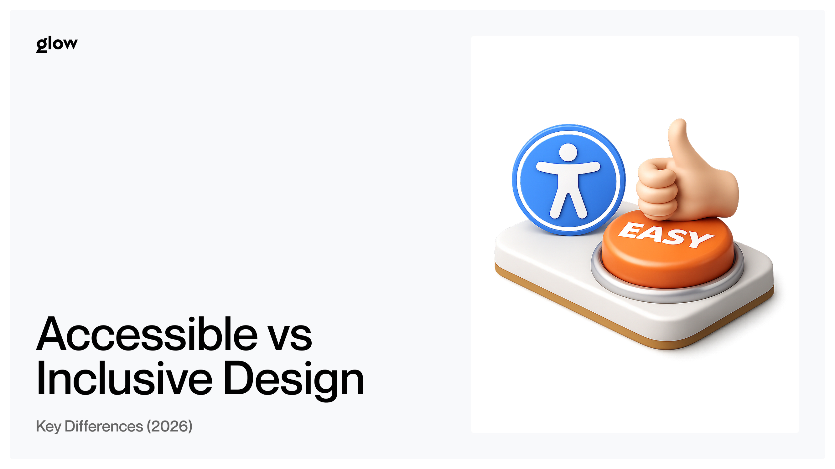
Accessible vs. Inclusive Design: Key Differences and Why Both Matter (2026)

Understand the real difference between accessible and inclusive design — what separates them, where they overlap, and how to apply both to create better products for everyone.
There's a mistake that shows up constantly in design conversations: using "accessible" and "inclusive" as if they mean the same thing. They don't. Think of it like squares and rectangles - every square is a rectangle, but not every rectangle is a square. Every piece of accessible design is a form of inclusion, but inclusive design reaches much further. Getting this distinction right isn't just semantic precision - it fundamentally shapes how you build products, who benefits from them, and how broadly relevant they become.
Quick Summary (Key Takeaways)
- Accessible Design ensures people with disabilities can access and use technology. It is tied to legal standards such as WCAG and ADA - and carries enforceable compliance requirements.
- Inclusive Design is a broader methodology considering all human diversity - age, culture, gender, language, and temporary or situational limitations. It is a mindset, not a checklist.
- The Analogy: Accessibility is a square inside the rectangle of inclusive design. All accessible design is inclusive - but inclusive design goes further.
Accessible Design Inclusive Design Scope People with disabilities All humans, all contexts Approach Technical compliance Philosophy + methodology Example ALT text, keyboard navigation Plain language, captions in noisy environments
Scope
- Accessible designPeople with disabilities
- Inclusive designAll humans, all contexts
Approach
- Accessible designTechnical compliance
- Inclusive designPhilosophy + methodology
Example
- Accessible designALT text, keyboard navigation
- Inclusive designPlain language, captions in noisy environments
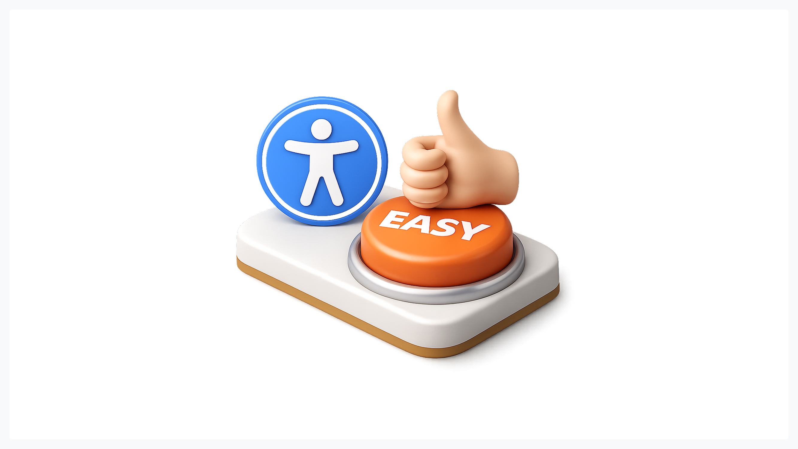
What Is Accessible Design?
Accessible design is the practice of building digital and physical products that people with disabilities can perceive, navigate, and use effectively. It's anchored in measurable, enforceable standards - most prominently the Web Content Accessibility Guidelines (WCAG), the Americans with Disabilities Act (ADA), and equivalent regional legislation.
The defining characteristic here is precision. Accessibility isn't a feeling - it's a set of technical outcomes with verifiable answers. Either your website works with a screen reader, or it doesn't. Either your color contrast meets the 4.5:1 ratio for normal text, or it fails the audit. This precision makes accessibility both powerful and legally binding. For teams delivering UI/UX design services, meeting accessibility standards is not optional - it is the professional and legal floor.
Key Principles of Accessible Design (WCAG)
WCAG organizes accessibility around four core principles, known as POUR:
- Perceivable. Information must be presentable in ways all users can sense, including text alternatives for images and captions for video.
- Operable. Interface components must be navigable via keyboard, not just a mouse or touchscreen.
- Understandable. Content and UI behavior must be predictable, consistent, and clear.
- Robust. Current and future assistive technologies, including screen readers, must reliably interpret content.
These principles form the backbone of modern accessibility audits, legal compliance reviews, and product certification processes.
Examples of Accessible Design in Practice
- ALT text on images so screen readers can describe visuals to blind users
- High color contrast (minimum 4.5:1 ratio) between text and background
- Keyboard navigation so every interactive element functions without a mouse
- Screen reader compatibility through semantic HTML and proper ARIA labeling
- Closed captions on all video content for deaf and hard-of-hearing users
Each of these has a clean pass/fail answer. That's the strength - and the inherent limitation - of pure accessibility thinking.
What Is Inclusive Design?
Inclusive design is a broader methodology. Where accessibility focuses on disability compliance, inclusive design considers the full spectrum of human diversity: age, language, culture, gender expression, cognitive style, digital literacy, and situational context. It's a mindset and a process - a way of framing problems rather than a list of requirements to satisfy.
The core question inclusive design asks is: who might we be excluding, and why? Then it systematically removes those barriers - not because a regulation demands it, but because exclusion is, at its root, a design failure.
When our team at Glow approaches a new product, that question regularly surfaces issues no WCAG audit would catch: onboarding flows that assume Western naming conventions, date formats that confuse users outside North America, or iconography that doesn't translate across cultures. These aren't edge cases - they're the everyday reality of building for a global, diverse audience.
The "Designing With" Principle
One of the most important shifts in inclusive design thinking is moving from designing for people to designing with them. Designing for a group implies you already understand their needs. Designing with them acknowledges that lived experience is an irreplaceable form of expertise.
This means disability advocates, cultural consultants, age-diverse testers, and non-native speakers enter the process as co-designers - present during discovery and wireframing, not invited to review a finished prototype. The difference in output is consistently significant: more nuanced solutions, fewer costly redesigns, and products that work for people you hadn't originally anticipated serving.
Our UX research process at Glow is built around exactly this principle - recruiting participants who represent the edges of your user spectrum, not just the statistical center.
Situational and Temporary Limitations
Here is the most compelling argument for inclusive design vs. accessibility thinking: disability is not binary, and human context is not static.
Consider captions. Yes, they help deaf users - but they also help someone watching a video in a noisy café, a non-native speaker processing spoken content, a student reviewing a lecture without headphones. One-handed mode in mobile apps helps people with limb differences, as well as a parent holding a baby, a commuter gripping a rail, or a person with a temporarily broken arm.
Designing for the edge of the spectrum benefits everyone in the middle. That's the power that inclusive design delivers, a pure accessibility compliance that never quite reaches on its own.
Examples of Inclusive Design in Practice
- Plain language that works for non-native speakers, people with cognitive differences, and users scanning content quickly
- Culturally neutral imagery that doesn't default to a single ethnicity, gender expression, or body type
- Diverse UI characters and illustrations that reflect the actual range of your users, not a hypothetical average
- Flexible time limits that don't penalize slower readers or users with motor difficulties
- Multiple authentication options - biometric, PIN, password - that accommodate varying abilities and device types
Notice that none of these appear on a standard WCAG checklist. That's exactly the point.
The Core Difference - Scope, Approach, and Intent
To understand the difference between accessible and inclusive design, pay attention to how each one frames the starting problem.
Accessible design begins with a defined user: a 70-year-old with cataracts needs to read this interface. The solution is concrete and verifiable: increase font size, boost contrast, and add screen reader support. Compliant. Done.
Inclusive design begins with a situation: what if the user has poor eyesight due to cataracts, a lost contact lens, bright sunlight on their screen, or simply a long day? What if they're tired, anxious, distracted, or reading in a second language? The solution becomes a system: flexible typography, adaptable contrast modes, plain language, reduced cognitive load across every interaction.
The difference between accessible and inclusive design isn't that one is superior - it's that they operate at different levels of abstraction. Accessibility handles the technical floor. Inclusive design raises the ceiling. You can explore how we integrate both layers into a single coherent design process at Glow - from brief to delivery.
Where Accessible and Inclusive Design Meet

Accessibility Is a Subset of Inclusive Design
Back to the opening analogy. A square is a rectangle - but a rectangle is not necessarily a square. Accessible vs. inclusive design follows the same geometry. Accessibility achieves one important dimension of inclusion: ensuring people with disabilities are not excluded. But inclusion does not stop at disability compliance.
Race, gender, language, age, economic context, digital literacy - all of these shape whether a person can genuinely use your product. Accessibility gets you to the square. Inclusive design is the whole rectangle.
They Share the Same Final Goal
Despite the differences between accessible and inclusive design, both ultimately pursue the same outcome: removing barriers and creating usable experiences for more people in more contexts. Accessibility achieves this through legal and technical standards. Inclusive design achieves this by treating every human variation - planned for or not - as a design variable worth addressing.
Two Ways to Move Toward Inclusive Design Today
1. Involve Diverse Voices From the Start
The most common mistake teams make is treating diversity as a step in the review process. "We'll run it by accessibility consultants before launch." That's too late and too narrow.
Inclusive design requires diverse voices during discovery, wireframing, and prototyping - not at sign-off. Disability advocates, cultural consultants, users across age groups, non-native speakers, and people with varying levels of digital literacy all need a seat at the table before the design hardens. If your current team is homogeneous, that is the first design problem worth solving.
2. Shift the Language: From "For" to "With"
Language shapes thinking at every level. "We're designing for disabled users" positions a group as passive recipients of your decisions. "We're designing with a range of human experiences" positions them as active contributors to better outcomes.
Teams that operate with "with" language ask sharper questions earlier, catch more exclusions before they become costly, and build stronger institutional habits around inclusive design vs. accessibility thinking. It sounds small. The results are not.
Why Every Team Needs Both
Accessible vs. inclusive design is not a competition or a forced choice. These are complementary, layered commitments.
Accessibility provides the legal and ethical baseline - skip it, and you expose your organization to liability while actively excluding millions of users. Inclusive design gives you the human aspiration - the ongoing commitment to keep asking "who else might we be leaving out?" even after every WCAG box is checked.
Together, they represent the broadest possible product relevance. Our design services at Glow are built around exactly this layered approach, because meeting the baseline - while necessary - was never the full ambition.
Conclusion: Accessibility Is the Floor, Inclusion Is the Ceiling
Accessible design is your obligation. Inclusive design is your aspiration. Neither one replaces the other - they are layers of the same core commitment to building products that work for real humans in real situations.
Meet the accessibility baseline, yes. Then keep going. Ask who else might be excluded. Involve more voices earlier. Build with, not just for. That's where products stop being merely compliant and start being genuinely excellent.
If you're ready to build something that works for everyone - not just the median user - let's talk.

.svg)

Related Articles Prompted by Glow


Get weekly glow prompts—
insights from the frontline of product design
Check your inbox for future updates.

No spam.
Just sharp insights that make you better at design & AI.