Logistics Solution Design: How to Build Digital Products That Operators Actually Use


AI Summary. What’s included?
Logistics solution design focuses on creating digital products that help dispatchers, drivers, warehouse operators, carriers, and supply chain managers work efficiently under real operational pressure. Effective logistics UX should prioritize critical data, surface delays and exceptions in real time, support different user roles and devices, and reduce friction between shippers and carriers.
Key design principles include clear information hierarchy, role-based dashboards, real-time maps and shipment timelines, mobile-first workflows for field teams, and freight-specific customization. The design process should begin with operational research, stakeholder mapping, and end-to-end workflow analysis before wireframes or UI design are created.
Learn how to design logistics software that operators actually use. This guide covers UX challenges, design principles, dashboard patterns, mobile workflows, and product design processes for freight, WMS, TMS, fleet management, and supply chain platforms.
A dispatcher managing 40 active shipments doesn't have time to hunt through menus. A warehouse worker scanning inventory at 2am needs an interface that works with gloves on. A carrier reading tender details from a cab needs the critical numbers on one screen, not three. Logistics software is one of the hardest design challenges in enterprise SaaS — not because the data is complicated, but because the people using it are under real operational pressure every time they open the product.
Good logistics solution design isn't about visual polish. It's about enabling faster decisions, reducing routing errors, and keeping communication intact between parties who don't naturally trust each other. Every minute of dispatcher confusion is a delayed shipment. Every mobile interface that breaks in a warehouse is a data entry error. The stakes are measurable, and they show up on the P&L. At Glow Team, logistics and supply chain platforms are one of the verticals we design for most often — the complexity is real, and it requires a specific approach.
This article covers the core UX challenges in logistics software design, the principles that actually work, the UI patterns that have proven out across freight, WMS, and supply chain platforms, and how to run a design process that produces something operators will use past week one.
Quick Summary
Logistics solution design is the process of designing the software interfaces and digital workflows used by shippers, carriers, dispatchers, warehouse operators, and drivers to manage freight, inventory, and supply chain operations — including freight management systems (FMS), warehouse management systems (WMS), transportation management systems (TMS), fleet tracking dashboards, and tender platforms.
Why design matters here specifically: a poorly designed interface in logistics doesn't just frustrate users — it directly causes delayed shipments, routing errors, missed handoffs, and lost carrier relationships. The cost of bad UX is operationally visible within days.
Five core UX challenges in logistics software:
- Multi-user complexity — one platform must serve radically different roles, technical literacy levels, and devices
- High data density — routes, ETAs, loads, and statuses must be visually prioritized to prevent decision paralysis
- Real-time requirements — critical alerts must surface instantly, not buried under navigation layers
- Cross-device design — desktop for office staff, mobile for drivers, tablet for field managers
- Trust between parties — freight platforms must design for transparency to reduce shipper-carrier friction
The 3 Biggest Problems Logistics Software Design Must Solve
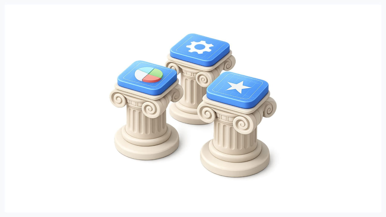
Most logistics platforms fail not because the engineering is bad, but because the design doesn't account for the actual business relationships and operational conditions the software sits inside. Three problems come up consistently.
Fragile Trust Between Shippers and Carriers
Automated tender platforms formalize the transaction but erode the relationship. Carriers bid low to win volume, then raise prices after the contract is signed. Shippers over-book to ensure capacity, then cancel last minute. Both behaviors are rational responses to opacity — neither party knows enough about the other to behave differently.
Design can fix this, but only if the product team treats it as an information architecture problem rather than a feature request. TendrX, a freight tendering platform, addressed this with a social-newsfeed structure that gave shippers visibility into carrier profiles: working conditions, experience by route type, ratings from previous engagements. Shippers could shortlist carriers they'd worked with before and build a preferred network over time. The design didn't eliminate pricing games, but it gave both sides enough context to make better decisions. Transparency here is relationship infrastructure, not a UI nicety.
Price Opacity and Market Blindness
Shippers typically submit tenders without any reference point for what market rates look like. One quote per carrier, no historical trend data, no visibility into whether rates are elevated because of seasonal demand or specific lane pressure. This produces adversarial negotiation by default.
Uber Freight's Lane Explorer tackled this directly with a calendar-based price heatmap — a visual convention borrowed from flight booking interfaces — showing market rate trends across specific lanes two weeks forward. Carriers and shippers could see where prices were likely to move and plan accordingly. The design insight is worth noting: when users need to understand something unfamiliar, borrowing a proven visual convention from a domain they already know cuts cognitive load immediately. Nobody needed to learn a new mental model. They already knew how to read a flight price calendar.
Environmental and Operational Inefficiency
Freight accounts for over 40% of all transport CO2 emissions and roughly 10% of global CO2 emissions, according to research from the International Council on Clean Transportation. Route optimization tools like Greenplan are increasingly relevant not just for sustainability reporting but for direct cost reduction — empty return loads and inefficient routing are both an environmental and a margin problem.
Design must surface this data clearly enough that operators actually act on it. An emissions figure buried in a reporting tab does nothing. A dashboard that shows the cost difference between two routes — one with an empty return leg, one with a load match — produces a different decision. The data exists in most modern logistics platforms. The design question is whether it's placed where operators see it at the moment the decision is being made.
Core UX Principles for Logistics Software

These aren't general UX principles reframed for logistics. They're specific to the constraints of freight, warehouse, and fleet management products.
Design for Information Hierarchy Under Pressure
A dispatcher managing 40 active shipments in a single interface cannot afford to scan for critical information. Color-coded status indicators, persistent alert banners, and strict visual hierarchy between critical and routine items are functional requirements, not aesthetic choices. When a load is delayed, that information needs to be at the top of the interface before the dispatcher even looks for it.
Convoy's dispatcher dashboard handles this with filterable facility metrics — volume, dwell time, incidentals — structured so that outliers surface without the user needing to run a query. The interface assumes the user will be managing exceptions, not browsing data. That assumption should inform the entire information architecture of any logistics platform.
Multi-Role, Multi-Device Architecture
A warehouse manager needs a complex desktop interface with dense data tables and multi-window support. A driver needs a mobile screen that works one-handed, in a moving vehicle, with large tap targets and minimal reading. A dispatcher needs multiple information streams open simultaneously without context collapse. These are not variations of the same interface — they are distinct products that happen to share a data layer.
Role-based UX hierarchy needs to be defined during discovery, not retrofitted after the core product is built. Retrofitting means every role ends up with a compromised version of someone else's interface. The cost of fixing this after launch is high — not just in design hours but in adoption. Operators who get a bad interface in week one rarely give it a second chance. A product design agency that has worked across multiple logistics products will have seen this failure mode before and know how to structure discovery to prevent it.
Real-Time Data Visualization
GPS tracking, live shipment status, warehouse occupancy — logistics data changes by the minute. Static dashboards that require manual refresh fail these users in production conditions. The design standard for logistics platforms is live status indicators, push notifications for exceptions, and non-reload data refresh across map and timeline views.
Maps and timeline components are core to logistics UI, not optional add-ons. A map without live position data is decoration. A timeline that doesn't reflect current delays is worse than no timeline at all, because it creates false confidence. Real-time design is an engineering and design collaboration problem — both sides need to agree on what data can actually be surfaced live before any interface is built around it.
Mobile-First for Field Operations
Drivers and warehouse workers are the heaviest users of logistics platforms by interaction volume, and they're almost never at a desktop. Their interfaces need large tap targets for gloved hands (minimum 44x44px), offline mode for poor connectivity in warehouses and rural routes, voice-command support for hands-free status updates, and QR-scan input wherever typed data entry would otherwise be required.
This last point matters more than it might seem. A driver confirming delivery should tap twice and scan once, not type a reference number into a form. Every additional input step in a field workflow is an error waiting to happen. The mobile design decisions made during the product design phase determine whether field operators use the platform or work around it.
Freight-Type Customization
Temperature-controlled pharmaceutical freight, hazmat chemicals, and automotive parts have distinct compliance requirements, handling workflows, and documentation needs. A single generic freight flow that forces all three into the same form is guaranteed to produce workarounds. Good logistics platforms surface the right fields and validation rules for each freight category — and hide the irrelevant ones.
Shipsta's approach to vertical-specific configuration is a useful reference here. The platform allows freight categories to define their own workflow paths without requiring separate products. The design challenge is making that configurability feel seamless to the end user rather than exposing the underlying complexity.
Key UI Patterns for Logistics Dashboards
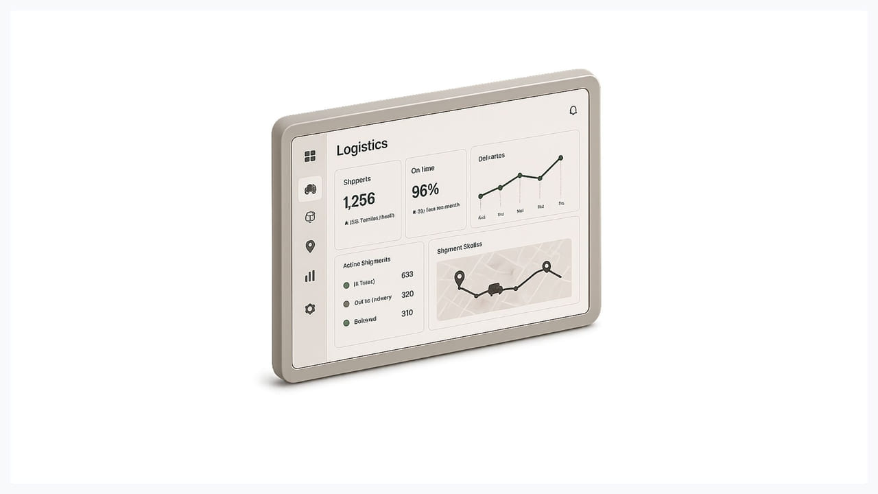
These patterns appear across the best-designed freight and supply chain platforms. They're not universal — the right pattern depends on the specific role and data type — but they've proven out across enough real products to be worth understanding before designing anything from scratch.
The Freight Status Timeline
A linear, color-coded timeline showing the key states of a shipment — Pickup, In Transit, Checkpoint, Delivered — gives every stakeholder instant clarity on where a load stands. The design requirement is that deviations must be visually prominent at the timeline level, not buried in a status dropdown. A yellow indicator on a checkpoint that's 2 hours overdue should be visible without clicking anything.
This pattern works because it matches the mental model that shippers, carriers, and dispatchers already have about how freight moves. It doesn't require learning a new representation. It requires designing the exception states well, which is where most implementations fall short.
Map and Data Table Split-View
Maps show where. Tables show the metrics. Combining both in a split-view layout — map on the left, table on the right — is the proven pattern for fleet management interfaces because it gives spatial context alongside performance numbers without requiring a context switch between screens. A dispatcher can see that truck 14 is in the wrong location on the map and immediately check its schedule in the table without navigating away.
The failure mode for this pattern is trying to put too much in both panes simultaneously. The map should show position and status. The table should show the operational data relevant to the dispatcher's current task. Everything else belongs in a detail view accessible on click.
Role-Based Entry Dashboards
A shipper's homepage on a freight platform should look completely different from a carrier's homepage on the same platform. The shipper needs tender status, carrier responses, and rate comparisons. The carrier needs open tender invitations, upcoming loads, and invoice status. Showing both users a generic "overview" that nobody fully owns is a common failure in multi-sided logistics platforms.
Role-based entry points are not just a UX preference — they directly affect whether users adopt the platform or continue managing their workflows in spreadsheets and WhatsApp threads. This is one of the design decisions with the clearest measurable impact on retention.
The Logistics Product Design Process
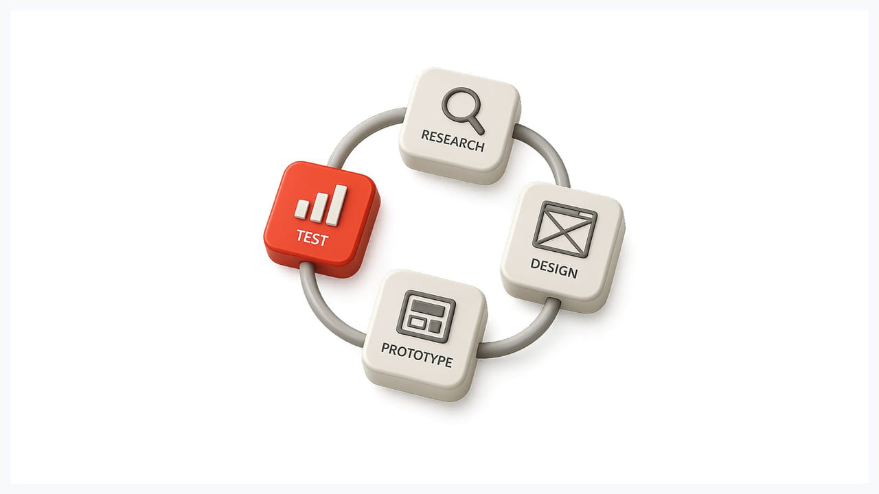
Logistics software designed in isolation — by a team that has never spent time in a dispatch office or a warehouse — tends to solve the problems the product team imagined, not the ones operators actually have. The process matters as much as the output.
Operational Shadowing Before Any Wireframes
You cannot design good logistics software without spending time in the environments where it will be used. A freight office, a warehouse floor, a truck cab. Contextual research reveals the workflows that don't surface in stakeholder interviews — like a dispatcher who keeps a WhatsApp tab open alongside the platform because the in-platform messaging has a 3-second lag that's too slow for exception management. That detail doesn't come out in a product requirements document. It comes out when you watch someone use the product under real conditions.
This is the same principle behind KNAPP's approach to warehouse automation projects: start with deep process analysis before specifying any system. Design decisions made without this context are expensive to fix — not just in revision cycles, but in the adoption problems that follow a launch that doesn't fit how people actually work.
Stakeholder Mapping by Jobs-to-Be-Done
Every role in a logistics platform has a distinct set of jobs they're trying to complete, and those jobs often conflict with each other in ways the interface has to manage. A shipper needs price transparency and carrier reliability data. A carrier needs clear tender requirements and minimal administrative overhead. A dispatcher needs real-time exception visibility and the ability to act on problems without navigating to a different screen. A driver needs route information, delivery confirmation with the fewest possible taps, and an interface that doesn't require reading while driving.
Mapping these jobs before touching a wireframe keeps the design grounded in what the product actually needs to do. It also surfaces the conflicts early — where the shipper's need for transparency creates friction for the carrier, or where the dispatcher's need for dense data creates cognitive overload for a driver using the same interface on a smaller screen.
Business Process Workshops Before UI Design
The full freight lifecycle — sourcing, tendering, dispatch, transit, delivery, invoicing — spans multiple systems, multiple companies, and multiple handoff points where errors propagate downstream. Mapping this entire process before designing any individual screen reveals where the real design problems are.
A login screen doesn't cause delayed shipments. A poorly designed handoff between the tendering module and the dispatch module does. A missing notification at the carrier acceptance stage does. These aren't discoverable by designing screens in isolation. They require mapping the business process end-to-end and identifying where information gets lost, delayed, or misinterpreted. That mapping work belongs at the start of a logistics design engagement, not after the first round of wireframes has already been approved.
If you're building a logistics platform and want to see how this kind of design process works in practice, take a look at our project work or read more about our product design approach.
In Logistics, Bad Design Costs Real Money
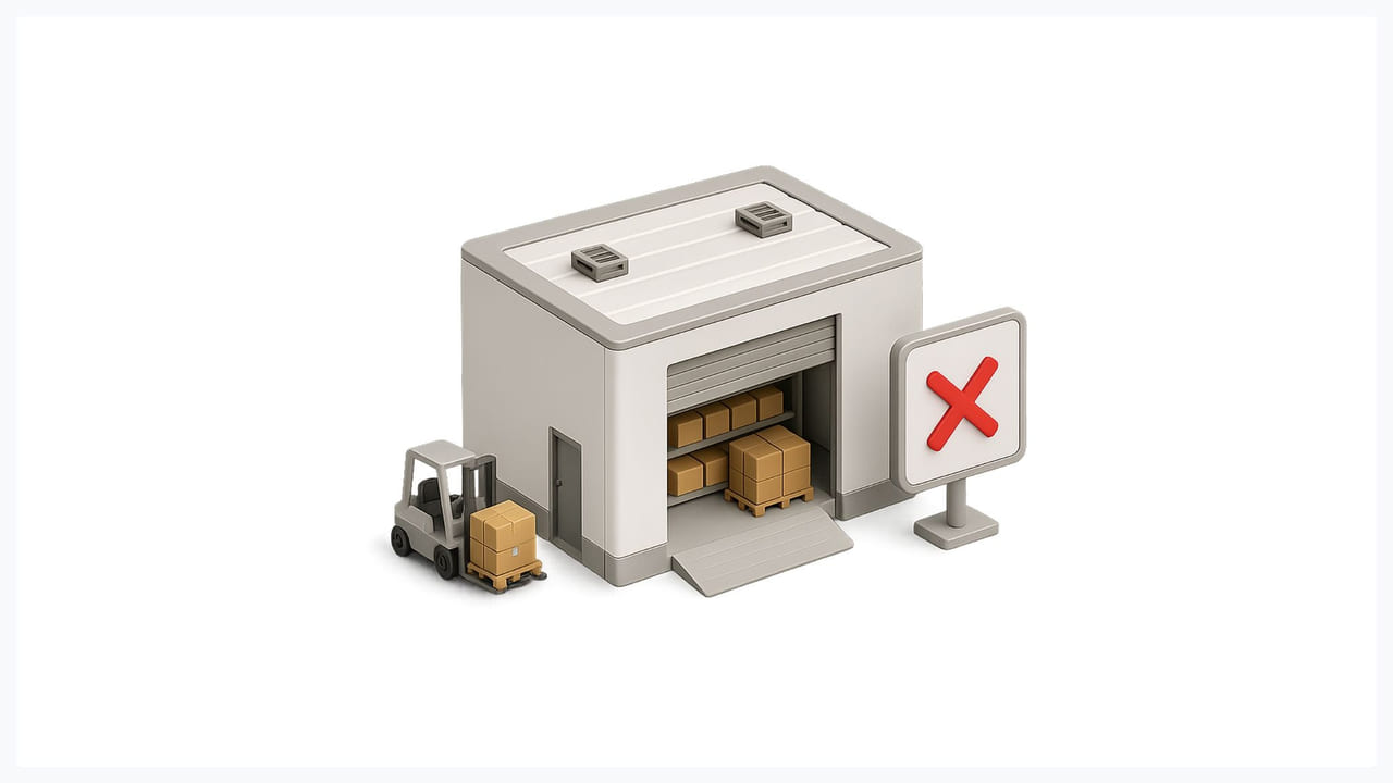
Every minute of dispatcher confusion is a delayed shipment. Every price opacity issue is a damaged carrier relationship. Every mobile interface that doesn't work with gloves is a warehouse error that someone has to correct manually. Logistics software design is operational infrastructure — the same way routing algorithms and warehouse automation are infrastructure. Treating it as aesthetic polish is how products end up with 40% adoption six months after launch.
The platforms that operators actually use share a few things: they were designed with role-specific entry points, they surface exceptions before the user has to look for them, and they were built by teams who spent time in the environments where the software would be used. None of that is technically difficult. It requires the right process and the right design decisions at the right stages of the project.
Glow Team is a UX design agency for complex SaaS products — logistics, supply chain, and freight platforms included. Start with a 3-day free trial — no contracts, no commitment. Or explore our UI/UX design services to see what a logistics design engagement typically covers.
FAQ
What is logistics solution design?
Logistics solution design is the process of designing the software interfaces and digital workflows used to manage freight, inventory, and supply chain operations. It covers the UX and UI of freight management systems (FMS), warehouse management systems (WMS), transportation management systems (TMS), fleet tracking dashboards, tender platforms, and driver-facing mobile applications. The goal is to make complex operational data actionable for dispatchers, warehouse managers, carriers, shippers, and drivers under real-world time pressure.
Why is UX design important for logistics software?
In logistics, a poorly designed interface has direct operational consequences: delayed shipments, routing errors, missed handoffs, and lost carrier relationships. Unlike consumer software, where a bad UX leads to churn, a bad logistics UX leads to measurable business failures. Dispatchers managing dozens of active loads, warehouse workers scanning inventory at speed, and drivers confirming deliveries from the cab all rely on interface clarity to do their jobs without errors.
What are the biggest UX challenges in logistics platform design?
The five most consistent challenges are: designing for multiple user roles with very different technical literacy and device constraints; managing high data density without creating decision paralysis; surfacing real-time alerts and exceptions before users have to look for them; building mobile interfaces that work under field conditions (gloves, poor connectivity, moving vehicles); and designing transparency features that reduce shipper-carrier friction on tender platforms.
How should a logistics software design process start?
With operational shadowing and stakeholder mapping, before any wireframes. Designers need to spend time in the actual environments where the software will be used — dispatch offices, warehouse floors, vehicle cabs — to understand the workflows that don't surface in product requirements documents. The business process (from freight sourcing through to invoicing) should be mapped end-to-end before any individual screen is designed. Design decisions made without this context are expensive to reverse after launch.
What UI patterns work best for logistics dashboards?
Three patterns appear consistently across well-designed logistics platforms: a color-coded freight status timeline that makes shipment state visible at a glance and surfaces deviations without requiring a click; a map-plus-data-table split view that combines spatial context with operational metrics for fleet management; and role-based entry dashboards that show shippers, carriers, and dispatchers different homepages based on their actual jobs-to-be-done.
What is the difference between TMS, WMS, and FMS design?
A transportation management system (TMS) handles the planning, execution, and tracking of freight movements — its design is centered on dispatchers, carriers, and shipment status visibility. A warehouse management system (WMS) manages inventory, picking, packing, and shipping workflows inside a facility — its design is centered on warehouse operators, often with barcode/QR scanning and mobile-first interfaces. A freight management system (FMS) typically covers tendering, carrier selection, and rate management — its design has to serve both shippers and carriers as distinct user roles on the same platform.
How do you design logistics software for drivers specifically?
Driver interfaces need to be treated as a separate design problem from dispatcher or warehouse interfaces. The requirements are specific: large tap targets for gloved hands (minimum 44x44px), offline mode for poor connectivity on rural routes, QR-scan input to replace manual data entry wherever possible, voice-command support for hands-free status updates, and delivery confirmation flows that complete in the fewest possible taps. A driver confirming a delivery should not need to fill in a form. Any interface complexity that requires reading while operating a vehicle is a safety and usability failure.

.svg)

Related Articles Prompted by Glow





























Get weekly glow prompts—
insights from the frontline of product design
Check your inbox for future updates.

No spam.
Just sharp insights that make you better at design & AI.
Want results like this? Book a call
Let's talk through your product in 20 minutes — no briefs, no fluff. Just a real conversation.