Guide to Creating a Great Blockchain UX (2026)

Master blockchain UX design with actionable strategies for simplifying onboarding, building trust, handling irreversibility, and designing for Web3 users in 2026.
Most people never complete their first blockchain transaction. They open a wallet app, encounter a seed phrase, see a gas fee denominated in a unit they have never heard of, and close the tab forever. The technology beneath that experience may be revolutionary, but the interface on top of it is often hostile to anyone who was not already a crypto native before they arrived.
This is not a technology problem. The protocols work. The consensus mechanisms are battle-tested. The real bottleneck to mainstream adoption is blockchain user experience - the gap between what decentralized products can do and what ordinary users feel capable of doing. In a market where dozens of wallets, exchanges, and DeFi platforms compete for the same user, UX is not a nice-to-have; it is the competitive moat. This guide to creating blockchain UX walks you through the most common failure modes, the strategies to fix them, and the design process that keeps your product accessible as it scales.
Quick Summary (Key Takeaways)
Core Challenge: Blockchain UX must bridge the gap between the complexity of decentralized systems and user demand for simplicity, security, and speed.
5 Key Areas:
- Simplified Onboarding - Social logins, mobile-first, progressive disclosure.
- Transparency & Education - Real-time TX status, human-readable addresses, tooltips.
- Designing for Irreversibility - TX previews, address validation, calm warnings.
- Performance & Reliability - L2 solutions, smart fee tiers (Slow / Average / Fast), graceful errors.
- Trust by Design - Calm UI, natural security patterns, consistency.
Area Challenge Solution Onboarding Seed phrase complexity Social login, Account Abstraction Transactions Fear of irreversibility Clear previews, address validation Jargon Gas, Hash, Wallet Plain language, tooltips Latency Long confirmation times Real-time status, L2 usage Security Self-managed keys Biometrics, social recovery
Onboarding
- ChallengeSeed phrase complexity
- SolutionSocial login, Account Abstraction
Transactions
- ChallengeFear of irreversibility
- SolutionClear previews, address validation
Jargon
- ChallengeGas, Hash, Wallet
- SolutionPlain language, tooltips
Latency
- ChallengeLong confirmation times
- SolutionReal-time status, L2 usage
Security
- ChallengeSelf-managed keys
- SolutionBiometrics, social recovery
Why Blockchain UX Is Uniquely Hard
Every design discipline has constraints, but blockchain products carry one that most software never faces: there is no "undo" button. A mistyped address, a confirmed transaction with the wrong amount, a lost private key - each mistake is permanent and potentially expensive. This single characteristic reshapes the entire design philosophy.
In traditional SaaS, errors are recoverable. Users can reset passwords, reverse payments, and contact support. In blockchain UX design, every interaction carries real financial risk, so every screen must earn the user's trust, pixel by pixel. The interface cannot merely display information; it must protect the user from the consequences of the technology's own immutability.
This is also why generic UI/UX principles, while necessary, are not sufficient. Blockchain products require a specialized layer of design thinking - one that accounts for irreversibility, self-custody, and a user base that ranges from protocol engineers to first-time crypto buyers. Teams that understand how to simplify confusing navigation in complex products have a head start, but blockchain demands even more rigor.
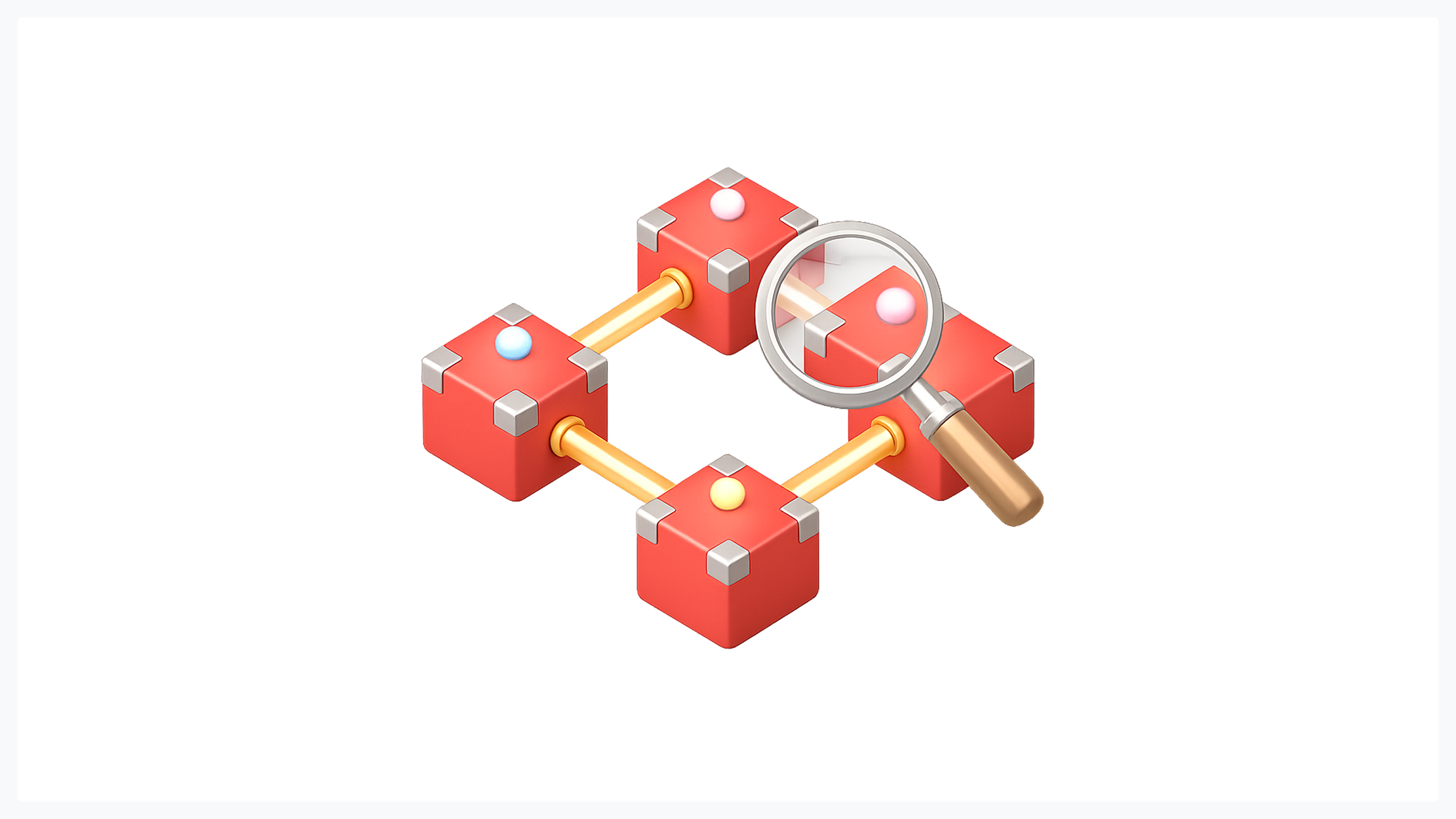
The 5 Most Common Blockchain UX Problems
Before building solutions, it helps to diagnose the failure modes that kill blockchain products today. These five issues account for the vast majority of user drop-off.
1. Arcane Terminology
"Gas," "seed phrase," "Merkle tree," "nonce," "Gwei" - the vocabulary of blockchain was invented by cryptographers for cryptographers. Dropping these terms into an interface without explanation is like handing a first-time driver a Formula 1 steering wheel.
The fix is plain language paired with progressive education. Replace "gas fee" with "network fee" and add a tooltip that explains the concept for curious users. Use "recovery phrase" instead of "seed phrase." Every piece of jargon that survives into the final UI should be accompanied by a contextual explanation that a non-technical user can absorb in under five seconds. This approach to Web3 UX best practices applies universally across wallets, DeFi platforms, and NFT marketplaces.
2. Difficult and Confusing Onboarding
Wallet setup is where most new users abandon the journey. The typical flow - download the app, generate a seed phrase, write down 12 words on paper, verify them in random order - is terrifying for someone used to signing up with Google in 2 taps.
Modern onboarding solutions include social login alternatives (using email or OAuth via account abstraction), guided multi-step flows with progress indicators, and mobile-first QR-based wallet connections. The goal is not to hide complexity but to stage it: let users start with the simplest possible path and introduce advanced features as their confidence grows. This is progressive disclosure applied to the blockchain user experience, dramatically reducing first-session churn.
3. No Explanation of What's Happening
A user initiates a token swap. The button goes gray. Ten seconds pass. Thirty seconds. Nothing. No status bar, no animation, no confirmation. The user wonders: Did it work? Should I try again? Is my money gone?
Transaction feedback is not optional in blockchain products. A clear lifecycle indicator - Pending → Confirming → Success (or Failed with a reason) - is mandatory. Showing the number of confirmations, an estimated completion time, and a link to the block explorer transforms an anxious wait into an informed one. Blockchain UX design lives or dies on feedback loops.
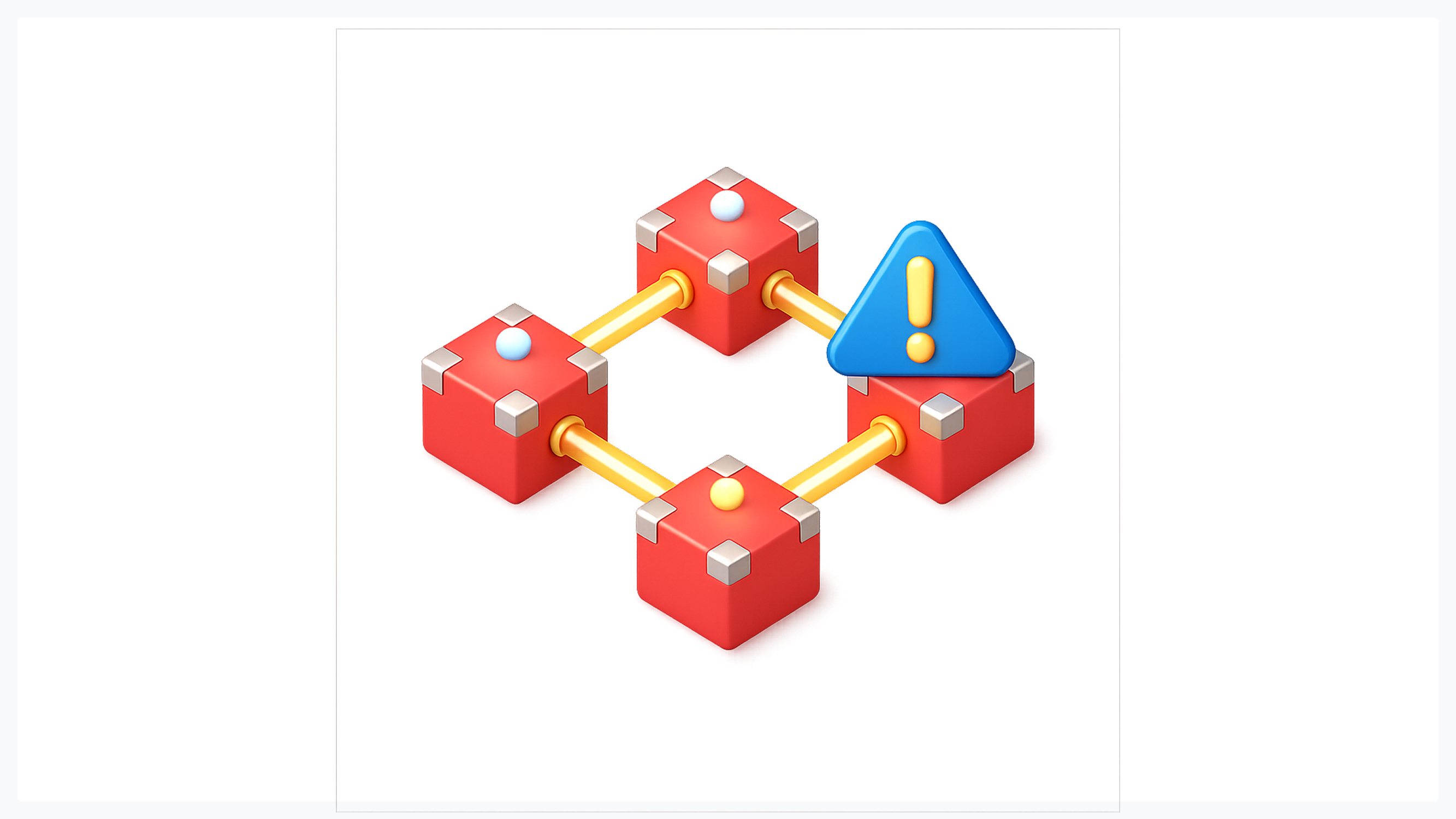
4. Vague and Alarming Security Warnings
"Warning: this action is irreversible" is technically accurate and practically useless. It creates panic without providing context or guidance. Users either freeze (and abandon the action) or habituate (and ignore all future warnings, including the ones that matter).
Effective security warnings are calm, contextual, and actionable. Instead of a generic alert, show exactly what will happen: "You are sending 0.5 ETH ($1,230) to alice.eth. This cannot be reversed once confirmed." The warning becomes a pre-flight checklist rather than a scare tactic.
5. Unclear Fees and Financial Information
Displaying gas fees in Gwei is meaningless to 99% of users. Even showing fees in ETH is unhelpful if the user thinks in dollars. The best Web3 UX best practices for fee display include showing the cost in the user's local fiat currency, offering a speed tier selector (Slow / Average / Fast with corresponding costs and times), and providing a total cost summary that includes both the transaction amount and the fee before confirmation.
5 Strategies for Building Great Blockchain UX
With the problems mapped, here are five strategies that address them systematically. Any thorough guide to creating blockchain UX must move beyond diagnosis and into actionable solutions.
1. Simplify Onboarding with Progressive Disclosure
Do not show everything on day one. A new user needs to accomplish one thing - their first successful transaction - not understand the entire protocol. Design the onboarding flow around that single goal, and defer wallet backup, advanced settings, and network selection to later sessions.
Mobile-first design is especially important here: most crypto-curious users discover products on their phones, and a seamless mobile experience with QR wallet connections and biometric authentication removes friction that desktop-first designs often introduce. Teams building in this space can draw on product design principles for Web3 to structure their onboarding around user confidence rather than protocol completeness.
2. Prioritize Transparency Through Real-Time Feedback
Every state change should be visible. Transaction submitted, transaction pending, transaction confirmed - each stage needs its own visual treatment. Use ENS names or address truncation with identicon avatars (Blockies) instead of raw 0x addresses to make destinations recognizable at a glance.
Transparency extends beyond transactions. If the network is congested, say so. If estimated wait times are longer than usual, show that. Users can tolerate latency; what they cannot tolerate is silence. This principle is at the core of blockchain UX design: status equals trust.
3. Design for Irreversibility - Prevent Errors First
Because there is no undo, the interface must prevent mistakes before they happen. Pre-transaction summaries that clearly show the recipient, amount, fee, and total cost should appear on a dedicated confirmation screen - not a modal that users click through reflexively.
Visual address validators like Blockies (colored geometric patterns generated from Ethereum addresses) give users a visual fingerprint to recognize addresses by. If the Blockie for an address looks different than last time, something may be wrong. Combine this with calm warnings for high-risk actions - such as large transfers, unfamiliar contracts, or first-time recipients - and you create a safety net that respects autonomy without overwhelming the user.
4. Optimize Performance and Handle Failures Gracefully
Layer 2 solutions like Polygon, Arbitrum, and Optimism can reduce transaction times from minutes to seconds and fees from dollars to fractions of a cent. If your product supports L2, set it as the default for everyday transactions and offer L1 as an explicit option for users who need it.
When failures happen - and they will - the error message should be actionable. "Transaction failed: insufficient gas" is better rendered as "This transaction didn't go through because the network fee wasn't high enough. Retry with a higher fee?" Never show raw error codes. Every error is a design opportunity to maintain trust.
5. Build Trust Through Design, Not Disclaimers
Trust in blockchain products cannot be established by stacking legal disclaimers at the bottom of the page. It is built through calm, consistent, professional interfaces that signal competence and care. A polished UI suggests a polished codebase; a sloppy interface suggests sloppy security.
Security features should feel natural, not intrusive. Biometric authentication, auto-lock timers, and social recovery flows should integrate seamlessly into the product rather than appearing as bolted-on afterthoughts. The same design-for-trust principles that apply in fintech apply with even greater intensity in blockchain, where users are their own banks. Consistency - in spacing, typography, color, and interaction patterns - is the cheapest trust signal a designer can deploy.
The Blockchain UX Design Process

A great blockchain user experience does not emerge from a single brainstorm. It follows a structured process - and no guide to creating blockchain UX is complete without one - that prioritizes user evidence over protocol enthusiasm.
Step 1 - Research Your Users (Not the Protocol)
The most common mistake in blockchain product design is starting with the technology. "We use zk-rollups and account abstraction" is an engineering brief, not a user insight. Start instead by segmenting your audience: crypto-native users (who understand wallets, gas, and contract interactions) versus crypto-curious users (who have heard of Bitcoin but have never held a token).
Design for the newcomer. Crypto-native users will tolerate a less-polished interface because they understand the underlying mechanics. Crypto-curious users will not. If your product targets mainstream adoption, every design decision should be validated against the question: "Would my non-technical parent understand this screen?" User research at this stage - interviews, surveys, usability tests with first-time users - is the single highest-ROI investment a blockchain team can make.
Step 2 - Build an MVP or PoC First
Do not design forty screens before a single user has touched the product. Build a minimum viable product that covers the core flow - connect wallet, execute one transaction, see the result - and put it in front of real users. Their reactions will reveal assumptions your team did not know it was making.
An MVP also forces prioritization. When you only have resources for five screens, you cannot waste one on a feature nobody asked for. This discipline is valuable in blockchain, where the temptation to expose every protocol capability often leads to interfaces that serve developers' egos rather than users' goals.
Step 3 - Test, Iterate, and Audit
Usability testing should be continuous, not a one-time event. Every major release deserves a round of moderated testing with users from both segments (crypto-native and crypto-curious). For existing products, a formal UX audit can identify the specific friction points - confusing labels, missing feedback, hostile error messages - that are driving drop-off.
The iteration cycle in blockchain products is particularly important given the rapid pace of ecosystem change. New wallet standards, new L2 networks, new token types - each introduces UX implications that must be absorbed into the product. Teams that adopt structured UX frameworks are better equipped to handle this velocity without sacrificing consistency.
Blockchain UX Patterns by Product Type
Not all blockchain products face the same UX challenges. The priorities shift by product category, and applying Web3 UX best practices requires adapting to each context.
Cryptocurrency Wallets
The wallet is the front door to all of Web3. Its primary UX challenge is balancing security with simplicity. Users need to manage private keys, view balances across multiple networks, and send or receive tokens - all without a centralized recovery process.
Key patterns: social recovery and account abstraction for onboarding, biometric authentication for daily access, clear asset grouping by network, and a transaction history with human-readable descriptions rather than raw hashes.
DeFi Platforms
Decentralized finance introduces financial complexity on top of blockchain complexity. Users must understand liquidity pools, yield rates, impermanent loss, and slippage - concepts that even traditional finance professionals struggle with.
Key patterns: progressive disclosure of advanced parameters (hide slippage tolerance behind an "Advanced" toggle), portfolio dashboards showing net position in fiat terms, risk indicators for high-APY pools, and clear before/after previews for every transaction. Web3 UX best practices in DeFi demand that the interface protect users from financial mistakes as aggressively as from technical ones.
NFT Marketplaces
NFT platforms are closer to e-commerce than to financial infrastructure, benefiting from familiar shopping patterns - grids, filters, favorites. The blockchain-specific challenges are gas-efficient minting flows, clear royalty and fee breakdowns, and provenance displays that let buyers verify authenticity without leaving the product.
Key patterns: lazy minting to defer gas costs until sale, batch-action interfaces for collection management, and social proof indicators (creator verification badges, floor prices). Applying UX design principles from product-focused agencies ensures that the marketplace itself matches the quality of the art it hosts.
Conclusion: UX Is the Real Web3 Challenge
The technology is solved. Consensus works. Smart contracts execute. Layer 2 networks offer speed and affordability that rival those of centralized alternatives. What remains unsolved is the human layer - the interface between a powerful protocol and a person who wants to accomplish a task without fear.
This is why blockchain UX design is not a sub-specialty of product design; it is the central challenge of the entire Web3 industry. The teams that invest in blockchain user experience now - researching their users, simplifying their onboarding, building trust into every pixel - will define the next decade of adoption. The teams that treat UX as a coat of paint over a smart contract will watch their users leave for competitors whose experiences feel effortless.
Every guide to creating blockchain UX eventually arrives at the same conclusion: the product that wins is not the one with the most features or the fastest chain. It is the one that makes the user forget they are using a blockchain at all. If your Web3 product is losing users at onboarding, confusing them mid-transaction, or failing to earn their trust, the answer is not more engineering - it is better design. Explore how Glow Team approaches product design for complex, high-stakes digital products, from AI-powered platforms to blockchain applications, and see what happens when UX becomes the strategy, not the afterthought.

.svg)

Related Articles Prompted by Glow


Get weekly glow prompts—
insights from the frontline of product design
Check your inbox for future updates.

No spam.
Just sharp insights that make you better at design & AI.