Design and Psychology: Ultimate Guide


Master cognitive load, emotional design, and behavioral laws for superior UX.
Every pixel on your screen is competing for a scarce resource: human attention. The apps we love - the ones we open without thinking - don't win because of flashier gradients or trendier typefaces. They win because someone on the design team understood how the brain actually works. That understanding sits at the crossroads of UX Design and Psychology, a discipline that treats cognitive science not as academic trivia but as a practical toolkit for building better products.
Strip away the jargon, and the truth is simple: users don't read interfaces, they scan them. They don't calculate options; they feel their way to a decision. The psychology of UX explains why a checkout flow that "looks fine" still bleeds conversions, or why users keep tapping the wrong button even though it's right there. When you design with the brain in mind, you stop guessing and start predicting.
This guide will walk you through the core psychological frameworks, laws, and principles that separate forgettable interfaces from products people genuinely enjoy. Whether you are a product manager, a startup founder, or a designer refining your craft, understanding psychology in UI/UX design will give you an unfair advantage - one rooted not in trends, but in neuroscience.
Quick Summary (Key Takeaways)
Definition: UX Design Psychology is the practice of applying cognitive and behavioral principles to digital products to create intuitive, emotionally resonant interfaces.
Success Factors:
- Cognitive Load - Minimize mental effort at every step.
- Predictability - Match users' mental models so interactions feel familiar.
- Emotional Response - Design on three levels: Visceral, Behavioral, and Reflective.
If you remember nothing else from this article, remember those three pillars. They are the lens through which every law, heuristic, and principle below should be evaluated. Reduce effort, meet expectations, spark the right emotion - and your product will outperform competitors who design by intuition alone.
The Three Pillars of Design Psychology
Before diving into specific laws, it helps to understand the two branches of psychology that inform interface design. Think of them as two lenses on the same user: one explains how people process information, the other explains why they act on it.
Cognitive Psychology
Cognitive psychology studies perception, memory, and information processing - the mental machinery running behind every click. When a user lands on your homepage, their brain is doing three things almost simultaneously: filtering visual noise, recognizing patterns, and storing a rough "map" of the page in working memory.
This matters for designers because working memory is tiny. Decades of research confirm that humans can hold only a handful of items in active thought at once. Overload that buffer and users freeze, second-guess themselves, or leave. The psychology of UX translates this finding into a practical imperative: every screen should present only what is needed right now, nothing more.
Perception is equally important. Users don't read left to right like a novel; they follow F- or Z-shaped scan patterns. Knowing where the eye lands first lets you place critical elements - CTAs, pricing, error messages - exactly where attention naturally goes. If you are building a product from scratch, a solid UX design framework can help you systematize these cognitive insights from day one.
Behavioral Psychology
If cognitive psychology tells us how people process a screen, behavioral psychology tells us why they click. This branch focuses on motivation, reward loops, and decision-making triggers - the forces that turn passive viewers into active users.
Behavioral design borrows heavily from this tradition. Variable rewards (think pull-to-refresh), loss aversion ("Only 2 left in stock!"), and social proof (star ratings, testimonial counts) are all behavioral levers. Used ethically, they remove friction and guide users toward outcomes that benefit everyone. Used carelessly, they become dark patterns - a distinction we will revisit later.
Understanding behavioral triggers is especially critical in fields like fintech and e-commerce, where a single moment of hesitation can cost a conversion. The key insight is that most decisions are not rational; they are emotional shortcuts refined by habit. Behavioral design respects this reality instead of fighting it.
5 Psychological Laws for Better UX
Theory is useful, but designers need rules they can apply in Figma on Monday morning. The following five laws bridge the gap between laboratory research and interface work.
Hick's Law (Choice Overload)
Hick's Law states that the time it takes to make a decision increases logarithmically with the number of choices. In plain language: more options equal slower (and more stressful) decisions.
The classic example is the navigation bar. A mega-menu with forty links might technically be "comprehensive," but it paralyzes users who just want to find pricing. Psychology in UI/UX design suggests a better approach: progressive disclosure. Show top-level categories first, then reveal sub-options on demand. Apple's product pages are a masterclass in this - minimal choices up front, deeper specs available with one click.
Practical takeaway: audit every screen for decision points. If a user has to choose among more than five or six options at once, consider grouping, filtering, or staging those choices across multiple steps.
Fitts's Law (Interactive Targeting)
Fitts's Law quantifies something designers intuitively know: the larger and closer a target is, the faster a user can reach it. The formula itself involves distance and width, but the design implication is straightforward - make important buttons big and place them where the cursor (or thumb) already is.
This law explains why mobile designers place primary actions in the "thumb zone" (the lower third of the screen) and why floating action buttons in Material Design are oversized circles. It is also why tiny "X" icons on modal pop-ups are universally frustrating - they violate Fitts's Law at the exact moment when the user's patience is thinnest.
When applying UX design and psychology to interactive elements, always ask: "Can the user hit this target on the first try, even in a hurry?" If the answer is no, increase the tap area or move the element closer to the user's natural resting position.
Miller's Law (The Magic Number 7)
In 1956, cognitive psychologist George Miller published a landmark paper arguing that human short-term memory can hold roughly seven items (plus or minus two). While subsequent research has refined that number downward - many experts now cite three to five "chunks" - the design principle remains valid: group information into digestible clusters.
Phone numbers are chunked into area codes, prefixes, and line numbers for exactly this reason. In interface design, Miller's Law justifies breaking long forms into multi-step wizards, limiting dashboard cards to a manageable number, and using whitespace to chunk related content visually.
The psychology of UX lessons here is humility: your user's brain is not a spreadsheet. If you force people to hold more than a few items in mind at once, error rates climb and satisfaction drops. Chunk relentlessly.
Gestalt Principles: Grouping Information
Long before digital screens existed, early twentieth-century Gestalt psychologists discovered that the human brain automatically organizes visual input into patterns. Three of their principles are especially relevant to psychology in UI/UX design.
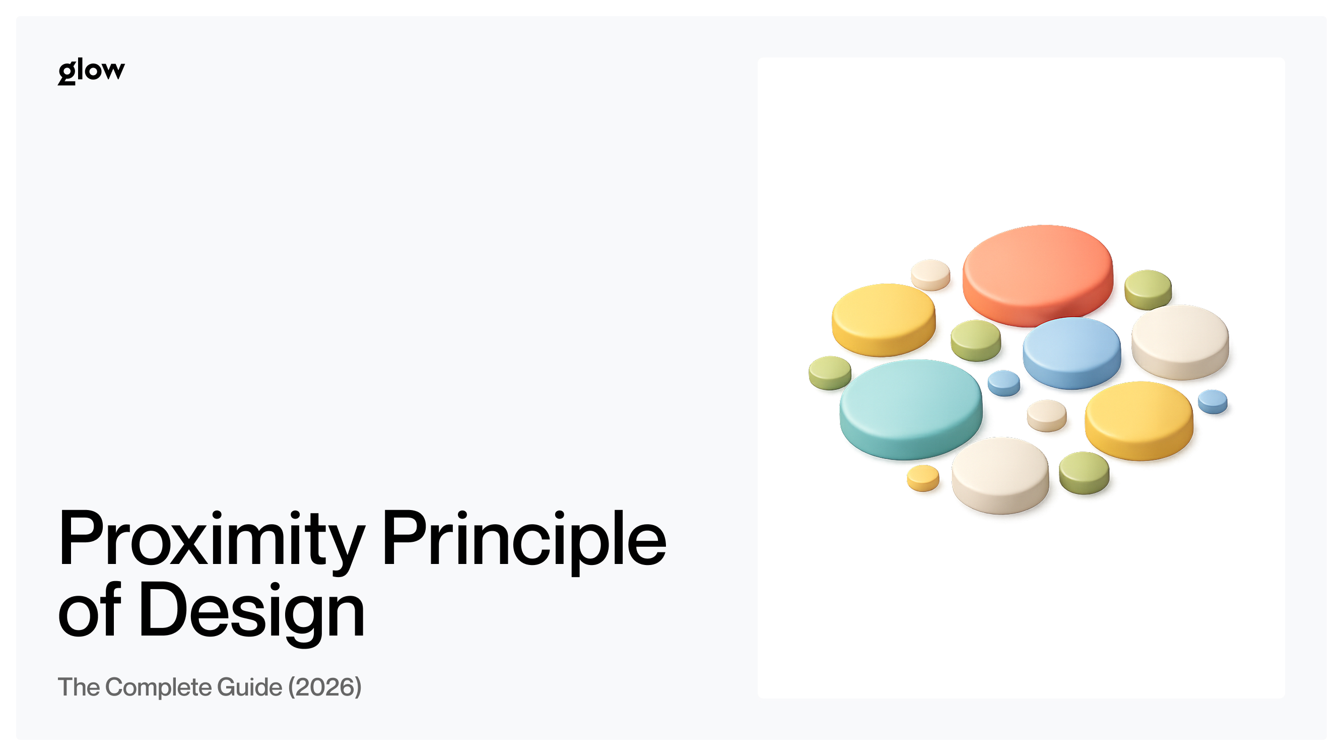
- Proximity. Elements placed close together are perceived as belonging to the same group. This is why spacing between form fields within a section should be tighter than spacing between sections. Inconsistent spacing confuses the brain's automatic grouping, leading to input errors and slower completion rates.
- Similarity. Items that share color, shape, or size are perceived as related. A dashboard where all actionable buttons are the same shade of blue and all informational tags are gray instantly communicates which elements do what - no label necessary. This principle underlies every robust design system and component library.
- Continuity. The eye naturally follows lines, curves, and aligned edges. A well-aligned layout feels "clean," not because of aesthetic preference but because continuity reduces the number of visual fixations the brain needs to parse the page. Broken alignment forces the eye to restart its scan, which is cognitively expensive.
Together, these principles explain why two wireframes with identical content can feel radically different: one respects how the brain groups information, and the other fights it. If you are designing a product from the ground up, incorporating Gestalt thinking early prevents costly redesigns later. Glow Team apply these grouping principles as part of their foundational UX process, ensuring that layouts are rooted in perception science rather than personal taste.
Emotional Design (Don Norman's Framework)
Functionality and usability are necessary - but insufficient. Don Norman, the cognitive scientist who coined the term "user experience," argues that products must also engage people emotionally. His three-level framework has become a cornerstone of psychology-driven product design.
- Visceral Level. This is the gut reaction - the first 50 milliseconds. Before a user reads a single word, they have already decided whether your product feels trustworthy, modern, cheap, or delightful. Color palettes, typography, whitespace, and imagery all operate at this level. A visceral response cannot be reasoned away; it is pre-conscious.
- Behavioral Level. Here, the user is actually doing something: filling out a form, swiping through photos, completing a purchase. The behavioral level is about flow and feedback. Does the interface respond instantly? Do error messages explain what went wrong and how to fix it? Is the "happy path" frictionless? When behavioral design aligns with the emotional level, the product feels effortless.
- Reflective Level. After the interaction, the user thinks back. Was the experience worth sharing? Does the brand align with the user's self-image? Reflective design is why people display Apple products on their desks and post their Spotify Wrapped results on social media - the product becomes a statement of identity. This level is harder to engineer, but it generates the deepest loyalty.
Norman's framework reminds us that psychology in UI/UX design is not just about reducing errors and speeding up task completion. It is about creating moments of genuine satisfaction - visceral, behavioral, and reflective - that keep users coming back. If you want to see how emotional design translates to emerging product categories, the article on future trends in UX design explores how AI and personalization are pushing this frontier forward.
Ethical Design vs. Dark Patterns
Every psychological principle in this guide is a double-edged sword. Hick's Law can simplify a checkout flow - or it can hide the "unsubscribe" option behind five screens. Scarcity cues can honestly signal that stock is low - or they can manufacture fake urgency to pressure a purchase. The line between ethical persuasion and manipulative dark patterns is drawn by a single question: whose interests does the design serve?
Behavioral design is ethically sound when it aligns the user's goals with the business's goals. A well-placed progress bar in an onboarding flow genuinely helps users complete setup while also improving the company's activation metrics. That is a win-win.
Dark patterns, by contrast, exploit cognitive biases that run counter to the user's interests. Pre-checked boxes that sign people up for newsletters, "confirmshaming" copy ("No thanks, I don't like saving money"), and labyrinthine cancellation all erode trust. They may boost short-term metrics, but they poison long-term brand perception and, increasingly, attract regulatory scrutiny.
Practicing UX design and psychology responsibly means building internal checks: design reviews that flag coercive patterns, user testing that measures not just task success but emotional sentiment, and a team culture that treats user well-being as a genuine KPI. For a deeper look at how ethical, user-centered design works in high-stakes environments, the case studies illustrate how trust and transparency become competitive advantages.
Designers who want to build AI-powered products face an additional ethical layer: algorithmic personalization can improve the experience, but it can also create filter bubbles and manipulate behavior at scale. The AI for UX design overview discusses practical safeguards for teams working at this intersection.
Conclusion: Designing for Humans
Pixels change. Frameworks rise and fall. The JavaScript library everyone swears by this year will be a footnote by the next. But neurons? Neurons stay the same.
The principles in this guide - Hick's Law, Fitts's Law, Miller's Law, Gestalt grouping, Norman's emotional levels - are not design fads. They are descriptions of hardware that has been running the same firmware for tens of thousands of years. That is what makes psychology in UI/UX design such a durable competitive advantage: while tools and trends rotate, the brain your user brings to the screen does not.
Understanding the psychology of UX does not mean turning every designer into a neuroscientist. It means cultivating a habit of asking why before asking how. Why do users hesitate here? Why does this layout feel cluttered even though it has fewer elements? Why does one onboarding flow convert at twice the rate of another? The answers almost always trace back to a cognitive or behavioral principle.
Start small. Pick one law from this guide - say, Hick's Law - and audit your current product for violations. Reduce choices on your busiest screen. Measure the impact. Then move to the next principle. Over time, UX design and psychology become not a separate discipline but the default way your team thinks about every interface decision.
Because in the end, design is not about making things look good. It is about making things work - for a brain that evolved long before screens existed, and will outlast whatever device we design for next. If you need a partner who approaches product design with this mindset, explore Glow Team's services and see how psychology-driven design can transform your digital product into something users not only use but remember.

.svg)

Related Articles Prompted by Glow


Get weekly glow prompts—
insights from the frontline of product design
Check your inbox for future updates.
No spam.
Just sharp insights that make you better at design & AI.