Mental Models vs. Conceptual Models: The UX Design Guide (2026)

Master the difference between Mental Models (what users believe) and Conceptual Models (what you design). Learn how to align them for intuitive UX.
Design isn't about pixels. It never was. At its core, design is applied psychology - the art of predicting how a human brain will interpret what's on a screen and then shaping that screen to match. And no concept in UX psychology causes more confusion than the relationship between mental models and conceptual models.
The terms sound interchangeable. They're not. One lives inside your user's head. The other lives inside your product. When they align, the interface feels invisible. When they clash, users click the wrong button and blame themselves - when the real failure belongs to the designer who didn't understand the gap.
This guide breaks down both concepts, explains why the conceptual model vs mental model distinction matters more than ever in 2026, and offers practical methods for aligning them.
Quick Summary (Key Takeaways)

If you need the essentials before the deep dive:
- Mental model - the user's internal, subjective understanding of how a system works. It's shaped by experience, cultural context, and assumptions. It's often incomplete and sometimes wrong.
- Conceptual model - the designer's intended framework for how a system should be understood. It's embedded in the interface through layout, metaphors, labels, and interactions.
- The core difference: mental models are discovered (through research), conceptual models are designed (through intention).
- The goal: minimize the gap between the two. When users' expectations match the system's behavior, friction disappears.
- The risk: when models collide, users don't read documentation - they leave.
What Is a Mental Model? (The User's View)

A mental model is the picture inside a user's head of how something works. Not how it actually works - how they believe it works. This distinction is everything.
When someone opens a new email app, they don't arrive with a blank mind. They have years of experience with Gmail, Outlook, or Yahoo Mail. They expect the inbox at the top, a compose button in an obvious place, and a trash folder that works like a physical wastebasket. These expectations form their mental model.
Jakob Nielsen formalized this into Jakob's Law: users spend most of their time on other sites, so they prefer your site to work the same way. It's not laziness - it's how the brain conserves energy. Familiar patterns require less cognitive effort, meaning faster decisions and fewer errors.
Understanding mental models in UX design starts with accepting an uncomfortable truth: the user's model is always right - for them. It doesn't matter that your navigation is "objectively" better organized. If it contradicts how the user expects things to work, it's wrong.
Characteristics of Mental Models
Mental models are not static blueprints. They shift, evolve, and carry specific traits that designers must account for:
- They are simplifications. No user holds a complete model of any system. A person using Google Docs doesn't think about collaborative conflict-resolution algorithms - they think, "I type, it saves."
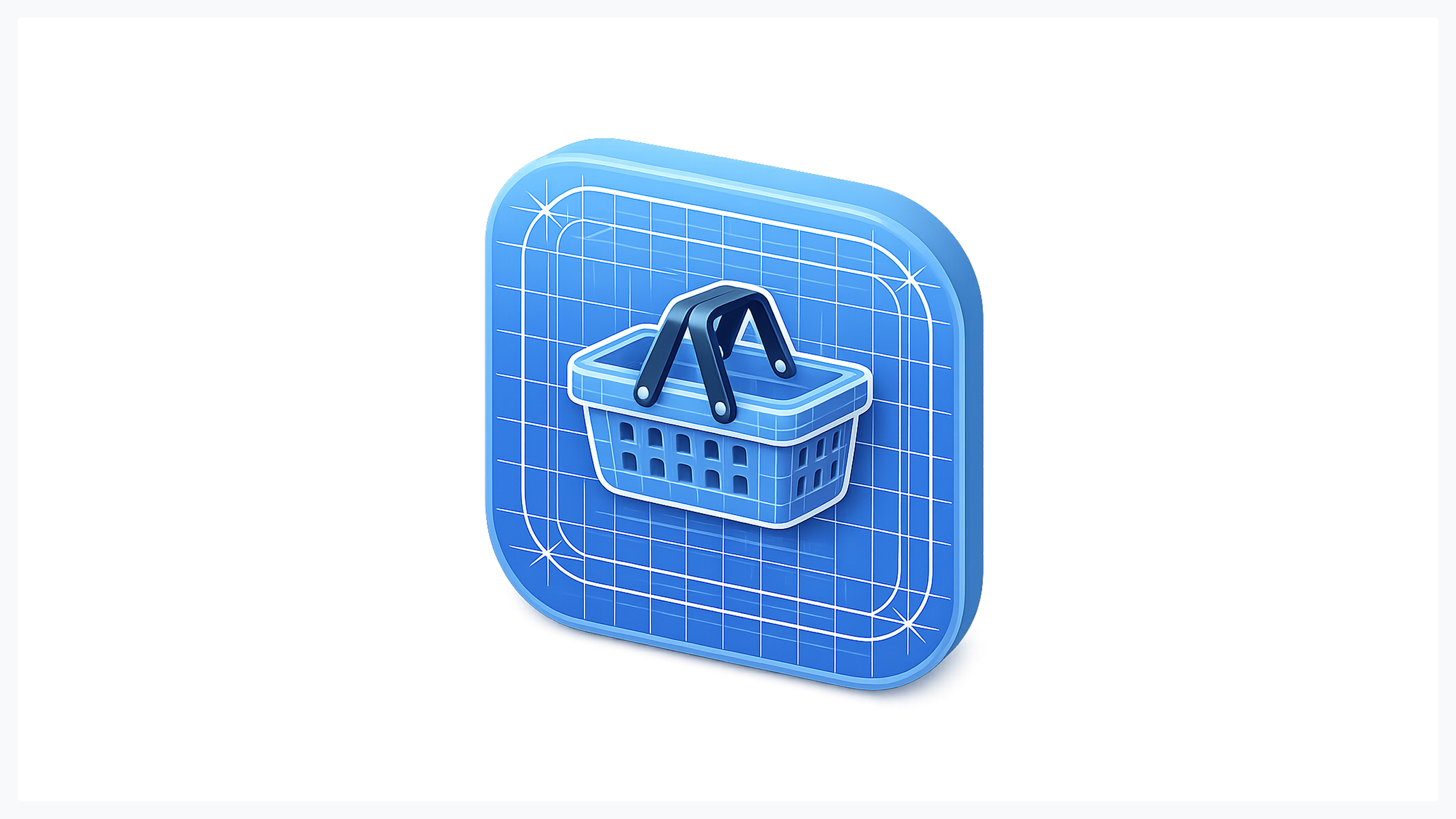
- They are shaped by analogy. People understand new things by mapping them onto familiar ones. A "shopping cart" in e-commerce works because everyone has pushed a physical cart through a store.
- They change over time. A first-time Figma user has a different mental model than a three-year veteran. Good design supports both the beginner's simplified view and the expert's richer one.
- They are culturally influenced. Reading direction, color associations (red as danger vs. red as luck), and interaction conventions vary across cultures. A model that works in Stockholm may fail in Tokyo.
What Is a Conceptual Model? (The Designer's View)
If a mental model is the user's guess about how the system works, a conceptual model is the designer's answer. It's the intended logic of the product - the structure that determines what things are called, how they relate, and what happens when you interact with them.
Don Norman, in "The Design of Everyday Things," introduced the "system image" - the sum of all signals a product sends through its interface, documentation, and behavior. The conceptual model is what the designer embeds in that image, hoping the user will extract the correct mental model from it.
A well-crafted conceptual model in UX answers fundamental questions before the user asks them: What can I do here? What will happen if I tap this? Where did my data go? How do I get back? The model doesn't answer these questions with text - it answers them with structure, visual hierarchy, and interaction patterns.
Creating a Consistent System
A conceptual model fails the moment it contradicts itself. If swiping left deletes an email in the inbox but archives it in the spam folder, the model is broken. Consistency is not a nice-to-have - it's the foundation.
Building a consistent conceptual model requires cohesion across every touchpoint (the same action should produce the same result everywhere), feedback loops that confirm user actions (the system should always respond to input, even if it's just a subtle animation), and meaningful metaphors that carry through the entire product (if your app uses a "notebook" metaphor, folders should look like tabs, not like server directories).
This is where UX design psychology meets systems thinking. The designer must hold the complete model in mind while the user only sees fragments. Every fragment must feel like it belongs to the same whole. Professional teams like Glow Team approach this challenge systematically, building design systems that bake conceptual consistency into components rather than leaving it to individual screen decisions.
The Core Conflict: When Models Don't Match
Here's where theory becomes pain. When the user's mental model and the designer's conceptual model diverge, the result is what Don Norman called the "Gulf of Execution" - the gap between what the user wants to do and how they figure out how to do it.
The gulf manifests as hesitation ("Which button do I press?"), error ("I deleted it instead of archiving it"), and abandonment ("This app is broken"). Users rarely blame the system - they blame themselves, feel frustrated, and quietly switch to a competitor.
The conceptual model vs mental model mismatch is the root cause of most usability problems. Not bad visual design, not slow loading times - a fundamental gap between what the user expects and what the system delivers.
Real-World Example: The "Save" Icon
No example illustrates model persistence better than the floppy disk icon. It has represented "Save" in software for over four decades. The physical object it depicts has been obsolete since the early 2000s. Most users under thirty have never held one.
Yet the icon persists, and it works. The mental model is no longer tied to the physical object. The floppy disk doesn't mean "write data to a 1.44MB magnetic disk." It means "save." The symbol has transcended its origin and become pure convention - a conceptual shorthand in the collective mental model of computer users worldwide.
This teaches designers a critical lesson: mental models don't have to be "correct" to be effective. They just have to be shared. Fighting a deeply embedded mental model, even an outdated one, is almost always more expensive than working with it.
How to Align Mental and Conceptual Models

Understanding the gap is step one. Closing it is the actual work. Here are four proven methods, each grounded in UX design psychology and practical research.
1. Research: Card Sorting & User Interviews
You cannot guess what users think. You must ask. Card sorting - where users organize content into groups that make sense to them - reveals how people naturally categorize information. It regularly uncovers structures designers would never have considered.
User interviews go deeper. Ask people to walk through a task while thinking aloud. Listen for moments of confusion, assumption, and surprise - the exact coordinates of model mismatch.
The key discipline is asking without leading. "Where would you expect to find account settings?" is a good question. "Would you look in the top-right menu?" is a bad one - it imposes the designer's model on the user. For teams building complex products, partnering with experienced UX researchers ensures these studies produce actionable insights, not just data.
2. Metaphors & Skeuomorphism
Metaphors are the oldest alignment tool in interface design. The desktop metaphor - files, folders, trash can - gave millions of first-time computer users a mental model that mapped directly onto physical office experience. It worked so well that it persists to this day.
Skeuomorphism (designing digital objects to resemble physical ones) takes this further. Early iOS used leather textures for calendars and linen backgrounds for notifications. The aesthetic aged, but the principle was sound: giving users visual anchors to existing mental models.
In 2026, the approach has matured. Designers use selective metaphors - borrowing just enough from the physical world to establish comprehension. A toggle switch that resembles a physical switch communicates its function instantly. A shadow beneath a card suggests it can be "lifted" or dragged. The metaphor does the teaching, so the documentation doesn't have to.
3. Visual Cues & Affordances
An affordance is a property of an object that suggests how it should be used. A door handle affords pulling. A flat plate affords pushing. In digital design, affordances are communicated through visual cues - what Don Norman later refined as "signifiers."
Buttons should look pressable. Links should look clickable. Draggable elements should have grab handles. Scrollable areas should show partial content as a teaser. Each cue aligns the user's mental model in UX design with the system's actual capabilities.
When signifiers fail, users don't discover features. They stare at a flat blue word and don't realize it's a link. They overlook a swipe gesture because nothing suggests swiping is possible. The feature exists in the conceptual model but not in the user's mental model - which means, functionally, it doesn't exist.
4. Onboarding & Education
Sometimes the mental model simply doesn't exist yet. When the iPhone launched in 2007, "pinch to zoom" was not in anyone's mental model. Apple had to teach it through guided tutorials, animated hints, and a massive advertising campaign showing fingers spreading apart on glass.
Good onboarding doesn't dump a manual on the user. It introduces new conceptual models progressively, as needed. Tooltips appear when a user first encounters a feature. Empty states explain what will fill the space. Coach marks highlight one new capability at a time.
The goal is gradual model construction. Each session adds a layer until the user's mental model closely matches the conceptual model, enabling confident, independent use.
Case Studies: Successful vs. Failed Models
Theory sharpens with contrast. Let's look at two landmark cases.
- Netflix is a masterclass in aligning mental models. The interface mirrors how people naturally think about entertainment: "What's trending?", "What's similar to what I liked?", "What's new?" The conceptual model (algorithmic recommendation organized by behavioral category) is hidden behind a mental model that feels like browsing a curated video store. Users never think about the recommendation engine - they just see shows they want to watch.
- Windows 8 is the cautionary tale. Microsoft introduced a radical conceptual model: full-screen "Metro" apps, hidden menus accessed by swiping from screen edges, and the removal of the Start button - the single most ingrained mental model in PC computing. The conceptual model was internally coherent and arguably forward-thinking. But it collided violently with two decades of user expectations.
Users couldn't find settings. They couldn't close apps. They didn't know hot corners existed because nothing signified their presence. The conceptual model vs mental model gap was so severe that Microsoft reversed course in Windows 10, restoring the Start menu. The lesson: you can innovate on the conceptual model, but you cannot ignore the existing mental model. The bridge must be built before the old road is demolished.
Glow Team's design portfolio reflects this exact philosophy - every interface redesign starts with mapping existing user expectations before proposing new structural patterns.
Conclusion: The Designer as a Translator
A designer's most important skill isn't mastery of Figma or an eye for typography. It's translation - the ability to stand between two worlds (the system's logic and the user's assumptions) and make them speak the same language.
Mental models in UX design are not obstacles to overcome; they are opportunities to learn. They are the raw material of good design. They tell you where users are starting from, what they expect, and where they're likely to get lost. Conceptual models are the designer's response: carefully structured systems that meet users where they are and guide them where they need to go.
The gap between the two will never fully close - mental models are too personal, too culturally variable, too shaped by individual history. But narrowing that gap separates products people tolerate from products people love.
In 2026, as interfaces expand into voice, gesture, spatial computing, and AI-driven interactions, the need for this translation only grows. New modalities mean new conceptual models - and users will arrive carrying mental models shaped by everything that came before. The bridge between those two worlds doesn't build itself. That's the designer's job. And it always will be.

.svg)

Related Articles Prompted by Glow


Get weekly glow prompts—
insights from the frontline of product design
Check your inbox for future updates.
No spam.
Just sharp insights that make you better at design & AI.