Proximity Principle of Design: The Complete Guide (2026)

Master the Proximity Principle (Gestalt). Learn how spacing and grouping create clearer UI, reduce cognitive load, and boost conversion rates.
There's an invisible force shaping every great design. It doesn't have a color, a font, or a border. Yet it's the difference between a layout that instantly makes sense and one that leaves users squinting at the screen, wondering what belongs where. That force is proximity - the silent glue that holds every pixel together.
Whether you're designing a landing page, a mobile app, or a checkout form, mastering the proximity principle of design is the single highest-leverage skill you can develop. It costs nothing to implement. It requires no new tools. And it transforms how users experience your product from the very first glance. At Glow Team, proximity is one of the core principles that drives every interface we design.
In this guide, you'll learn not just what proximity is, but how to use it with precision - from the 8pt grid system to the squint test that every experienced designer swears by.
Quick Summary: Key Takeaways

Definition:
- The proximity principle states that objects placed close together are perceived as a group. It is a core concept of Gestalt psychology - a school of thought that studies how the human brain organizes visual information.
Why It Matters:
- Creates structure - organizes information into scannable, logical chunks
- Establishes hierarchy - guides users' eyes to what's important first
- Reduces cognitive load - users understand relationships without conscious effort
Key Applications:
- Grouping form labels directly with their input fields
- Clustering image, title, and price into a single product card unit
- Separating navigation sections to signal different functions
What Is the Proximity Principle? (The Gestalt Connection)

Simply put: things that are close together seem like they belong together. Move them apart, and they start to feel like strangers. This is the essence of the proximity principle of design, and it's not a stylistic preference - it's a hard-wired cognitive response.
The principle is one of several laws that come from Gestalt psychology, a German school of perceptual psychology from the early 20th century. Gestalt theorists discovered that the brain doesn't process visual information element by element - it looks for patterns, groups, and relationships. Proximity is the most fundamental of these cues.
In practical terms, two elements sharing tight space will be interpreted as related, regardless of whether they actually are. The brain doesn't wait for logical confirmation. It groups first, asks questions later.
The Psychology of 'Grouping'
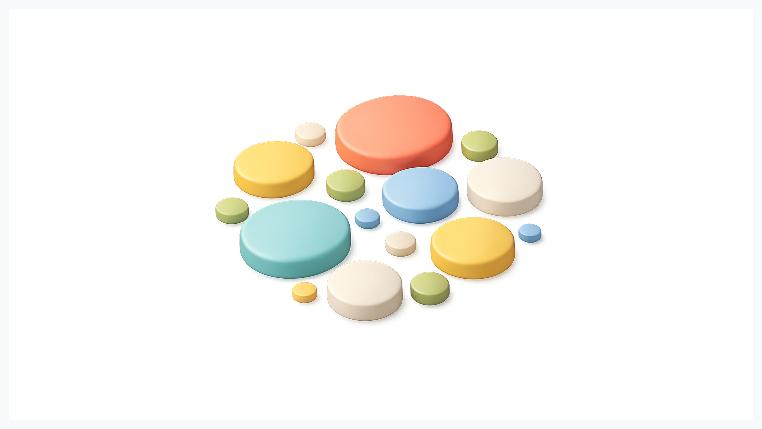
Think of your brain as running in efficiency mode. Every second, it's processing millions of visual signals, so it cuts corners aggressively. One of its favorite shortcuts is chunking: grouping nearby elements into a single unit that can be processed as a single unit.
This is why a well-designed form feels intuitive: the label sits close to its input field, so the brain reads them as a single concept. No conscious scanning required. But when a label is equidistant between two fields? Confusion. Hesitation. Doubt. The user's eye drifts. The cognitive load spikes. And in conversion-critical moments, that hesitation costs you.
The brain's lazy-loading of information through proximity is not a bug - it's a feature. Your job as a designer is to leverage it deliberately.
Why Proximity Is the Most Important Design Rule
You could argue for color theory, typography, or grid systems. All are valid. But visual hierarchy in UI design starts with proximity - and here's why it outranks everything else.
Reduces Cognitive Load
When users visit an interface, they don't read it - they decode it. Every misplaced element is a micro-tax on their attention. The goal of cognitive load reduction in design is to make that decoding effortless.
Proximity does exactly that. A tightly grouped card with an image, title, price, and CTA tells the brain: "This is one thing." Compare that to a layout where those same four elements are scattered across a grid - suddenly the user has to construct the relationship manually. That's mental effort spent not on buying or converting, but on navigation.
The rule: if elements are related, their spacing should scream it.
Creates Instant Visual Hierarchy
Here's something that surprises most junior designers: spacing is more powerful than size. You can make a heading twice as big as body text, but if everything is evenly spaced, the hierarchy collapses. The eye has no anchor points.
However, when you group a heading close to its supporting paragraph and leave generous white space before the next section, the hierarchy snaps into place. The user doesn't need font size to understand what a title is and what a supporting detail is. The white space usage does the heavy lifting.
This is why the most elegant interfaces often look almost empty. They're not - they're deliberately using space to create meaning.
Improves Scannability
Research into UI scanning patterns - particularly the F-Pattern (where users scan left to right on the top, then only down the left side) - shows that users rarely read a page linearly. They hunt for relevance.
Good proximity grouping turns a wall of content into a series of scannable clusters. The eye jumps from group to group, evaluating relevance at each stop. When groups are poorly defined - when everything blends into one undifferentiated mass - the F-pattern breaks down. Users miss key information not because they're inattentive, but because the design gave them nothing to latch onto.
In short, proximity creates the punctuation that enables scanning.
Real-World Examples of Proximity in UI Design

Forms: The 'Label' Test
Forms are the most direct test of proximity literacy. Poor form layout is the silent killer of conversion rates, and it almost always comes down to the same mistake: labels that float between fields instead of anchoring to a single field.
The golden rule: a label must be closer to its own input field than to the field above it. When the gap between label and field is larger than the gap between the label and the previous field, the grouping breaks, and users make errors, slow down, or abandon the form entirely.
Best practice checklist for form proximity:
- Keep 4-8px between a label and its input
- Use 20-32px between separate form groups
- Never center labels equidistant between two fields
- Group related fields (e.g., First Name + Last Name) with tighter spacing than unrelated ones
E-Commerce Product Cards
A well-designed product card is a masterclass in grouping related elements. Image, product name, price, and the add-to-cart button should form a tight visual cluster - a single coherent unit the brain processes as a single entity.
When you browse Amazon, Shopify stores, or Apple's online shop, notice how the card elements sit close together, with clear white space separating each card. This isn't aesthetic luxury - it's functional communication. Proximity design examples like these directly influence perceived product quality and purchase intent. See how Glow Team applies these principles across real client projects.
Navigation Menus
Navigation is where proximity becomes organizational logic. Items grouped signal a shared function or category. Think of a top navigation bar where "Products," "Features," and "Pricing" cluster together - then a noticeable gap before "Blog" and "Docs."
That gap is not wasted space. It communicates: these are different kinds of links. The first group is commercial. The second is educational. Users read this distinction instantly, not because of labels or colors, but because of Gestalt psychology in UX - proximity doing its silent work.
How to Apply Proximity: A Step-by-Step System
1. The White Space Rule: Shrink to Group, Add to Separate
This is the foundational move. Every time you want to signal that two elements belong together, reduce the space between them. Every time you want to signal a separation - a new section, a new concept, a new group - increase the space.
The power of white space usage isn't just aesthetic breathing room. It's semantic. A designer who understands this can create a clear hierarchy with no borders, no background colors, no dividers - nothing but space.
White Space Rules at a Glance:
- Related elements: 4-8px gap
- Sub-groups within a section: 12-16px gap
- Between major sections: 32-64px gap
- Between full-page sections (hero, features, CTA): 80-120px gap
2. Using a Spacing System: The 4pt / 8pt Grid
Arbitrary spacing is the enemy of consistency. A layout where one component has 14px padding, and another has 17px, feels subtly "off" - even if the user can't articulate why. The 8pt grid system solves this by restricting all spacing decisions to multiples of 8: 8, 16, 24, 32, 40, 48, 64, and so on.
For finer control - especially within components like buttons or form labels - a 4pt grid system allows increments of 4: 4, 8, 12, 16, 20, 24. This creates a mathematically consistent rhythm that users feel even when they can't see it.
Why this matters for proximity specifically:
- It forces you to make deliberate decisions: is this element close (8px) or far (32px)? There's no 15px ambiguity.
- It creates a visual rhythm that makes groupings self-evident.
- It makes your design system scalable - any new designer joining the project can maintain the same spatial logic.
3. The 'Squint Test.'
This is a technique used by experienced designers and art directors worldwide, and it requires no tools whatsoever. Step back from your design and squint - literally blur your eyes - until the fine details disappear.
What you're left with is a map of visual groupings. At this level, you can instantly see whether your proximity groupings are working. If related elements merge into clear clusters and distinct sections separate naturally, your proximity is effective. If everything blurs into one undifferentiated block, you have a problem.
Common Proximity Mistakes to Avoid

Even experienced designers fall into predictable traps. Here are the most common proximity errors - and how to fix them instantly.
- Trapped Headings This happens when a heading sits equidistant between the section above it and the content below it. The heading appears to "belong" to the previous section just as much as the next. The result: users misread the structure and miss key entry points.
- Fix: Always give more space above a heading than below it. The heading should feel like it's "attached" to its content, not floating in no-man's-land.
- Orphaned Buttons A CTA or action button that sits far from the content it relates to is an orphaned button. It floats on the page, disconnected from context. Users don't know what clicking it will do - or why they should.
- Fix: Keep buttons close to their trigger content. A "Buy Now" button should sit immediately beneath the product description, not 60px below a whitespace gap.
- Equal Spacing Everywhere Applying uniform padding and margins throughout a layout is a beginner mistake that kills visual hierarchy in UI design. When everything is equally spaced, nothing is grouped - and nothing stands out.
- Fix: Use intentional spacing contrast. Related elements close. Unrelated elements far. The contrast between tight and loose spacing creates the structure users navigate by.
- Inconsistent Spacing Systems Mixing arbitrary pixel values creates a layout that looks subtly unprofessional, even when individual elements look fine in isolation. Without a consistent system, proximity groupings feel accidental rather than intentional.
- Fix: Commit to an 8pt grid system or a 4pt grid system and apply it strictly. Consistency transforms spatial decisions from guesswork into grammar.
Conclusion: Spacing Is Meaning
The proximity principle of design is deceptively simple: things close together belong together. But mastering it is the difference between a layout that looks like a collection of parts and one that communicates as a unified, intentional whole.
What makes proximity so powerful - and so often underestimated - is that it operates below the level of conscious perception. Users don't think "good grouping." They think "this makes sense." They don't notice the spacing. They just trust the interface. That trust is built one deliberate gap at a time.
From the 8pt grid system to the squint test, from form labels to e-commerce cards, the applications are everywhere. And the implementation costs nothing beyond attention and intention.
Start with one layout you're currently working on. Apply the white space rule. Run the squint test. Fix one trapped heading or orphaned button. You'll see the difference immediately - and so will your users.
Because in design, spacing isn't just space - it's meaning. And proximity is the most powerful sentence you can write without a single word.
Want your next product to feel this effortless? The team at Glow Team builds interfaces where every pixel has a purpose. Contact us and we will help you.

.svg)

Related Articles Prompted by Glow


Get weekly glow prompts—
insights from the frontline of product design
Check your inbox for future updates.

No spam.
Just sharp insights that make you better at design & AI.