Web3 Design Principles: Building Trust in Decentralized Apps (2026)

Master Web3 UX. From wallet connections to gas fees, learn the 7 core design principles that build trust and adoption in decentralized applications.
Let's be honest - Web3 still scares people. The idea of managing your own keys, paying gas fees for a button click, and staring at a transaction hash that looks like a cat walking across a keyboard is not exactly a warm welcome. Yet, behind the complexity lies a powerful promise: true ownership, transparency, and freedom from centralized gatekeepers.
So what stands between that promise and the next billion users? Design. Not just "make it pretty" design, but thoughtful, trust-building Web3 design principles that turn confusion into confidence. In this article, we'll walk through the core principles every product team should follow when designing for decentralized apps (dApps) in 2026 - and show how the best projects are already putting them into practice.
Quick Summary (Key Takeaways)
Before we dive deep, here's the short version:
- What are Web3 design principles? A set of UX and UI guidelines specifically tailored for blockchain-based applications, where users bear more responsibility (and more risk) than in traditional Web2 products.
- The five core principles: Transparency & Provenance, Wallet-First Authentication, Security & Risk Communication, Transaction Feedback Loops, and Simplification.
- Best practices at a glance: always link actions to block explorers, design high-friction flows for irreversible operations, replace crypto jargon with plain language, and provide real-time transaction status updates.
- Why it matters: trust is the currency of Web3. Users who don't understand what's happening will leave - and they won't come back.
The Core Philosophy: "Code is Law" vs. "User is King"

Web2 trained us well. We expect "Forgot Password" links, instant page loads, and customer support chat bubbles in the bottom-right corner. Everything is optimized for convenience because the platform owns our data and can fix mistakes on our behalf.
Web3 flips that model. Here, code is law - smart contracts execute exactly as written, with no admin panel to reverse a bad transfer. The user owns their assets, their identity, and their mistakes. This is philosophically beautiful and practically terrifying for anyone used to Gmail's "Undo Send."
The tension between these two worlds defines every Web3 user experience challenge a designer will face. The goal isn't to recreate Web2 inside a blockchain wrapper. It's to honor the decentralized ethos while making it accessible. Think of it as building a bridge: one end sits on the familiar shore of intuitive interfaces, the other on the new continent of self-sovereignty. The bridge has to be sturdy enough for both crypto natives and complete newcomers.
Principle 1: Transparency & Provenance

If decentralization is about removing the need for trust in intermediaries, then design must replace that trust with clarity. Users should never wonder where their assets came from, where they're going, or what just happened.
Visualizing On-Chain Data
One of the strongest blockchain UX patterns emerging in 2026 is the visual provenance trail. Instead of hiding transaction details behind developer consoles, leading dApps now surface them in human-readable formats directly in the UI. Think of it as a package tracking page for your tokens: you can see the origin, every stop along the way, and the final destination.
This applies to NFT marketplaces that show the full ownership history of a piece, DeFi dashboards that display the source and flow of pooled funds, and DAO governance tools that reveal exactly how each vote was cast and counted. The principle is simple: if it happened on-chain, show it on-screen.
Linking to Block Explorers
Every meaningful action in a dApp should include a "View on Etherscan" (or the relevant explorer) link. This tiny UI element does enormous trust-building work. It tells the user: "Don't take our word for it - verify it yourself."
Best practice is to make these links contextual. After a swap, show the link next to the confirmation message. After minting, embed it in the success screen. The goal is to make verification feel like a natural part of the flow, not a detective mission. Teams like Glow Team emphasize this pattern in their dApp design work, treating explorer links as a core trust element rather than an afterthought.
Principle 2: Wallet-First Authentication
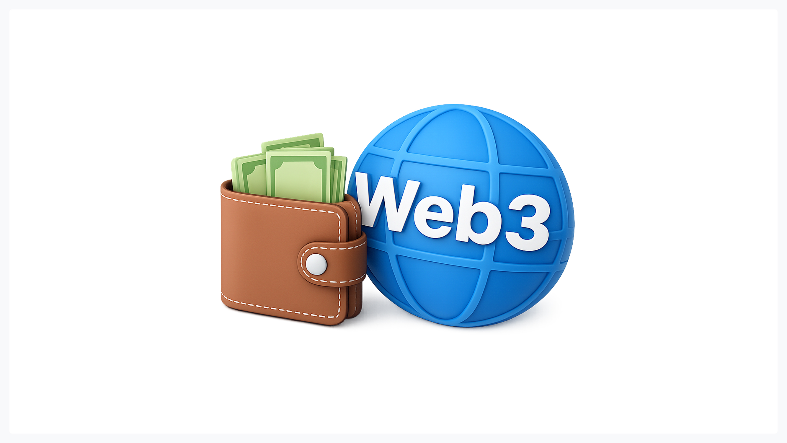
In Web3, your wallet is your identity. There's no email/password form, no OAuth popup, no "Sign in with Google." This is both a blessing and a significant design challenge.
Designing the "Connect Wallet" Flow
The "Connect Wallet" button is the front door of every dApp, and first impressions matter. Good design here means supporting multiple wallet providers - MetaMask, Rainbow, WalletConnect, Coinbase Wallet - and presenting them in a clean, recognizable modal. Users should see familiar logos, not a wall of text.
A few practical guidelines for this flow:
- Auto-detect installed wallets and surface them first.
- Provide a clear, educational "What is a wallet?" link for newcomers.
- Show a brief loading state during the handshake so the user knows something is happening.
- Confirm the connection using the wallet address (truncated) and a visual indicator, such as a green dot.
This is one of those areas where designing for decentralized apps (dApps) requires extra empathy. For a crypto veteran, connecting a wallet is muscle memory. For a newcomer, it's a leap of faith.
Handling Connection States
What happens when things go wrong? The user's wallet might be on the wrong network, disconnected mid-session, or locked. Each state needs its own clear, non-alarming UI treatment.
A "Wrong Network" banner, for example, should tell the user exactly which network they need, offer a one-click switch (leveraging wallet_switchEthereumChain), and explain why it matters. A disconnected state should invite reconnection without losing the user's place in the flow. These micro-interactions might seem minor, but they're the backbone of a trustworthy experience.
Principle 3: Communicating Security & Risk
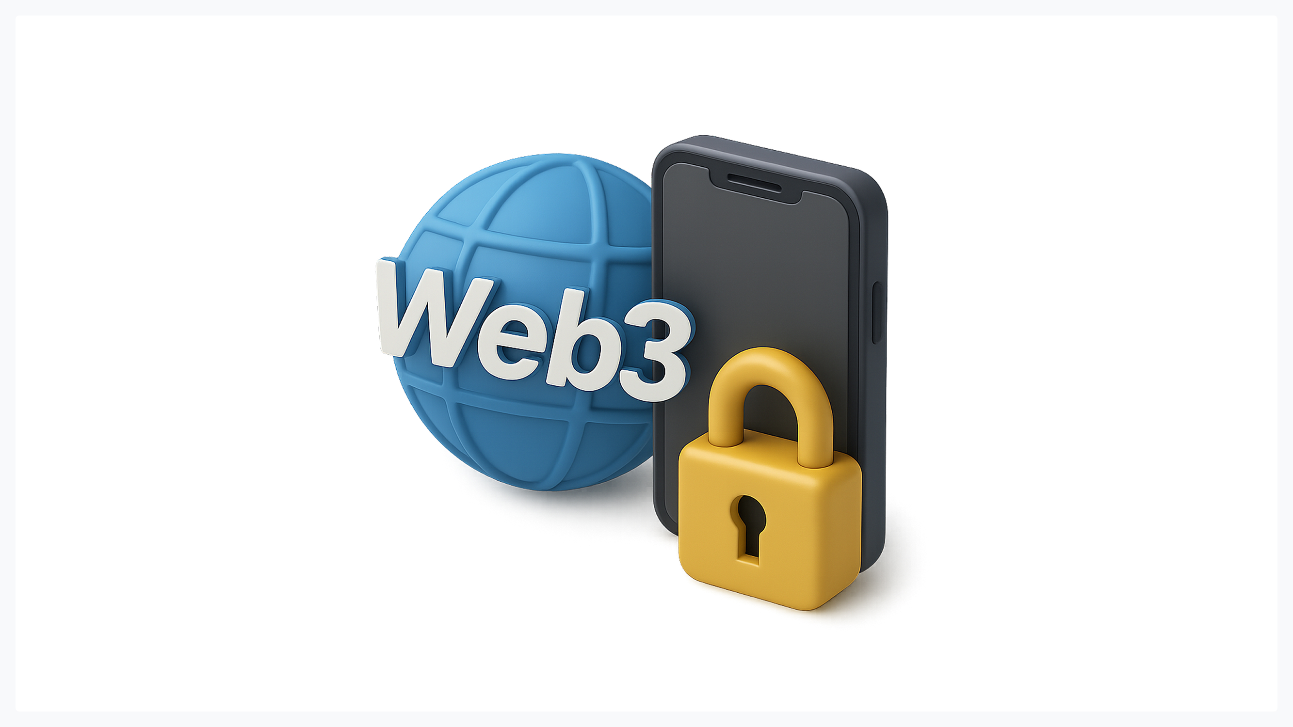
No topic in Web3 design principles carries more weight than security communication. In a world without "Forgot Password," the stakes of every action are higher by default.
Irreversible Actions
Sending tokens to the wrong address, approving a malicious contract, or confirming a swap at an unfavorable rate - these are one-way doors. The UI must treat them accordingly.
High-friction design patterns are essential here. This means requiring explicit confirmation steps (not just a single click), showing clear summaries of what's about to happen ("You are sending 2.5 ETH to 0x3f...8a2c"), and using visual hierarchy to highlight risk. Some teams use red borders, warning icons, or even a short countdown timer before the final "Confirm" button becomes active.
The guiding philosophy: make dangerous actions hard and safe actions easy. If a user has to slow down and read before committing, the design is doing its job.
Phrase & Key Management
Seed phrases remain one of the most anxiety-inducing aspects of Web3 onboarding. Twelve (or twenty-four) random words that control everything - and if you lose them, no one can help you.
Designers should approach this screen with the gravity it deserves:
- Use clear, prominent warnings: "If you lose this phrase, your funds are gone forever. No one, including us, can recover them."
- Never allow copy-pasting without a verification step (ask the user to re-enter specific words).
- Consider progressive disclosure - explain what it is and why it matters before revealing it.
- Suggest (but don't force) secure storage options, such as hardware wallets or encrypted password managers.
Principle 4: Transaction Feedback Loops
Blockchains are slow. A transaction that takes 12 seconds on Ethereum L1 (or longer during congestion) feels like an eternity compared to the instant response of a Web2 app. Effective blockchain UX patterns must bridge this gap.
Managing "Pending" States
When a user submits a transaction, the worst thing a dApp can do is go silent. The screen should immediately acknowledge the submission and provide a clear pending state - a progress indicator, an estimated time, or, at the very least, a spinner with a message like "Your transaction has been submitted to the network."
Advanced approaches include multi-stage progress bars (Submitted → Confirming → Confirmed), real-time block confirmations, and proactive notifications if a transaction is stuck or fails. The more information you give during the wait, the less anxiety the user feels.
Explaining Gas Fees
"Why am I paying $4.72 to click a button?" This question has driven more users away from Web3 than almost any other friction point. Yet Web3 user experience challenges around gas fees are largely a communication problem, not a technical one.
The solution is reframing. Don't call it "gas." Call it "Network Cost" or "Processing Fee" - language that aligns with mental models people already have (like a credit card processing fee). Show the fee upfront before the user commits, break it down if possible (base fee vs. priority tip), and provide context: "This fee goes to the network validators who process your transaction, not to us."
Transparency here isn't just good design - it's a trust signal. Users who understand what they're paying for are far more likely to accept the cost.
Principle 5: Simplification (The "Web2.5" Approach)
Not every user needs to see every detail. The most successful dApps in 2026 adopt what many designers call the "Web2.5" approach: a clean, familiar surface with Web3 power underneath. This is where professional teams like Glow Team's design experts can make a real difference, helping projects strike the right balance between simplicity and decentralization.
Jargon-Free Language
Language is the lowest-hanging fruit in Web3 design improvement. A simple terminology swap can reduce cognitive load dramatically:
- "TxHash" → "Receipt" or "Transaction ID"
- "Sign" → "Confirm" or "Approve"
- "Mint" → "Create" or "Claim"
- "Nonce" → (just hide it entirely from most users)
- "Revoke Approval" → "Remove Permission"
The rule of thumb: if your mom wouldn't understand the word, replace it. You can always offer an "Advanced" toggle for power users who want the raw data. But the default experience should read like plain language, not a Solidity textbook.
Real-World Examples of Great Web3 UX
Theory is useful, but examples stick. Here are three products that demonstrate strong Web3 design principles in practice.
- Uniswap remains the gold standard for DeFi interfaces. Its swap screen is radically simple - two token selectors, an amount field, and a big button. Yet it clearly communicates price impact, minimum received amount, and fees before confirmation. The "Confirm Swap" modal is a masterclass in high-friction design: it summarizes everything and requires a deliberate wallet signature.
- OpenSea (despite its ups and downs) pioneered provenance visualization in NFT marketplaces. Every item page shows a full activity history - mints, transfers, sales - linked directly to on-chain records. This pattern has become the industry norm.
- RabbitHole took onboarding seriously by gamifying the process. Instead of dumping users into a complex dashboard, it guides them through quests - small, rewarded actions that teach Web3 concepts by doing. It's education disguised as engagement, and it works.
What these projects share is a refusal to treat complexity as inevitable. They invest in design as a core product function, not a skin applied at the end. For teams without the in-house expertise to achieve this level of polish, partnering with a specialized Web3 design studio can significantly accelerate the journey.
Conclusion: Designing for the Next Billion Users
The technology behind Web3 is maturing rapidly. Layer 2 solutions are enabling faster, cheaper transactions. Account abstraction is smoothing out wallet management. Zero-knowledge proofs enable privacy without sacrificing transparency. But none of these advances matter if the interface sitting on top of them feels hostile.
Designing for decentralized apps (dApps) in 2026 means accepting a fundamental truth: trust is the currency of this ecosystem. Users can't call a support hotline. They can't reverse a mistake. They are, by design, on their own - and the UI is the only safety net they have.
The five principles outlined here - transparency, wallet-centric auth, security communication, transaction feedback, and simplification - aren't a checklist to satisfy and forget. They're a mindset. Every screen, every micro-interaction, every word in a tooltip is an opportunity to build (or destroy) the trust that keeps users in the ecosystem.
The projects that win the next era of Web3 won't be the ones with the most sophisticated smart contracts. They'll be the ones that make sophisticated smart contracts feel simple. Design is the bridge. Build it well.

.svg)

Related Articles Prompted by Glow


Get weekly glow prompts—
insights from the frontline of product design
Check your inbox for future updates.

No spam.
Just sharp insights that make you better at design & AI.