Zeroheight Design System: Full Guide (2026)

Master Zeroheight for your design system. Learn how to centralize documentation, sync with Figma, and create a single source of truth for design and dev teams.
Picture this: your design team just updated button styles in Figma, but developers are still referencing a six-month-old PDF. Marketing is using the wrong brand colors from an outdated Wiki page. Sound familiar? This disconnect between design files and documentation leads to costly mistakes and slows product development. Zeroheight design system documentation solves this by creating a living, breathing single source of truth that stays synchronized with your actual design files.
Quick Summary (Key Takeaways)

Zeroheight is a centralized documentation hub that syncs with design tools like Figma and Sketch to keep your design system documentation tools alive and continuously updated. Unlike static PDFs or Wiki pages that become obsolete the moment you publish them, Zeroheight creates an intelligent bridge between design and development.
Key Benefits:
- Continuous Sync: Automatically reflects changes from Figma or Sketch without manual updates
- Code + Design Snippets: Embeds live code examples alongside visual components for seamless developer handoff
- Bridge Between Teams: Creates a single source of truth for design that both designers and engineers can trust
How It Works:
- Connect your design tool (Figma, Sketch, Adobe XD)
- Document by adding context, usage guidelines, and code snippets
- Publish a living styleguide that updates automatically
What Is Zeroheight and Why Use It?

Zeroheight acts as an intelligent translation layer between design tools and development teams. While Figma houses your visual designs, your codebase contains the implementation, Zeroheight tutorial content bridges this gap with contextualized documentation that never falls out of sync.
What is the problem with traditional approaches to creating design system documentation? They become stale immediately. You export components to a PDF, share them in Confluence, or write lengthy Wiki entries - but the moment your design files change, that documentation is outdated. Teams waste hours searching for "the latest version" or, worse, build products based on deprecated guidelines.
Zeroheight solves "Stale Documentation Syndrome" by connecting directly to your design files. When you update a button component in Figma, your component library documentation in Zeroheight reflects those changes automatically. No manual exports. No version confusion. Just one reliable, always-current source of truth that your entire organization can depend on.
Key Features (Sync, Code Snippets, Analytics)
Sync Figma to Zeroheight capabilities form the foundation, but the platform offers much deeper functionality. Live embedding means any frame or component from Figma appears as an interactive element in your documentation - not just a static screenshot. Your team sees the actual component with accurate colors, spacing, and behavior.
Code snippet integration transforms design system style guide examples into actionable resources for developers. Embed React components, CSS classes, or design tokens directly alongside visual examples. Engineers no longer need to guess at implementation details or reverse-engineer spacing from screenshots.
Built-in analytics reveal which documentation pages get the most traffic, helping you identify gaps or confusion points. Version history tracking ensures you can always reference previous iterations when questions arise about "why we changed that button style last quarter."
Getting Started: Setting Up Your Zeroheight Account
Beginning your Zeroheight design system journey requires just a few strategic steps. First, create your workspace and invite team members with appropriate permissions - designers need edit access, while developers and stakeholders can have view-only access.
Connecting your design tool forms the critical second step. Navigate to Integrations, select Figma (or Sketch), and authorize the connection. Zeroheight requests read-only access to your design files, ensuring security while enabling automatic synchronization. Choose which Figma files or projects you want to document - you don't need to connect everything at once.
Structure your first styleguide thoughtfully. Most teams begin with UI kit guidelines covering foundations: colors, typography, spacing, and iconography. Create separate pages for these fundamentals before diving into complex components. This hierarchy helps new team members understand building blocks before tackling full patterns.
Import your first components by selecting Figma frames or components and embedding them directly into Zeroheight pages. Add descriptive text explaining when to use each component, but resist the urge to over-document initially. You can always expand later - the goal is to launch something usable quickly rather than create perfect documentation that takes months.
If you need expert guidance implementing your design system, specialized agencies like Glow offer comprehensive support for teams transitioning to modern documentation workflows.
Best Practices for Documenting in Zeroheight
Many organizations benefit from professional design system services when establishing documentation standards and governance models. Effective implementation of design system documentation tools requires more than just technical setup. How you structure and present information determines whether your team actually uses the documentation or ignores it in favor of Slack messages and guesswork.
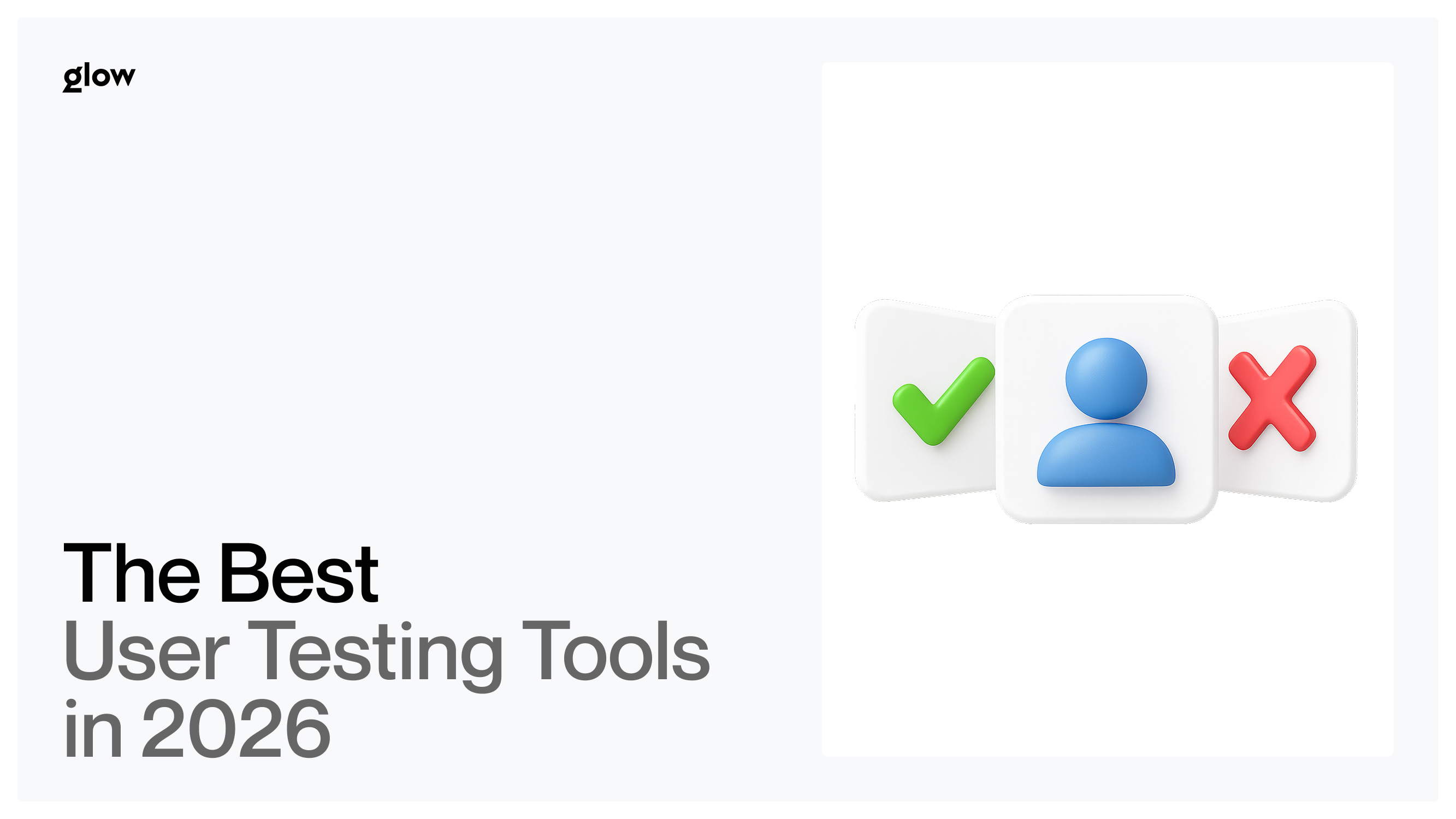
1. Define "Do's and Don'ts"
Visual clarity beats lengthy explanations every time. For each component in your component library documentation, show correct usage with a green checkmark and incorrect usage with a red X. These visual examples communicate faster than paragraphs of text.
For example, when documenting buttons, show:
- ✅ DO: Use primary buttons for the main action on a page.
- ✅ DO: Provide adequate spacing between button groups.
- ❌ DON'T: Use multiple primary buttons in the same section.
- ❌ DON'T: Resize buttons to arbitrary dimensions.
Include real screenshots from your product showing both good and poor implementations. Teams learn faster from seeing actual mistakes they might make rather than abstract principles. Design system style guide examples with clear visual comparisons reduce decision paralysis and support questions.
2. Embed Live Code for Developers
Making developer handoff best practices work requires meeting engineers where they are. Don't just show how components look - show exactly how to implement them. Embed code snippets using Zeroheight's built-in code blocks with syntax highlighting for your tech stack.
Structure code examples with clear copy buttons, so developers can grab snippets instantly. Include props tables for React components, CSS class names for stylesheets, or design token references for both. When your button component accepts variations like size="large" or variant="secondary", document every option with visual examples and corresponding code.
Link to your actual component library (GitHub, npm, internal repository) so engineers can explore full implementations. The documentation should answer 80% of questions independently, but always provide pathways to deeper technical details when needed. This approach transforms your single source of truth for design into something developers actively want to use.
3. Use Design Tokens
Design tokens documentation creates scalability that manual documentation can't match. Instead of documenting "use #3B82F6 for primary buttons," document "use the color-primary-500 token." When that blue eventually changes, the token updates everywhere automatically.
Organize tokens hierarchically: primitive tokens (raw values), semantic tokens (purpose-based), and component-specific tokens (specialized uses). Your documentation should explain this system so that both designers and developers understand the methodology. Sync Figma to Zeroheight capabilities become even more powerful when paired with design tokens - changes propagate through the entire system consistently.
Show token values in multiple formats: hex codes for designers, RGB for certain tools, CSS variables for web developers, and platform-specific formats for iOS and Android teams. Comprehensive token documentation prevents the "which shade of gray?" questions that waste countless team hours.
4. Keep It Concise
Bullet points communicate faster than walls of text. Your Zeroheight tutorial pages should respect busy schedules - team members want answers quickly, not essays. Structure information in scannable chunks using:
- Short paragraphs (2-3 sentences maximum)
- Descriptive subheadings that enable skimming
- Numbered lists for sequential steps
- Bullet points for options or considerations
- Abundant white space for visual breathing room
Remember that documentation competes with tight deadlines and Slack notifications. If finding an answer requires scrolling through dense paragraphs, team members will ask questions rather than read the documentation. Concise, visual content with a clear hierarchy wins adoption.
Step-by-Step: Workflow for a Healthy Design System
Establishing a rhythm for creating design system documentation ensures your system evolves without becoming chaotic. Successful teams treat their design system like a product - with regular updates, clear processes, and stakeholder communication.
The Update Cycle begins when designers modify components in Figma. Before publishing changes, the designer adds an entry to a changelog (built into Zeroheight or maintained separately). This changelog explains what changed and why - critical context for teams tracking updates.
Next, update the corresponding Zeroheight documentation. Since sync Figma to Zeroheight happens automatically for visuals, focus on text: usage guidelines, new variations, or updated implementation details. Review code snippets to ensure they reflect the latest component API or styling approach.
Versioning and Releases prevent confusion during major changes. Use semantic versioning (1.0.0, 1.1.0, 2.0.0) to communicate the scale of updates. Minor versions might add new component variations, while major versions introduce breaking changes that require developer work. Document migration guides for breaking changes, showing teams exactly how to update their implementations.
Schedule regular design system reviews - monthly or quarterly, depending on your team size. These sessions evaluate component usage, identify documentation gaps, and prioritize upcoming improvements. Your UI kit guidelines should feel alive, not abandoned - consistent attention signals to the organization that the design system matters.
Top 3 Real-World Zeroheight Examples
Learning from established design system style guide examples accelerates your own implementation. These organizations demonstrate how thoughtful documentation drives consistency at scale:
- Decathlon's design system showcases a comprehensive component library documentation with clear visual hierarchies. They organize content by user journey rather than just component type, helping teams find patterns relevant to specific features. Their code examples include accessibility considerations, making inclusive design the default rather than an afterthought.
- OpenTable's documentation excels at developer handoff best practices. Every component page includes live code examples, Storybook links, and explicit dos and don'ts. Their design token documentation clearly explains the semantic naming system, enabling engineers to make decisions independently. Notice how they balance completeness with brevity - enough detail to answer questions without overwhelming readers.
- Shopify's Polaris (documented partially in Zeroheight) demonstrates governance at a massive scale. With hundreds of designers and thousands of developers, they maintain consistency through meticulous documentation of not just what components look like, but when and why to use them. Their content principles and voice guidelines extend beyond visual design, showing how a single source of truth for design encompasses entire user experiences.
Zeroheight vs. Competitors (Storybook, Notion)
Choosing between design system documentation tools depends on your team's technical capabilities and needs. Each platform excels in different scenarios, and many teams use combinations rather than picking just one.
Zeroheight specializes in designer-friendly documentation with minimal technical setup. Non-technical team members can easily create and update pages, making it ideal for organizations where design ops teams manage documentation. The sync Figma to Zeroheight integration works seamlessly, requiring no custom code or complex configuration. However, it focuses primarily on design documentation rather than live component testing.
Storybook serves as the developer-centric complement, providing interactive component playgrounds where engineers can test different states and props. It's tightly integrated with codebases but requires technical knowledge to maintain. Many teams run Zeroheight design system documentation for broad organizational access while maintaining Storybook for engineering-specific needs.
Notion offers flexibility and low cost, but lacks design-specific features. You can't embed live Figma components or automatically sync changes. For small teams just starting with creating design system documentation, Notion provides a quick launch pad. But as systems mature, dedicated tools like Zeroheight deliver better return on investment through automation and specialized features.
The best approach? Zeroheight (for design) \+ Storybook (for code) \= comprehensive coverage. Zeroheight handles visual documentation, usage guidelines, and cross-functional communication. Storybook manages technical implementation details and component testing. Link between them so users can navigate seamlessly from design principles to working code.
Ready to transform your design documentation process? Contact experienced practitioners who can help you avoid common pitfalls and accelerate implementation
Conclusion: Building a Culture of Documentation
Tools enable documentation, but culture determines adoption. The fanciest design system documentation tools fail without organizational buy-in and consistent maintenance. Success requires treating documentation as a first-class deliverable, not an afterthought.
Start by including documentation in your definition of done. No component ships without corresponding Zeroheight tutorial content explaining how to use it. This standard prevents documentation debt from accumulating - the gap between reality and documentation that plagues many organizations.
Celebrating documentation wins publicly. When someone creates exceptional design tokens documentation or particularly helpful developer handoff best practices, recognize their work in team meetings or internal communications. This visibility reinforces the importance of documentation and encourages high-quality contributions.
Regularly audit your component library documentation to remove outdated content. Dead links and deprecated guidelines erode trust faster than incomplete documentation. Better to have less content that's reliably accurate than comprehensive guides that users learn to distrust.
Remember that your single source of truth for design only works if people actually consult it. Monitor analytics, ask teams about pain points, and iterate constantly. The best design systems evolve through feedback loops - listening to users and adjusting documentation to serve real needs rather than checking boxes.
Zeroheight design system implementation succeeds when documentation becomes invisible infrastructure - something teams rely on naturally without thinking about it. That's the ultimate goal: making good design decisions so effortless through excellent documentation that consistency becomes the path of least resistance.
Don't want to navigate this journey alone? Consider starting with a trial consultation to evaluate how documentation tools fit your specific workflows

.svg)

Related Articles Prompted by Glow


Get weekly glow prompts—
insights from the frontline of product design
Check your inbox for future updates.
No spam.
Just sharp insights that make you better at design & AI.


