How a Product Design Agency Started a Charity Campaign: The Story of "I Believe in U"

AI Summary. What’s included?
This is the story of "I Believe in U", the charity campaign Glow ran from Odesa in 2022. It covers why the team decided to act, the idea behind the campaign, the logo woven into a vyshyvanka, the swallow postcard, the video and its organic reach, and how the team helped volunteers directly. It closes with what the team learned from designing for a cause and why help is still needed.
The story of "I Believe in U", Glow's 2022 charity campaign from Odesa: the idea, the identity, the swallow postcard, the video and what it raised.
In the summer of 2022, our team was still working from Odesa. Most of our clients were startups and companies in Europe, the US and the Middle East, and the work went on between air raid alerts. Like most Ukrainians, we donated to support the defenders of our country. By late spring, though, we noticed that people around us were donating less often than in the first weeks of the full-scale invasion, while the need hadn't changed at all.
So we did what a design team knows how to do. In July 2022 we built a small campaign to make giving feel personal again: anyone who donated 50 UAH or more received a set of stickers and a postcard signed by our team. This is the story of how it came together, and what we learned from designing for a cause instead of a client.
Why a design team decided to act


The war had already changed how we worked. On client calls we talked about what was happening in Ukraine and shared ways to help. One of our American clients wrote an article about how the team kept delivering during rocket attacks. Some clients offered to help us relocate, but most of the team chose to stay in Odesa. On Instagram, where many Ukrainian designers follow us, we had been sharing what it was like to keep working in wartime.
Design can't stop a missile. What it can do is make an idea clear, memorable and easy to act on. That's what a fundraising campaign needs, so we treated this one like any other project: a concept, an identity, assets, a launch and a way to measure the result.
The idea: "I Believe in U"

The concept was simple: every Ukrainian matters, and every contribution counts. The phrase was inspired by a song by the Ukrainian band 5'nizza. In informal English, "you" is often written as "U", which is also the first letter of "Ukraine". That gave us a small equation that held the whole campaign together: U = you, U = Ukraine, so you = Ukraine. The slogan became "I Believe in U".
The logo: a message woven into a vyshyvanka


We wanted the letter U at the center of the logo, and we wanted it to feel unmistakably Ukrainian. We looked at the flag, folk patterns and embroidery before settling on the vyshyvanka, the traditional embroidered shirt.
While researching, we found a book on Brodiv text embroidery, a technique in which ornaments encode words. We used it to embroider a hidden message, "Peace to Ukraine!", and adjusted the pattern so the letter U emerged from it. The logo was drawn in pixels, a nod to the digital world our team works in, and colored blue, a traditional vyshyvanka color often associated with water, sky and calm. Graphic designer Olha developed two alternative concepts so we could compare directions before choosing.
The full wordmark uses Glow Medium, a custom typeface Kyrylo Tkach'ov and Serhii Makarenko created based on our logo. We printed the stickers with Klei, a printing studio in Kyiv, because supporting Ukrainian businesses was part of the point.
The swallow postcard


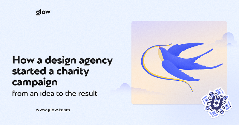
The postcard had two jobs: to remind people who protects them, and to tell the defenders that we believe in them. We chose the swallow, a familiar symbol of spring, good news and freedom. Sailors traditionally associated swallows with land being near, which felt right for a message about coming home.
The illustration combined the logo colors with yellow and red, a sunset-like background and a grainy texture, with the logo and slogan on the front. Team members signed the postcards by hand.
The video and its organic reach
We wanted to show how small and easy a donation can be. We wrote two short scripts. In the first, a morning cup of coffee suggests that the 50 UAH spent on it could become support instead. The second follows a young woman getting ready for work and donating on her way; the opening scene at the mirror is echoed at the end, where a woman in uniform looks at her reflection with pride. The voice-over was recorded by Olha Voronina, a well-known Ukrainian voice-over artist.
We posted the video on our own account without paid promotion, influencers or media buying. It reached about 13 times as many people as our usual posts. For a small studio account, that was the clearest sign the idea had landed.
Helping volunteers directly


We partnered with Pivdenna Palianytsia, a volunteer group from Odesa that delivered aid to soldiers and civilians in Mykolaiv. Working from their list of needs, we bought fleece jackets for the coming winter and hydration packs, because Mykolaiv was short of drinking water at the time. We handed these over together with the printed postcards and stickers, each one signed with a short note of thanks from the team.
Donations made through the campaign went to two Ukrainian charitable foundations, Come Back Alive (savelife.in.ua) and KOLO (koloua.com). Together, the contributions we tracked came to more than 10,000 UAH.
What we learned from designing for a cause
The campaign was small, and we don't pretend it changed the course of anything. But it taught us a few things we still use in client work.
A clear idea travels further than a big budget. The "U" wordplay was simple enough to explain in a sentence, and that made it easy to share. Personal touches matter: hand-signed postcards made the campaign feel human in a way a polished asset alone can't. And a small, tangible reward, a sticker and a card, can turn an abstract request into something people want to be part of.
Most of all, it reminded us why we do this work. Design is a way of helping people understand something and act on it. Sometimes that's a SaaS onboarding flow; sometimes it's a reason to donate. If you want to see how we approach identity work for products and companies today, our branding projects follow the same process we used here: start from one clear idea, then build every asset around it.
Help is still needed
The need for support that started this campaign hasn't gone away. If this story moved you, the foundations above accept donations, and many Ukrainian volunteer groups continue to deliver aid to the people who need it most. Every contribution, like every letter U in our logo, still counts.



Related Articles Prompted by Glow










Get weekly glow prompts—
insights from the frontline of product design
Check your inbox for future updates.

No spam.
Just sharp insights that make you better at design & AI.
Want results like this? Book a call
Let’s talk through your product in 30 minutes — no briefs, no fluff. Or start with a free 3‑day trial: one real screen from your product in 3 working days. No card, no contract.