SaaS Design Principles That Keep Users Coming Back


SaaS design principles that drive activation and retention: time-to-value, progressive disclosure, feedback, patterns, and metrics, with real examples.
Two products can ship the exact same features, and one keeps its users while the other watches them leave in the first week. The difference is almost never the feature list. It is whether a person can reach real value before they give up. Good SaaS design principles exist to protect that path, turning a dense, multi-step, multi-user tool into something that feels obvious. Get them right and adoption follows. Ignore them and no amount of new features will fix the churn.
This is a working guide, not a glossary. It covers what actually separates sticky SaaS products from frustrating ones, the patterns where those ideas live, and how to tell whether your design is doing its job. At Glow we build these products for a living, so the examples are the ones we keep coming back to.
What makes SaaS design different from other product design
Designing a SaaS product carries constraints a marketing site or a one-off consumer app never faces. Miss them and you end up applying generic best practice to a problem that needs something sharper.
The relationship is recurring, not a single visit. A SaaS user comes back daily or weekly, often for years, and pays on a subscription. That flips the priority order: long-term clarity and low effort beat first-impression delight. A flourish that charms on day one but slows the hundredth visit is a net loss.
Onboarding decides survival. Most SaaS churn happens in the very first session. If a new user cannot reach a first meaningful outcome, the moment the product proves it was worth signing up for, they leave and rarely return. That puts unusual weight on the path from empty account to first real win.
The products are dense and data-heavy, and there is rarely a single user. Records, dashboards, settings, permissions, integrations, all packed into one tool used by admins, members, billing owners, and viewers who each need a different view of the same thing. Managing that complexity without overwhelming anyone is the core SaaS design challenge, and it is why structure matters more here than on a simple website.
The core SaaS design principles
A handful of principles sit under almost every well-designed SaaS product. They are easy to state and hard to hold to once feature pressure sets in. Treat them as a checklist you keep returning to, not a one-time setup.
Put time-to-value first
Design the shortest honest path from sign-up to a real outcome, then defend it from every feature that wants to interrupt it. Time-to-value is the gap between a user clicking "create account" and hitting their first "this works" moment. The shorter that gap, the higher your activation and retention. Slack gets a new user into a channel sending messages within minutes; the settings, integrations, and admin depth wait until they are actually needed. Every extra field on the sign-up form and every tour step before the first win is a place people drop off.
Reduce cognitive load with progressive disclosure
Show what the user needs right now and defer the rest. Progressive disclosure, revealing complexity gradually as people are ready for it, beats dumping every option onto one screen. Notion opens with a near-blank page instead of a wall of formatting controls, then surfaces features as you reach for them. The Nielsen Norman Group has documented for years that progressive disclosure lowers error rates and speeds up learning, because people process a few choices far better than forty at once. In a feature-rich B2B tool, this is often the single highest-impact move you can make.
Make the current state obvious
Users should always know where they are, what scope they are acting in, whether a change saved, and what happens next. Ambiguity about state is quietly one of the most expensive problems in SaaS. Which workspace am I in? Did that save, or do I need to hit a button? Is this filter still applied? When the answer is unclear, people slow down, double-check, and lose trust. Persistent labels, active-state indicators, and "saved" confirmations are small details that carry a lot of the experience.
Stay consistent with a design system
The same action should look and behave the same way everywhere. Consistency is what lets users stop reading the interface and start flowing through it. A documented design system, shared colors, typography, components, spacing, and terminology, is how you keep that consistency as the product and the team grow. It also speeds up shipping, since designers and engineers reuse instead of reinventing. Products that skip this end up with three different date pickers and a navigation that shifts between sections, forcing people to relearn on every screen. A design system is the backbone of the work we do in our UI/UX design services for exactly this reason.
Give feedback for every action
A save, a sync, an error, an empty result: every action needs a response, because silence is the fastest way to make a product feel broken. When a user clicks and nothing visibly happens, they assume failure and click again, often creating duplicates or giving up. Subtle micro-interactions, loading states, toast confirmations, and clear inline errors tell people the system heard them. This is not decoration. It is the difference between a product that feels alive and one that feels frozen.
Design for recovery, not just prevention
You cannot prevent every mistake, so make mistakes cheap to undo. Undo actions, confirmations scaled to consequence (a light prompt for archiving, a firm one for deleting a workspace), and clear error states that explain how to get back on track all matter more than trying to block every wrong move. Gmail's "undo send" is a good model: it assumes people will slip and gives them a few seconds to fix it, instead of nagging before every action.
Build accessibility in from the start
Accessible design means people can use your product regardless of visual, motor, auditory, or cognitive ability, and regardless of temporary barriers like a noisy room or a small screen. Readable contrast, keyboard navigation, proper labels for screen readers, and clear focus states widen your audience and, in many markets, keep you compliant with legal standards. Bolting accessibility on after launch means redoing work. Building it in from the first component is far cheaper and produces a cleaner product for everyone, not just users with disabilities.
Design for scale
A scalable interface absorbs new features, larger datasets, and more complex workflows without needing a full redesign. That comes from modular, reusable components and an information architecture that can grow logically. The test is simple: when you add the next twenty features, does the navigation still make sense, or does it become a maze? Products that plan for expansion early avoid the painful rebuild that hits fast-growing SaaS around the point where the original structure runs out of room.
Designing for beginners and power users at once
Here is the tension every SaaS team runs into. Beginners open the product asking "where do I start?" and want clarity and a short learning curve. Power users ask "how do I go faster and bend this to my exact workflow?" and want depth, shortcuts, and customization. Design only for one and you lose the other.
The way through is layered support that fades as competence grows, a concept borrowed from teaching called scaffolding. New users get rich tooltips, guided setup, and sensible defaults that hold their hand through the first tasks. As they gain confidence, those aids recede and more advanced tools come into reach. Trello does this well: newcomers meet a simple board-and-card interface, while custom fields, automations, and power-ups reveal themselves later. Role-based dashboards help too, showing an admin different controls than a viewer, so each person sees the tools that match their job instead of the full firehose. The goal is a product that supports the novice and challenges the expert without forcing either into the other's experience.
Where these principles show up: core SaaS patterns
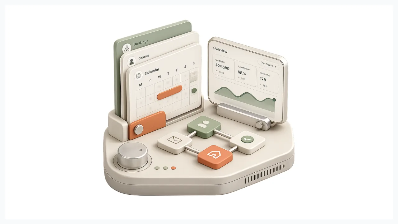
Principles stay abstract until you see the patterns they produce. A few recur across nearly every strong SaaS product because they solve problems unique to the model.
Onboarding and activation flows, guided checklists, sample data, and contextual nudges, carry the time-to-value principle. The best of them get out of the way the moment a user no longer needs them. Empty states are the underrated one: a blank dashboard is a teaching moment, not a dead end. A strong empty state explains what goes here, why it matters, and offers one obvious action to fill it, turning the most fragile screen in the product into an on-ramp.
Dashboards put data density to the test. Good dashboard design prioritizes the few numbers that drive decisions, supports scanning over reading, and lets people drill down without losing their place. As products grow, the command palette (the now-familiar Cmd+K pattern) gives power users a keyboard path to any action or record, keeping speed high even as the surface area expands. And settings, roles, and permissions are where multi-user design gets real: dense, high-stakes screens used by admins under pressure, where clear structure prevents the misconfiguration that erodes trust. You can see how we approach patterns like these across the products in our portfolio.
How to tell if your SaaS design is working
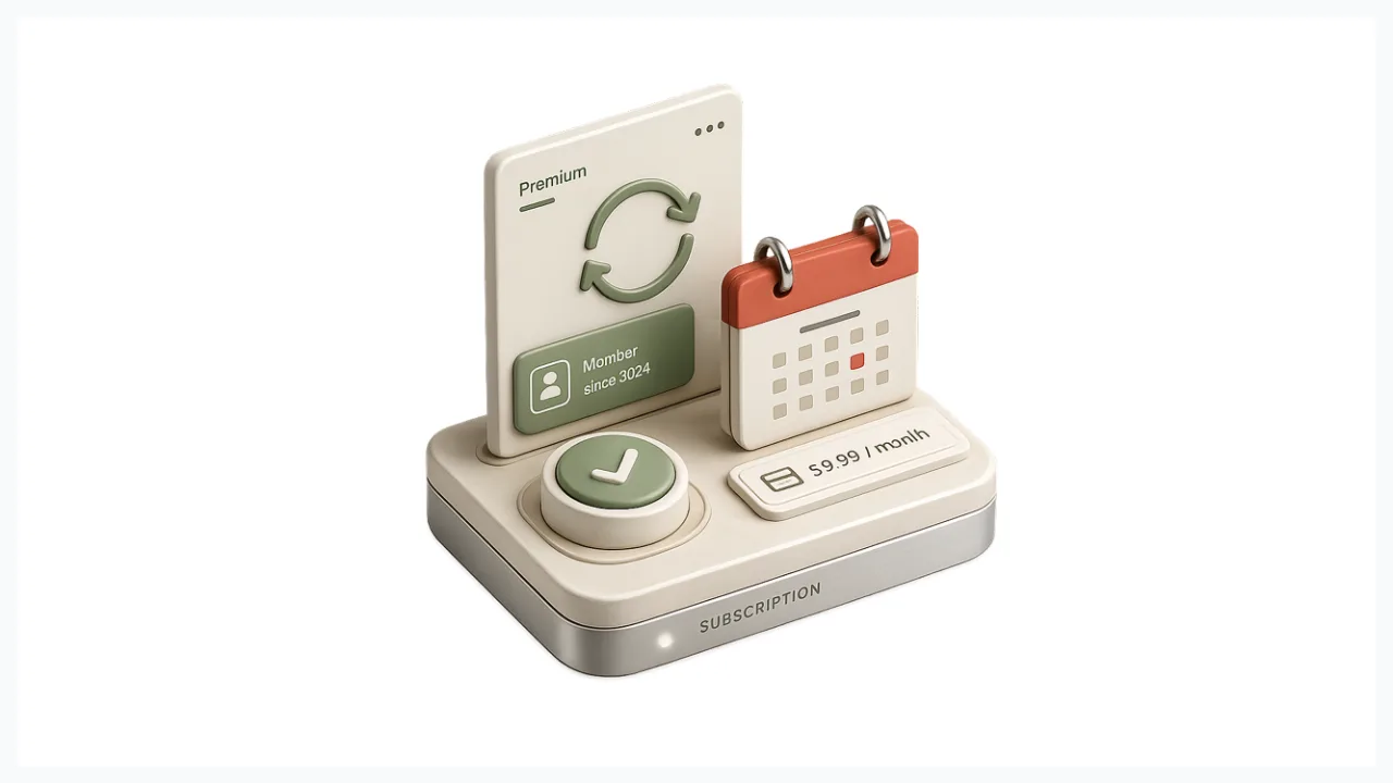
Unlike a brochure site, SaaS design is measurable, which means you can stop arguing about taste and look at behavior. A few metrics tell you whether the experience is doing its job.
Activation rate, the share of new users who reach that first meaningful outcome, is the single best early signal of design health. Time-to-value tracks how long that takes; shorter is almost always better. Task success and time-on-task tell you whether people can complete the core jobs and how much effort it costs them. Feature adoption shows whether users are discovering the capabilities that drive retention, or missing them entirely. And retention and churn are the lagging indicators everything else rolls up into. Design problems surface here last, so if you wait for churn to move before acting, you are already behind. Watch activation and time-to-value first, because they change quickly and point straight at where people are getting stuck.
Common SaaS design mistakes to avoid
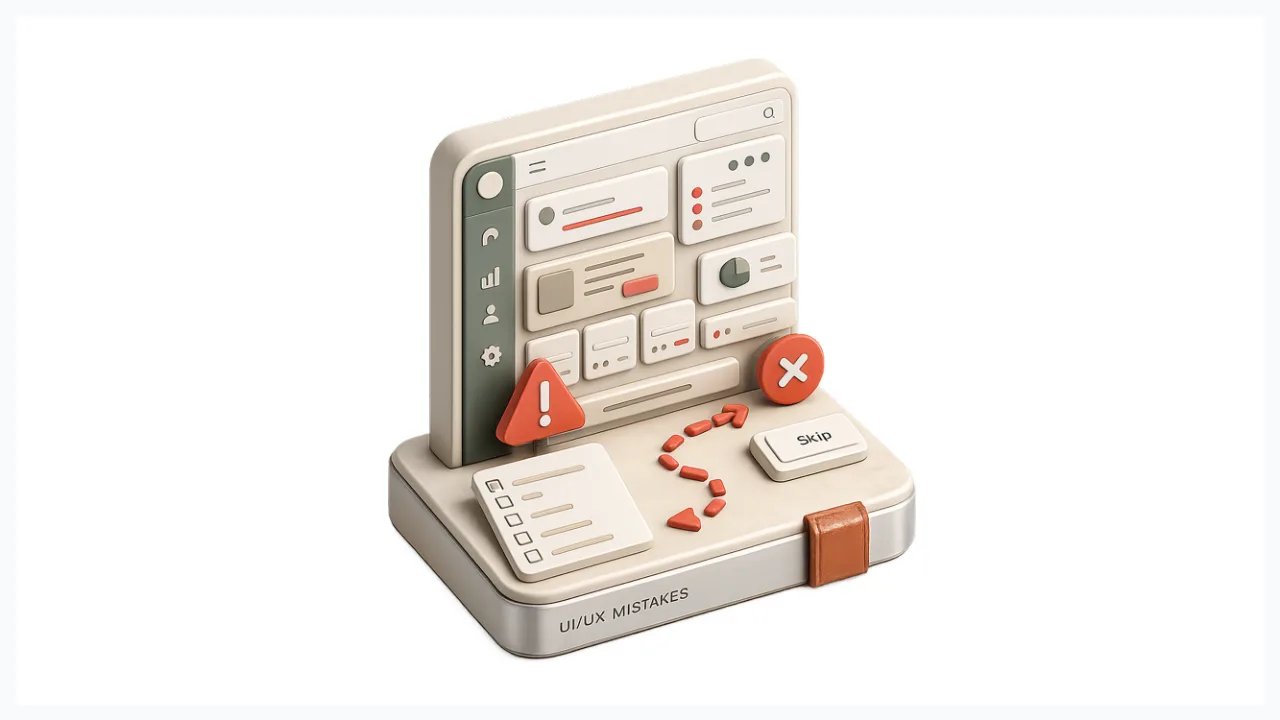
Most SaaS design failures are not exotic. They are the same handful of mistakes, repeated. Optimizing the first impression over the hundredth visit, so daily use feels slow and heavy. Dropping new users into an empty product with no path to first value. Cramming every option onto one screen instead of revealing complexity as it is needed.
The rest are just as common. Inconsistent patterns that force people to relearn the product on every screen. Silent actions with no feedback, so users cannot tell whether anything happened. And designing for a single user when the product is really used by admins, members, and viewers at the same time, each with different needs. None of these are hard to spot once you know to look. The trap is that they creep in feature by feature, which is why a periodic design review tends to catch more than any one launch check.
If your product has grown past the point where one person can hold the whole experience in their head, that is usually the moment to bring in a dedicated design partner. Our team works with SaaS companies at exactly that stage, when the feature set is outrunning the structure.
Frequently Asked Questions
What are the core SaaS design principles?
The principles most strong SaaS products share are: put time-to-value first, reduce cognitive load through progressive disclosure, make the current state obvious, stay consistent with a design system, give feedback for every action, design for recovery from mistakes, build in accessibility, and design for scale. Because SaaS is a recurring, multi-user relationship, long-term clarity matters more than one-time delight.
What is the difference between UI and UX in SaaS?
UI is how the product looks: layout, components, typography, and visual style. UX is whether it works for the person using it, can they find a feature, understand what state they are in, recover from a mistake, and finish the job they came to do. In SaaS the two are tightly linked, but UX is the deeper layer that sets the ceiling on how good the interface can ever feel.
What makes good SaaS design?
Good SaaS design gets a user to value fast, keeps cognitive load low by revealing complexity gradually, makes state and the result of every action obvious, stays consistent across the product, and assumes people will make mistakes worth recovering from. It also serves beginners and power users at once through layered support that fades as competence grows.
How do you measure SaaS design?
Start with activation rate and time-to-value to find where new users stall, since those move quickly and point straight at friction. Add task success, feature adoption, and engagement to see whether people can do the core jobs and keep coming back. Retention and churn confirm the picture, but they lag, so do not wait for them to react.
What are the most common SaaS design mistakes?
The frequent ones are optimizing the first impression over daily use, dropping users into an empty product with no path forward, overloading a single screen, using inconsistent patterns, giving no feedback on actions, and designing for one user when several roles share the product. Each tends to creep in over time rather than appear all at once.
How is B2B SaaS design different?
B2B products usually involve complex, multi-role workflows where admins, managers, and everyday users interact with the same tool differently. That raises the stakes on information hierarchy, role-based views, and scalability, since the platform has to grow with the client's business. Clean navigation and thoughtful data visualization matter more here than visual flourish.
Strong SaaS design principles are not a coat of paint applied at the end. They are decisions about structure, flow, and feedback that decide whether people reach value and stay. If your product has the features but not the retention, that gap is usually a design problem worth fixing deliberately. Get a quote from Glow or start our 3-day free trial, no charge and no commitment, and see how simple design can make a complex product feel obvious.

.svg)

Related Articles Prompted by Glow

















Get weekly glow prompts—
insights from the frontline of product design
Check your inbox for future updates.

No spam.
Just sharp insights that make you better at design & AI.
Want results like this? Book a call
Let's talk through your product in 20 minutes — no briefs, no fluff. Just a real conversation.