Medical Device UX Design: A Complete Guide to Safe, Compliant, and Human-Centered Interfaces


AI Summary. What’s included?
This article explores the critical role of UX/UI design in the healthcare industry. Using a real-world example of a glucose meter interface error that led to severe medical consequences, the author explains why medical design is governed by strict safety standards, including FDA regulations. The piece provides actionable insights into designing interfaces where a UX mistake can literally cost human lives and health.
Discover why medical device UX design is a matter of patient safety, not just visuals. We break down strict compliance standards, FDA guidelines, and how it differs from traditional product design.
In 2019, the FDA documented a recurring use error with a popular home glucose meter. The interface displayed blood sugar readings without sufficiently emphasizing the decimal point. Patients were misreading 1.0 mmol/L as 10 mmol/L and injecting ten times the correct insulin dose. The result: dozens of severe hypoglycemic episodes. The cause: one ambiguous digit in a poorly considered interface.
That story isn’t a UX horror story. It’s a patient safety incident. And it’s exactly why medical device UX design operates by completely different rules than any other design discipline.
According to FDA data, more than 50 device recalls over a five-year period were linked directly to usability failures, not technical malfunctions or manufacturing defects, but design decisions that enabled trained professionals to make dangerous errors. In medtech, the interface is not a layer on top of the product. It is the safety system.
At Glow Team, we’ve worked across complex digital products in fintech, AI, and data-heavy B2B environments. When we engage with healthcare projects, the first thing we communicate is this: everything changes. The stakes, process, documentation and testing — all of it operates at a different level of seriousness. This guide breaks down exactly what that looks like in practice.
Quick Summary (Key Takeaways)
Medical device UX design is the practice of creating interfaces for FDA-regulated hardware and software — including diagnostic equipment, patient monitoring systems, wearable health devices, and surgical navigation tools — where every usability decision directly affects patient safety and regulatory approval.
Three things make it non-negotiable:
- Safety-First Design: Design for use errors, not user errors. If a trained nurse presses the wrong button, the interface fails. Not the nurse.
- Regulated Process: Formative testing (iterative, throughout development) and Summative validation (for FDA submission) are both mandatory, not optional.
- Context-Realistic Testing: Usability testing must be conducted under realistic clinical conditions: gloves on, bright lights, noisy wards, and stressed users.
How Medical Device UX Differs from Consumer and Enterprise Design
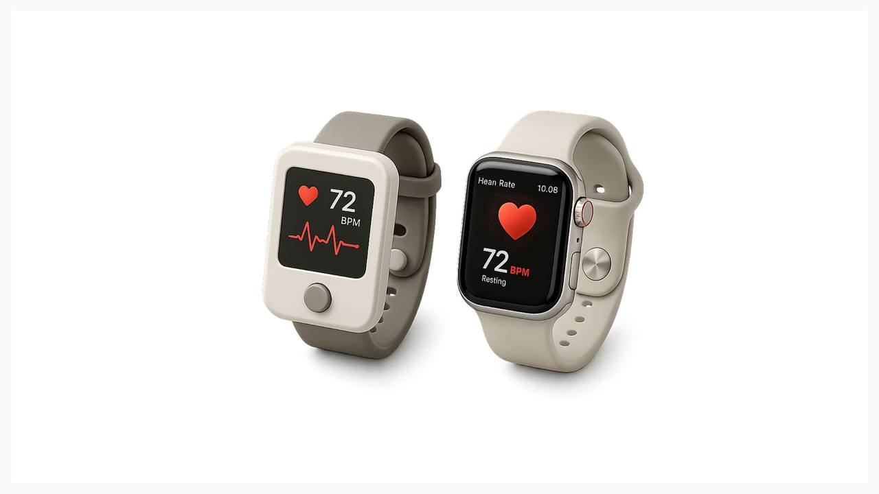
Most UX principles you already know still apply here: hierarchy matters, cognitive load matters, and feedback and error recovery matter. But the context around those principles is fundamentally different, reshaping how you approach every design decision.
“Move Fast” is Not an Option
In a consumer SaaS product, you can roll back a bad feature overnight. You deploy a fix, push an update, and move on. In medical device UI design, a single-pixel change to a safety-critical screen may require months of revalidation before the device can legally ship.
Every design decision is logged in the Design History File (DHF) — a regulatory document that regulators can audit at any time. This isn’t bureaucracy for its own sake. It exists because lives depend on traceability. A designer who understands the DHF from the start of a project will save their team months of retroactive documentation pain.
Multiple, High-Stress User Types
A surgeon might operate a single medical device under a time constraint, a night-shift ICU nurse managing 40 patients simultaneously, a lab technician running routine diagnostics, and a post-discharge patient at home with no clinical training whatsoever. Medical device interface design must work safely for all of them, not as an afterthought, but as a primary design requirement.
Hardware Constraints Are Non-Negotiable
Many medical devices run on slow processors, legacy operating systems, and hardware that lacks support for modern UI libraries. Designers often build interface components entirely from scratch. The aesthetic flexibility you have in a browser or native mobile app doesn’t exist. The constraint is the brief.
The Key Regulatory Standards Every Designer Must Know

Most designers encounter these standards for the first time when a client asks if they’re familiar with them. Here’s what each one actually means for how you do your work.
IEC 62366 — Usability Engineering
This is the international framework for designing medical interfaces with real human use at the center. It requires full documentation, from user profiles (who uses this, in what context, under what conditions) to formative testing iterations, all the way to final validation. It’s not a checklist, it’s a process framework that should run parallel to your entire design workflow.
ISO 14971 — Risk Management
Every possible misuse of the device (intentional or accidental) must be identified and mitigated. This is where terminology matters: under ISO 14971, a use error is classified as a design failure, not a user failure. The burden of preventing misuse sits with the design team, not the clinical user. That mental model shift changes everything about how you approach UX design for medical devices.
FDA Human Factors Guidance
US-specific and required for any device seeking FDA clearance. It mandates formal summative testing with target users operating the device in intended environments. The evidence from this testing — task completion rates, use error documentation, near-miss observations — goes directly into the regulatory submission package. No shortcuts, no substitutes.
The Medical Device UX Design Process (Step by Step)
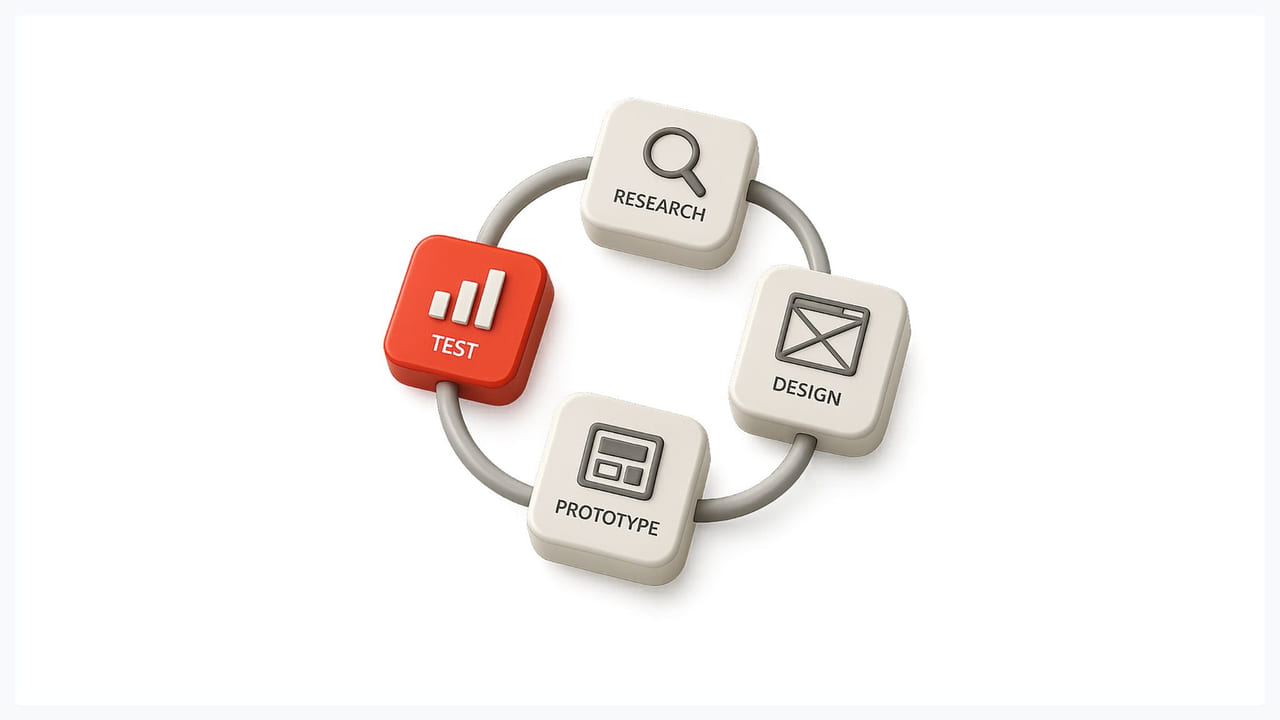
This is not a waterfall process. It’s continuous, iterative, and meticulously documented at every stage. Here’s how it works in practice:
1. Contextual User and Environment Research
Forget surveys and remote interviews as your primary research method. To design for an ICU, you need to spend time in an ICU. Observing real workflows — how nurses navigate around equipment carts, how alarms are currently being managed (or ignored), how lighting changes between day and night shifts — reveals behavioral patterns that no research instrument can capture.
Alarm fatigue is a perfect example. Clinical staff in high-volume environments are conditioned to dismiss alarms because so many are false positives. A medical device UI designed without accounting for this behavioral reality will be built around a fictional user.
2. Stakeholder Alignment Workshops
Regulatory, clinical, engineering, and design teams must align early: before hardware specs are locked, before architectural decisions are made, before the first wireframe exists. Late-stage specification changes after hardware has been ordered are catastrophically expensive. A one-hour alignment session in week two is worth more than a month of rework in week twelve.
At Glow Team, we run deep discovery sessions before any design work begins — not to delay output, but to ensure that what we build doesn’t require tearing down.
3. Prototyping Under Realistic Conditions
A button that appears perfectly sized in Figma may be functionally impossible to press with double surgical gloves on. A confirmation dialog that reads clearly on your monitor may be completely illegible under the overhead lighting of an operating room.
Realistic condition prototyping means testing early with actual protective equipment, lighting, and noise levels. Physical prototypes, even rough ones, reveal usability failures that screen-based testing never will.
4. Formative Testing (Iterative)
Formative testing occurs throughout development while requirements remain malleable. Each round identifies specific use errors, documents them, and informs the next design iteration. This is where the real UX design for medical devices happens, not in perfecting mockups, but in systematically finding and fixing failure modes before they reach patients.
This is also where the DHF gets built. Document every formative round: who participated, what tasks were tested, what errors occurred, and what design changes were made in response.
5. Summative Validation (FDA Submission)
The summative study is the final formal usability evaluation. It requires representative participants from each user group, standardized critical task scenarios, and clearly defined pass/fail metrics established before the study begins. Results, including errors that occurred, become part of the regulatory submission package. This is not an internal QA exercise. It’s evidence for a regulator.
5 Core Principles for Medical Device Interface Design

1. Ruthless Information Hierarchy
In an ICU, a nurse scanning multiple patients simultaneously cannot hunt for a number. Vital signs, dosage amounts, and alert states must be visually dominant, not buried in a screen full of secondary data. Everything else competes for attention that doesn’t exist. Design for the most cognitively loaded moment, not the average moment.
2. Eliminate Ambiguous Visual Language
Go back to the glucose meter example. That incident happened because a single digit (a decimal point) was displayed without sufficient visual weight. In medical device UI design, high-contrast typography is not a matter of aesthetic preference. It’s a clinical requirement. Critical data must be communicated through multiple redundant cues: size, color, iconography, and spatial position, working together, never relying on any one alone.
3. Design for Use Errors, Not User Errors
If a trained clinician makes a mistake with your interface, the interface fails. Full stop. This means that every irreversible action — dose confirmation, device activation, threshold override — requires an explicit, unmistakable confirmation step. Labels must be unambiguous. Destructive actions must be visually and spatially separated from routine ones. The design assumes responsibility for preventing errors.
This principle directly aligns with how we approach complexity at Glow — we work with difficult products and make them simple enough to use correctly under pressure.
4. Consistent, Standardized Visual Language
A typical clinical shift involves interacting with equipment from multiple manufacturers. If your device uses a non-standard icon for alarm mute, a nurse who has spent twelve hours managing alarms across other systems will make mistakes. Medical device interface design must lean into established conventions: red means danger, amber means warning; these are not design opportunities for differentiation.
5. Accessibility for ALL Users
Large, well-spaced tap targets are not just good UX — they’re essential when users are wearing protective gloves. Color alone cannot convey safety-critical meaning, either for accessibility compliance or because clinical environments have variable lighting. Font sizes must account for older patient demographics who may have reduced visual acuity. Accessibility in medical contexts is not a compliance checkbox. It’s a patient safety requirement.
Common Challenges in Medical Device UX (And How to Solve Them)
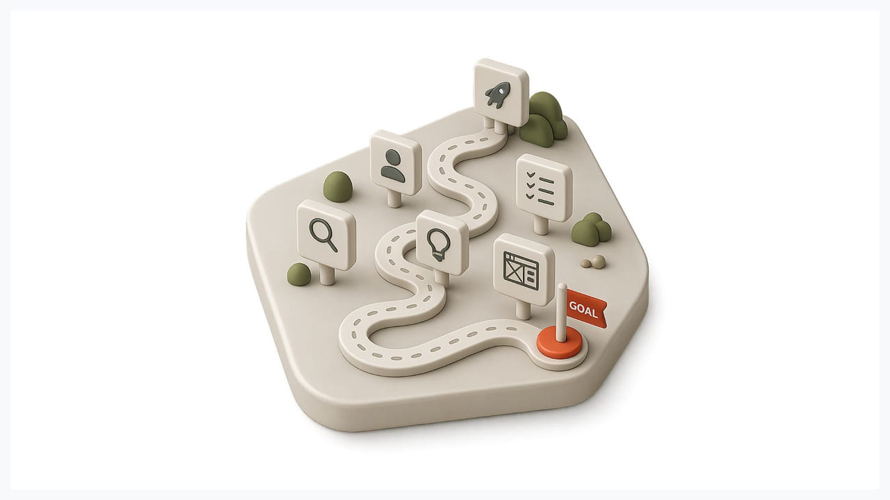
Slow approval cycles frustrate teams used to agile shipping cadences. The solution isn’t to rush — it’s to invest in DHF documentation discipline from day one so that each regulatory touchpoint has the evidence it needs, ready.
Legacy hardware constraints often prevent you from using modern UI frameworks. Prioritize design effort on the safety-critical screens first. Standardize the most frequent patterns and accept that aesthetic richness is a secondary concern.
Hospital resistance to external testing is common — clinical environments are busy, and staff time is genuinely scarce. Push for in-situ testing anyway. A 45-minute observation in a real ICU is worth more than four hours in a sterile conference room.
Designer emotional load is real and underappreciated. Working on products where design errors could harm people creates a specific kind of pressure. Rotating responsibilities among team members and building structured project debriefs help maintain the quality of thinking over long regulatory timelines.
2026 Trends in Medical Device UX

AI decision support is rapidly entering clinical interfaces. The critical UX requirement: the system must explain its reasoning. A black-box recommendation in a medical context is not acceptable — clinicians need to understand why a threshold was flagged, not just that it was. Our AI design services are built on the principle of transparency.
- Voice and gesture interfaces are gaining ground in sterile environments where touch is constrained. But every voice command that triggers a clinical action must have a robust, unambiguous confirmation loop. Convenience cannot compromise safety.
- Biometric authentication is replacing PIN and password entry for device access — faster, harder to share, and more traceable in audit logs.
- Omnichannel continuity — seamless handoff between wearable health monitors, patient portals, and clinical workstations — is becoming a standard expectation. The design challenge is maintaining data consistency and context across environments that look and behave very differently.
How to Choose the Right Medical Device UX Agency

The stakes of this decision are higher than in any other design engagement. Ask direct questions:
Ask to see a shipped, FDA-cleared device they contributed to — not a case study with redacted names, an actual clearance they can reference. Ask specifically where usability testing was conducted. If the answer is “in our office,” that’s a problem. Ask whether they can produce Human Factors Engineering documentation as part of their deliverables. And ask which regulatory pathways they have experience with — 510(k), De Novo, and PMA have meaningfully different HFE requirements.
At Glow Team, we’re direct about what we bring and what we don’t. If a project requires regulatory expertise outside our experience, we say so. The right agency for medical device UX design understands where the line is between design excellence and regulatory necessity — and takes both equally seriously.
Conclusion: In Medical UX, the Interface IS the Safety System
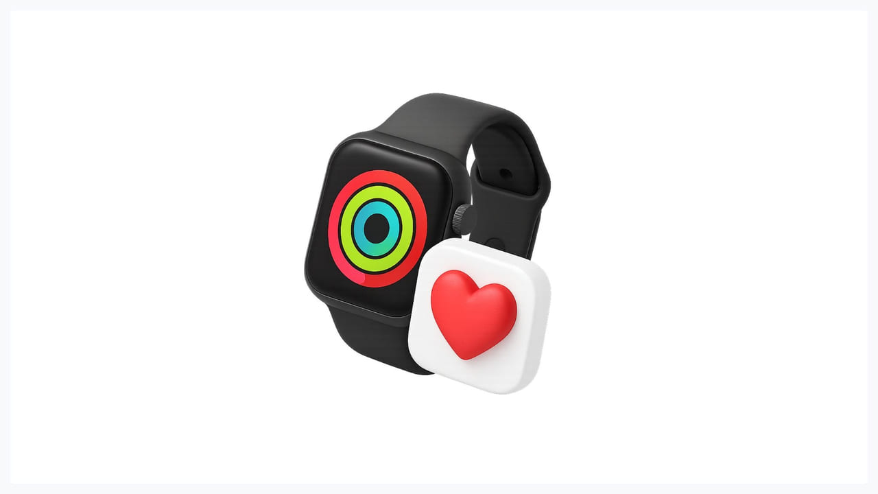
Poor UX design for medical devices doesn’t frustrate. It is harmful. The glucose meter decimal isn’t an edge case — it’s a predictable failure mode in a product where visual clarity was treated as secondary.
Great medical device UX design doesn’t just satisfy regulatory reviewers. It prevents errors that clinical training alone cannot prevent. It reduces cognitive load for professionals operating under extreme stress. It enables a patient with no medical background to use a device correctly at home, alone, at 2 am.
The interface is not decoration. It is the system through which every clinical decision gets executed.
If you’re building a medical or health product and need a design team that takes both usability and compliance seriously, we’d like to talk.

.svg)

Related Articles Prompted by Glow



























Get weekly glow prompts—
insights from the frontline of product design
Check your inbox for future updates.

No spam.
Just sharp insights that make you better at design & AI.
Want results like this? Book a call
Let's talk through your product in 20 minutes — no briefs, no fluff. Just a real conversation.